“Design is not just what it looks like and feels like. Design is how it works.” — Steve Jobs
Here’s something that will change how you look at logos, magazine spreads, and storefronts forever: the most visually satisfying designs in human history weren’t made by accident. The Parthenon. The Mona Lisa. The Apple logo. Twitter’s old bird. All of them share a mathematical pattern so persistent across nature and art that some designers call it proof that beauty has a formula.
That formula is the Golden Ratio — and once you understand it, you’ll see it everywhere, and you’ll never design the same way again.
What Exactly Is the Golden Ratio?
The Golden Ratio is approximately 1.618, often written with the Greek letter φ (phi). It describes a specific proportional relationship between two quantities: the ratio of the larger part to the smaller part equals the ratio of the whole to the larger part.
In simple terms: divide a line into two segments. If the ratio of the whole line to the longer segment equals the ratio of the longer segment to the shorter one, you’ve got the Golden Ratio.
Mathematically: a/b = (a+b)/a ≈ 1.618
This isn’t just an abstract number. It appears in:
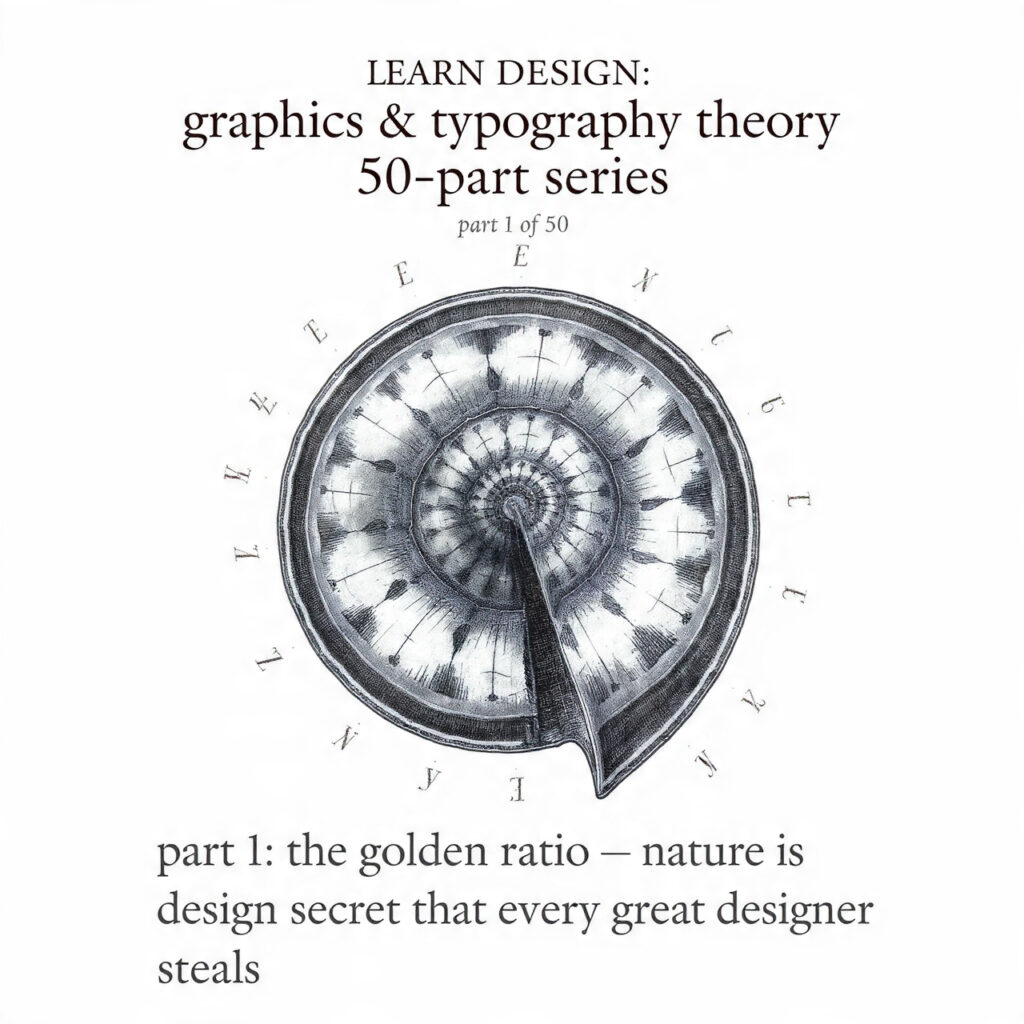
- The spiral of a nautilus shell
- The arrangement of seeds in a sunflower
- The branching of trees
- The proportions of the human face
- The structure of DNA
When something occurs this consistently across unrelated systems in nature, designers and artists eventually pay attention.
A Brief History: From Ancient Greece to Your Instagram Grid
The ancient Greeks didn’t “discover” the Golden Ratio the way Newton discovered gravity. They observed it, studied it, and consciously applied it to architecture and sculpture because they noticed it produced results that humans found inherently pleasing.
The Parthenon’s façade fits nearly perfectly within a golden rectangle. Greek pottery, temple columns, and sculptural proportions all reflect this ratio in their construction.
In the Renaissance, mathematician Luca Pacioli published De Divina Proportione in 1509 — illustrated by Leonardo da Vinci — which formalized the ratio’s application to art and architecture. The title itself, meaning “The Divine Proportion,” tells you how seriously Renaissance thinkers took this relationship.
Da Vinci applied it obsessively. The composition of The Last Supper, the positioning of figures in The Vitruvian Man, the proportions of the human body in his anatomical sketches — all filtered through this lens of mathematical proportion.
Later, this ratio got embedded into the Fibonacci sequence (0, 1, 1, 2, 3, 5, 8, 13, 21, 34…), where each number is the sum of the two before it. As the numbers grow larger, dividing adjacent Fibonacci numbers gets progressively closer to 1.618. This sequence creates the famous Fibonacci spiral, which maps onto the natural growth patterns found in shells, galaxies, and flower petals.
Try out and download our best font for free 👀


The Golden Rectangle and the Golden Spiral
Two constructs come directly from the Golden Ratio and appear constantly in design practice:
The Golden Rectangle has sides in a 1:1.618 ratio. What makes it particularly useful is its self-similar property: remove a square from a golden rectangle, and the remaining piece is another golden rectangle. This nested quality means the shape contains an infinite regression of itself — making it one of the most structurally elegant forms in geometry.
The Golden Spiral is created by drawing quarter-circle arcs connecting opposite corners of those nested squares. The result is a logarithmic spiral that curves outward in perfect mathematical harmony — the same curve found in nautilus shells.
Designers use both as compositional tools. Place key elements where the spiral’s eye falls. Structure a layout within a golden rectangle. Crop images to golden proportions. Each decision subtly pulls the composition toward visual balance.
How Designers Actually Use This in Practice
Theory is one thing. Application is where the Golden Ratio earns its reputation.
Logo Design: The Apple logo was constructed using circles whose diameters relate to each other in Golden Ratio proportions. Twitter’s bird (in its earlier iterations) used overlapping golden circles to define its curves. National Geographic’s yellow rectangle border closely approximates golden proportions. These aren’t coincidences — they’re deliberate craft decisions made by designers who understood that mathematically balanced forms hold visual weight more effectively.
Typography: When setting type, the relationship between font size and line height can be guided by the Golden Ratio. If body text is set at 10pt, a harmonious line height would be approximately 16pt (10 × 1.618). This creates breathing room that feels neither too tight nor too airy — it hits a point of natural legibility.
Spacing and Layout: The ratio can guide decisions about margin widths, column proportions, and white space distribution. A two-column layout where one column is 1.618× the width of the other creates inherent visual hierarchy without forcing the eye to work.
Image Cropping: Instead of centering a subject or using the rule of thirds (which we’ll cover separately), some photographers and designers use golden spiral overlays to guide where subjects are placed within the frame. The eye lands where the spiral tightens — a powerful focal point.
Web Design: Page layouts, button proportions, spacing scales — all can be governed by 1.618 multiplication. A spacing scale of 8px, 13px, 21px, 34px, 55px directly mirrors Fibonacci numbers and creates rhythm that feels natural across screen sizes.
Does the Brain Actually Prefer It? The Science (and the Debate)
Here’s where it gets complicated — and intellectually honest design education requires acknowledging this.
Side Note : Promote & earn with Letterhanna’s affiliate program.

Some studies suggest humans show measurable preference for golden proportions. A famous series of experiments by psychologist Gustav Fechner in the 1860s found that when shown various rectangles, people tended to prefer those closest to golden proportions. Later studies in neuroaesthetics have suggested that processing golden-ratio compositions requires less cognitive effort — the brain “locks on” to the pattern more easily.
However, the scientific community isn’t settled on this. Other researchers have found that the preference is far less consistent than the mythology suggests, that cultural context matters significantly, and that rectangles close to — but not exactly matching — golden proportions are often rated as highly as the exact ratio.
What this means for designers is nuanced: the Golden Ratio is a powerful guide, not an immutable law. It provides a principled starting point for proportion decisions. It offers a rationale for choices that might otherwise feel arbitrary. It gives designers a shared language for discussing visual harmony.
But slavishly applying 1.618 to every element of every design, hoping the math alone will produce beauty, misunderstands how design actually works. The ratio is a tool. The designer is the craftsperson.
The Golden Ratio Versus the Rule of Thirds
These two principles often get conflated, but they serve slightly different purposes and produce noticeably different results.
The Rule of Thirds divides a composition into a 3×3 grid and suggests placing key elements along the lines or at the intersections (called “power points”). It’s simpler, faster to apply, and more commonly taught in photography and basic design courses.
The Golden Ratio is more precise and, when applied to composition, creates focal points that sit slightly differently than the rule of thirds would suggest. The golden spiral’s eye falls at approximately 38.2% from the edge of a frame (1 ÷ 1.618), while the rule of thirds places points at exactly 33.3%.
The difference is small — but in refined typography and editorial design, small differences accumulate into perceptibly different results. Many professional designers use the rule of thirds as a quick compositional shortcut and reach for the Golden Ratio when precision matters: when constructing a logo, finalizing a layout, or determining typographic proportions.
Applying the Golden Ratio: A Practical Exercise
Take any design project currently in progress and run this diagnostic:
- Identify the primary content area. What’s the most important element on the page, screen, or layout?
- Measure its dimensions. Now calculate what 1.618× that measurement would be.
- Apply that number to secondary elements. If your hero image is 600px wide, a supporting sidebar at approximately 371px (600 ÷ 1.618) creates a golden proportional relationship.
- Check type hierarchy. If your headline is 48px, a golden body text size would be roughly 30px. Line height at 1.618× body text creates natural spacing.
- Apply to whitespace. Padding at golden proportions creates margins that feel designed rather than default.
This won’t automatically transform any design into a masterpiece. But it will eliminate a category of proportion decisions that could otherwise undermine visual harmony — replacing guesswork with principle.
Why This Still Matters in Digital Design
There’s sometimes an impulse in modern design to reject classical principles as outdated, as if screens have somehow changed the fundamental way human perception works. They haven’t.
The Golden Ratio persists in contemporary digital design precisely because it addresses something timeless: the human preference for visual harmony and proportional balance. The medium changes. Screens get larger, smaller, fold in half. Resolution density increases. Interaction paradigms shift. But the proportional relationships that the brain processes as balanced remain stable.
Understanding the Golden Ratio doesn’t make design rigid. It makes design principled. There’s a significant difference between rules that constrain and principles that guide. The best designers in the world understand both how and when to apply classical proportional theory — and how and when to deliberately break from it for expressive effect.
Knowing the rule exists is what makes breaking it meaningful.
Key Takeaways for Part 1
- The Golden Ratio (φ ≈ 1.618) describes a proportional relationship found consistently throughout nature and human-made objects considered visually harmonious.
- It produces the Golden Rectangle and Golden Spiral, both of which serve as compositional tools in logo design, layout, typography, and image composition.
- Historical applications span the Parthenon, Renaissance art, and contemporary brand identity design.
- The science behind human preference for golden proportions exists but is nuanced — the ratio is a guide, not a guarantee.
- Practical application touches typography size ratios, spacing scales, layout column proportions, and image cropping decisions.
- Understanding this principle gives designers a principled language for proportion decisions rather than relying on aesthetic intuition alone.
Next in this series → Part 2: The Rule of Thirds — How one simple grid transforms composition decisions in photography, illustration, and layout design.
Here Are Some Fonts You Might Love! 👀