So you’ve fallen in love with handwriting fonts (who hasn’t?). They’re charming, soulful, and just the right amount of imperfect. But the real magic? Knowing how to use them like a pro.
In this article, we’ll guide you through the art of using handwriting fonts with style and strategy—so your designs look polished, not like a teenage diary entry.
🖋️ The Power of Handwriting Fonts: A Quick Recap
Before we get into the how, let’s remember the why:
-
They give your design a human voice
-
They stand out in a sea of sterile sans-serifs
-
They create instant emotional connection
But like garlic in cooking—too much, and you’ve gone from gourmet to “whoa.” Balance is everything.
🧠 1. Know Your Message Before Picking a Font
Think of your handwriting font as a tone of voice. Is your brand:
-
Playful and fun? → Go for bouncy, rounded scripts.
-
Elegant and chic? → Choose flowing, calligraphic styles.
-
Rustic or handmade? → Try textured or monoline hand-lettered fonts.
The font should mirror the message. Don’t use a bubbly script for a luxury law firm logo. (Unless it’s a very quirky law firm. In which case… we want to meet them.)
🧩 2. Pair Wisely: Handwriting Fonts + Simplicity = ✨
Handwriting fonts shine best when they’re the main star, not competing for the spotlight. Always pair with:
-
Clean sans-serifs (like Montserrat, Lato, or Open Sans)
-
Classic serifs for contrast (like Playfair or Merriweather)
-
Minimal color palettes and spacious layouts
Pro tip: Never pair two handwriting fonts together unless you’re going for chaotic creative energy. And even then—do a vibe check.
Try out and download our best font for free 👀

🔠 3. Choose the Right Context
Handwriting fonts work beautifully in:
-
Logos – Use for the brand name or tagline for warmth.
-
Social media posts – Great for quotes, promotions, or featured words.
-
Headlines & callouts – They grab attention fast.
-
Invitations & packaging – Adds authenticity and charm.
Avoid using them in body text or long paragraphs. Your readers’ eyes will cry, and so will your bounce rate.
🔧 4. Customize When Possible
Many handwriting fonts come with:
-
Ligatures – Stylish letter pairs (like “th”, “ll”, “st”)
-
Alternates – Variations of letters to avoid repetition
-
Swashes – Decorative flourishes for that ✨extra✨ flair
Don’t ignore these! They’re what take your design from “just okay” to “where’d you get that font?!”
🧪 5. Test Across Devices & Sizes
A font might look dreamy at 60pt on your screen… and become a mess at 12pt on a phone.
Before finalizing:
Side Note : Promote & earn with Letterhanna’s affiliate program.

-
Preview on mobile and desktop
-
Print it (especially if it’s for packaging or print media)
-
Check for readability at different sizes
It’s like trying on clothes before a party. You want to know you look good everywhere.
🚫 6. Common Mistakes to Avoid
Let’s talk font faux pas:
-
❌ Using too many styles at once
-
❌ Ignoring alignment and spacing
-
❌ Choosing a handwriting font just because it’s cute
-
❌ Not checking license usage
Yes, even fonts need legal protection. Always double-check that your font is cleared for commercial use, especially for logos and products.
🛒 Bonus: Where to Get the Good Stuff
Sure, you can dig through the internet for freebies… but nothing beats a curated collection of professional handwriting fonts that are:
-
💎 Beautifully made
-
✅ Licensed for commercial use
-
✍️ Full-featured (ligatures, alternates, multilingual support)
-
🔥 Designed to wow on any project
👉 [Explore Our Handwriting Font Library] – Your next favorite font might just be waiting for you.
🎯 Final Words: Make It Personal, Make It Professional
Handwriting fonts walk the line between heartfelt and professional. When used intentionally, they can completely transform the look and feel of your design.
Remember: You’re not just using a font. You’re crafting an experience. You’re adding a human voice to digital space.
So go ahead—mix a little personality into your pixels.
✍️ Your design deserves to feel as real as you are.
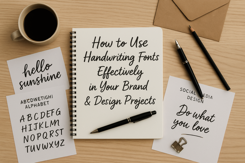
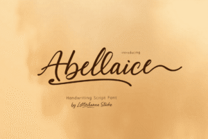
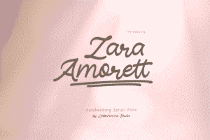
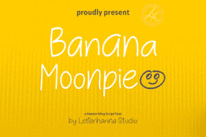
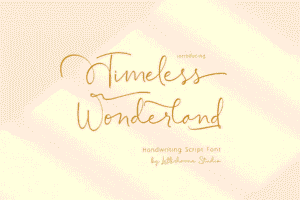
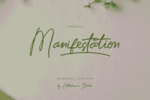
Here Are Some Fonts You Might Love! 👀