The category predates digital design by three centuries. What feels current is a rediscovery, not an invention.
The Myth
Spend enough time in design discourse — forums, podcasts, brand identity critiques, type trend reports — and the framing emerges reliably: handwriting fonts are having a moment. They’re everywhere right now. Brands are reaching for them to feel more human, more authentic, more personal in an era of digital overload. The implication is clear even when it’s not stated directly: this is a relatively recent development, a category that rose to prominence in the digital age or perhaps in the specific visual culture of the past decade.
This framing is wrong in a way that matters. Handwriting-derived type is not a trend. It is not a response to the digital era, the rise of social media aesthetics, or the particular brand strategy anxieties of the early 21st century. It is one of the oldest categories in the history of moveable type — in continuous professional use for roughly as long as commercial printing has existed.
What feels like a trend is usually one of two things: either a genuine cyclical revival of styles that had faded from mainstream use, or simply increased visibility in contexts that didn’t previously use handwriting type extensively. Neither of these is the same thing as the category being new.
The Historical Record
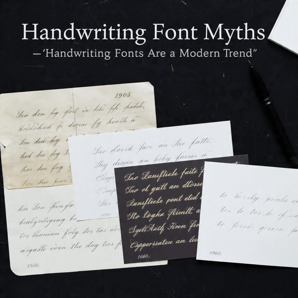
The earliest metal typefaces designed to imitate handwriting appeared in Europe in the late 15th and early 16th centuries, not long after Gutenberg’s press itself. The humanist scripts of Renaissance Italy — typefaces designed to reproduce the carefully formed pen lettering of educated scribes — were among the first attempts to capture the look of handwritten text in moveable metal type. The motivation was familiar: at a moment when print was new and books were new, the prestige and cultural authority of handwriting was so strong that type was expected to imitate it.
By the 17th century, formal script typefaces based on copperplate engraving styles were in commercial production. These were sophisticated designs — cut in metal to replicate the pointed-pen calligraphic styles used by professional clerks and correspondence writers of the period. They served the same function that a formal script font serves today: signaling refinement, authority, and deliberate care. Banks, legal offices, merchants, and institutions used them for exactly the reasons that luxury brands use formal script fonts now.
Try out and download our best font for free 👀


The 18th century saw continued development of formal script type across European printing centers. Type founders competed to produce the most convincing and elegant script faces, with the formal Roundhand and Copperplate traditions generating numerous commercial variants. These were not marginal or experimental products — they were mainstream commercial type used in significant volumes across the printing industry.
The 19th century brought the expansion of commercial printing and advertising, and with it a dramatic broadening of the handwriting and script type category. Wood type producers and metal foundries produced brush script styles, informal handwriting-imitating faces, and a wide range of display scripts that served the growing needs of advertising, signage, and promotional printing. The Victorian era was, among other things, a golden age of script type — one that produced visual language still referenced heavily in contemporary design.
The 20th Century: Phototype and the Mid-Century Peak
The transition from metal type to phototype in the mid-20th century, if anything, accelerated the development of handwriting and script fonts rather than diminishing it.
Phototype technology removed the physical constraints of metal type — no more risk of fragile hairlines breaking, no more limitation on how close letters could be set without collision. Script typefaces that were difficult or impossible to produce in metal became viable in phototype, and type studios responded with an explosion of script and handwriting designs.
Photo-Lettering Inc., founded in New York in 1936, built a library that eventually ran to thousands of typefaces — an enormous proportion of which were script and handwriting styles. Their catalogues, produced through the 1940s, 50s, 60s, and 70s, document a category in vigorous commercial health, generating new designs continuously for advertising agencies, editorial studios, and brand designers of the era.
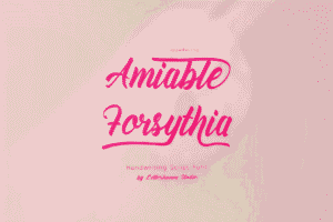
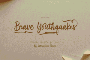
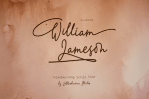
Fonts that later became classics — Mistral (Roger Excoffon, 1953), Brush Script (Robert E. Smith, 1942), Palette (Hermann Zapf, 1949), Civilité, and many others — were commercial handwriting and script releases of this period, used extensively in mid-century advertising, packaging, and editorial work. These weren’t novelty items. They were workhorses of the commercial type system.
Side Note : Promote & earn with Letterhanna’s affiliate program.

The Desktop Publishing Transition
The shift to digital type in the late 1980s and through the 1990s created a moment of relative displacement for handwriting fonts. Early digital type libraries were dominated by converted metal type classics — primarily text fonts and headline serifs — and the tools for creating high-quality digital script faces hadn’t fully matured. The early digital era is sometimes remembered as a period when handwriting type was less visible, which has contributed to the impression that its current use represents a new development.
But even in this period, the category didn’t disappear. ITC offered digital versions of established script faces. Type designers continued producing new handwriting designs through the desktop era. The visibility simply contracted relative to the preceding decades.
What changed in the late 2000s and through the 2010s was the explosion of independent type designers and font marketplaces — Creative Market, MyFonts, Font Squirrel, and others — that gave thousands of new handwriting font designers direct access to buyers. The apparent surge in the category’s presence was largely a visibility and accessibility surge: more fonts, cheaper fonts, fonts available to a much wider designer population. The underlying category had never gone away.
Why the Trend Perception Persists
Several forces maintain the illusion that handwriting fonts are a recent development.
Generational field of view. Design trends feel like trends relative to when a given designer entered the field. A designer who came up in the early 2000s, when sans-serif minimalism dominated brand identity, experiences the current prevalence of handwriting fonts as a departure from the norm they learned in. The historical record before their professional formation is abstract knowledge, not felt experience.
Platform amplification. Social media and design portfolio platforms make current visual trends highly visible in ways that historical use patterns are not. The volume of handwriting font usage happening right now is more visible than the equally substantial usage that happened in 1965, not because it’s genuinely greater but because the documentation infrastructure is different.
Marketing language. Font foundries and marketplaces have commercial reasons to describe their releases in terms of current trends — it drives purchasing decisions. Framing a handwriting font release as “riding the authenticity trend” is more persuasive marketing than “here is a continuation of a centuries-old typographic tradition.” The marketing language shapes the perceived reality of the category.
Here Are Some Fonts You Might Love! 👀