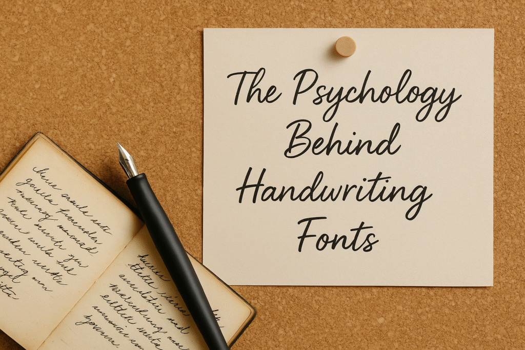
Ever wonder why handwriting fonts feel so personal?
Like how a single handwritten word can evoke more emotion than a whole paragraph in Arial?
Spoiler alert: it’s not magic. It’s psychology.
When used strategically, handwriting fonts can influence how people feel, what they remember, and even what they buy. So let’s unpack the emotional science behind those swoopy letters and loopy lines—because the next time someone clicks “Add to Cart,” your font might just be the reason why.
🧠 Fonts Speak to the Brain Before the Eyes Catch Up
We process visual elements faster than words. Before someone reads your message, they’ve already felt it.
That’s where handwriting fonts thrive. They mimic real, human writing, which triggers the brain’s social-emotional processing center. It’s called the fusiform gyrus (sounds like a Harry Potter spell, but it’s real), and it’s responsible for recognizing faces and familiar shapes—including handwriting.
This makes your design:
-
More memorable
-
More emotional
-
And, often, more effective
❤️ Handwriting Fonts Signal Authenticity
Today’s audiences are allergic to anything that feels overly polished or corporate. They crave realness.
A clean sans-serif may look sleek, but a handwriting font says:
-
“This was made with love.”
-
“There’s a human behind this.”
-
“We care.”
It’s especially powerful for:
-
Small businesses
-
Artisanal products
-
Creators, coaches, and personal brands
-
Lifestyle content and indie e-commerce
Think of it as visual storytelling—without needing to say a word.
✨ Emotions = Conversions
Design isn’t just about beauty—it’s about behavior.
When your typography evokes the right emotion, it moves people to:
-
Pause their scroll
-
Click the link
-
Remember your brand
-
Buy your product
Handwriting fonts can elicit emotions like:
-
Nostalgia – Feels like reading an old letter or journal.
-
Warmth – Looks homemade and heartfelt.
-
Creativity – Think artistic, expressive, and fun.
-
Trust – Especially in packaging or testimonials.
So yes, fonts can literally make people feel something. And when people feel something—they act.
🕵️♀️ Your Audience Reads Between the Letters
Here’s a fun fact: People don’t just interpret the words you write—they interpret how those words look.
Let’s try a quick imagination game.
Imagine this phrase in two fonts:
“Handmade with care”
-
Font 1: All caps, blocky sans-serif
-
Font 2: Soft, flowing handwriting script
Feel different, right?
That’s typographic tone, and it’s as important as color, imagery, or copy.
📊 Science Says Fonts Shape Perception
Multiple studies have shown how typography changes how people perceive information. Some highlights:
-
A study from MIT found that font choice significantly affects trustworthiness.
-
A psychology journal discovered that handwritten-style fonts increase attention span in digital content.
-
Neuromarketing research shows that human-like design elements (like handwriting) enhance empathy and memory retention.
In simpler terms: if your audience feels like you’re talking to them personally, they’re more likely to listen—and buy.
💡 How to Use This Font Psychology in Your Design
Ready to apply the science? Here’s how to make those emotions work for you:
1. Match Emotion to Message
Use warm, soft handwriting for emotional content (quotes, testimonials). Use bold scripts for calls to action or lifestyle branding.
2. Limit to Key Areas
Highlight short phrases, headings, or taglines. Don’t overuse it in body text.
3. Pair With Purpose
Let handwriting be the “emotion,” and pair it with a structured font for clarity and balance.
4. Stay On-Brand
Not every handwriting font is created equal. Choose one that fits your voice—whether that’s playful, elegant, cozy, or confident.
🛍️ Why This Matters for Font Buyers
If you’re a designer, small business owner, or creative content maker, here’s the big takeaway:
Choosing the right handwriting font isn’t just an aesthetic choice. It’s a psychological strategy.
When you invest in a high-quality, thoughtfully-designed handwriting font, you’re giving your message more than style. You’re giving it power.
Power to connect.
Power to persuade.
Power to convert.
🧶 Final Thought: Fonts Are Feelings in Disguise
Your audience may not remember your exact words—but they’ll remember how you made them feel.
And handwriting fonts?
They make people feel something real.
That’s why they work. That’s why they sell.
That’s why they belong in your next design.


