Ever wonder why some designs just feel right while others… don’t?
You know the ones. Those websites that make you want to stay. Those logos that stick in your mind for days. Those posters you can’t help but photograph.
Here’s the thing: professional designers aren’t born with some magical eye for beauty. They follow principles—time-tested rules that transform good ideas into great designs.
And the best part? You can learn them too.
Whether you’re a budding designer tired of your work looking “off,” a business owner wanting to DIY your brand, or just someone curious about what makes design work, these seven principles will change how you see (and create) visual content forever.
Let’s dive in.
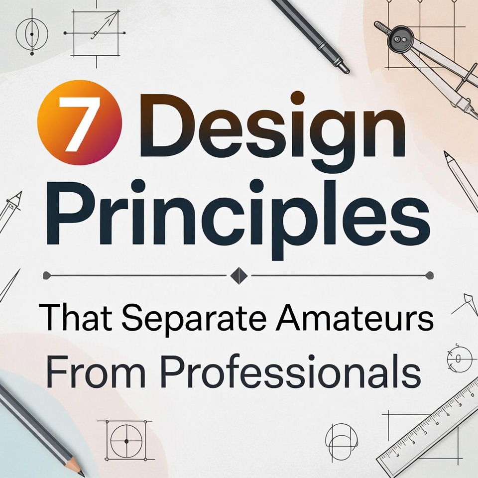
1. White Space Isn’t Wasted Space—It’s Your Secret Weapon
Amateurs fear empty space like nature abhors a vacuum. They fill every pixel, cram every corner, and wonder why their designs feel chaotic.
Professionals? They worship white space.
Also called negative space, this is the breathing room around and between design elements. It’s not lazy—it’s strategic. White space gives your eyes a place to rest, guides attention to what matters, and paradoxically makes your design feel more premium.
The Amateur Mistake: Treating white space as leftover area that needs filling.
The Professional Approach: Using white space deliberately to create hierarchy, improve readability, and establish visual flow.
Look at Apple’s website. Notice something? It’s mostly… empty. Yet it feels luxurious, not sparse. That’s white space working its magic.
Quick Win: In your next design, remove 30% of the elements. Yes, really. You’ll be amazed how much stronger it becomes.
2. Hierarchy Tells People Where to Look First (and Second, and Third)
Your design is having a conversation with viewers. Hierarchy is how you control that conversation.
Amateur designs scream everything at once—same size fonts, competing colors, no clear entry point. It’s visual noise. Professional designs whisper strategically, using size, color, contrast, and placement to guide the eye on a specific journey.
The Amateur Mistake: Making everything “important” (which makes nothing important).
The Professional Approach: Establishing clear levels of information—primary, secondary, tertiary—and designing accordingly.
Think about a concert poster. What should you see first? The band name. Then the date and venue. Then ticket info. A professional poster makes this sequence obvious through visual hierarchy.
Quick Win: Ask yourself: “What’s the ONE thing viewers should see first?” Make it 2-3x bigger or bolder than everything else.
Try out and download our best font for free 👀


3. Consistency Builds Trust (And Inconsistency Destroys It)
Here’s a truth bomb: your audience won’t consciously notice consistency, but they’ll definitely feel inconsistency.
Amateurs treat each design as a standalone project—different fonts here, different colors there, different button styles everywhere. Professionals build design systems where every piece feels like it belongs to the same family.
The Amateur Mistake: Choosing fonts and colors based on “what looks good right now.”
The Professional Approach: Creating and following brand guidelines—specific fonts, colors, spacing rules, and visual styles used everywhere.
Think of your favorite brand. McDonald’s. Nike. Spotify. You can spot their content from a mile away because they’re religiously consistent.
Quick Win: Limit yourself to two fonts (one for headings, one for body) and three colors. Use them everywhere. No exceptions for a month.
4. Contrast Creates Drama (Without Being Dramatic)
If everything in your design has the same visual weight, nothing stands out. It’s like a movie where every scene is a whisper—technically audible, but exhausting to watch.
Contrast is the difference between elements. Big vs. small. Bold vs. light. Dark vs. bright. Thick vs. thin. Amateurs use timid contrast. Professionals aren’t afraid to be bold.
The Amateur Mistake: Using similar sizes, weights, and colors for different types of information.
The Professional Approach: Amplifying differences to create visual interest and hierarchy.
Look at any professional poster. The title isn’t just slightly bigger than the body text—it’s dramatically bigger. That’s contrast doing its job.
Quick Win: Take your current design and increase the size difference between your largest and smallest text by 50%. Too much? Good. You’re getting closer.
5. Alignment Creates Order From Chaos
This one sounds boring. It’s not.
Alignment is the invisible grid that makes designs feel organized, intentional, and professional. Amateurs place elements randomly or “where they look good.” Professionals align everything to an invisible structure.
The Amateur Mistake: Centering everything or placing elements based on gut feeling.
The Professional Approach: Creating edge alignments and visual connections between elements—even across the page.
Every element in your design should visually connect to something else through alignment. When nothing lines up, your brain subconsciously registers chaos.
Quick Win: Draw imaginary vertical lines in your design. Does everything align to these lines? If not, start moving things until they do.
Side Note : Promote & earn with Letterhanna’s affiliate program.

6. Color Theory Isn’t Just for Artists
“I’m just going to pick colors I like” is the amateur’s anthem. And hey, personal preference matters. But professional designers understand color psychology, relationships, and hierarchy.
Colors communicate. Red creates urgency. Blue builds trust. Yellow demands attention. But beyond individual colors, professionals understand combinations—complementary, analogous, triadic—and use them intentionally.
The Amateur Mistake: Picking colors randomly or using every color they love.
The Professional Approach: Choosing a strategic color palette (usually 3-5 colors) with specific roles: primary, secondary, accent, neutral.
Netflix uses red for action and black for sophistication. That’s not random—that’s strategy.
Quick Win: Use a color palette generator (like Coolors or Adobe Color) and commit to one palette. Use your primary color for 60% of your design, secondary for 30%, and accent for 10%.
7. Typography Makes or Breaks Everything
You can nail every other principle, but if your typography is off, your design will still look amateur.
Here’s what professionals know: fonts have personalities. Comic Sans says “birthday party.” Helvetica says “clean and modern.” Times New Roman says “I didn’t think about fonts.”
Beyond font choice, professionals obsess over kerning (space between letters), leading (space between lines), and hierarchy (size and weight variations).
The Amateur Mistake: Using too many fonts, default spacing, or fonts that don’t match the message.
The Professional Approach: Choosing fonts strategically, adjusting spacing for readability, and creating typographic hierarchy.
The New York Times didn’t become iconic by accident. Their typography—from font choice to spacing—is meticulously crafted.
Quick Win: Increase your line spacing (leading) by 20%. Most amateur designs have text that’s too cramped. This one change dramatically improves readability.
The Bridge Between Amateur and Professional
Here’s what’s fascinating about these principles: none of them require expensive software or years of art school. They’re not secrets. They’re not even particularly difficult.
So why do they separate amateurs from professionals?
Because professionals apply them consistently, intentionally, and together.
One principle applied well improves your design. All seven applied together? That’s when magic happens. That’s when people stop scrolling. That’s when clients say “yes” without hesitation. That’s when your work stops looking like “pretty good for someone without training” and starts looking… professional.
Your Next Steps
Understanding these principles intellectually is step one. Applying them is step two. Internalizing them until they become second nature? That’s step three, and that’s where professionals live.
Start with one principle. Master it. Then add another. Within weeks, you’ll notice the difference in your work. Within months, others will too.
The gap between amateur and professional isn’t talent. It’s not expensive tools. It’s not even experience.
It’s knowledge of principles—and the discipline to apply them.
Now you have the knowledge. The rest is up to you.
#DesignPrinciples #GraphicDesign #DesignTips #UIDesign #VisualDesign #DesignTheory #TypographyDesign #ColorTheory #ProfessionalDesign #DesignEducation #CreativeDesign #DesignBasics #BrandDesign #WebDesign #DesignSkills #LearnDesign #DesignTutorial #DesignInspiration #DesignFundamentals #DesignerLife
Here Are Some Fonts You Might Love! 👀