Let’s face it: gone are the days when a logo lived only on a signboard, business card, and a fax cover sheet (RIP fax machines 🪦). Now, a logo has to show up on a smartwatch, website header, social media icon, app splash screen, car wrap, coffee cup… you get the idea.
Enter: adaptive logos—a modern, modular approach to logo design where your visual identity changes shape, but not its soul.
🧬 What Is an Adaptive Logo?
An adaptive logo is a visual identity system that includes multiple versions of the logo, each optimized for different contexts, while retaining consistent core elements.
It’s like a costume change, not a personality shift.
Key Versions You’ll Often See:
-
Primary logo – Full version with all components
-
Secondary logo – Slightly simplified (stacked, condensed, or horizontal)
-
Icon or logo mark – Just the symbol or monogram
-
Favicon – Super tiny version (e.g. 16×16 px)
-
Wordmark – Just the brand name, stylized
-
Responsive logo – Changes dynamically depending on screen size
🖼 Why Adaptive Logos Matter
📱 1. Multi-Device Compatibility
Your full logo might look great on a billboard—but shrink it to a phone screen? Suddenly, that elegant serif font turns into digital soup.
Adaptive logos make sure you always look crisp, clear, and confident—whether it’s 40ft wide or 40 pixels tall.
🔄 2. Flexibility for Marketing
From podcast thumbnails to product packaging to TikTok banners, brands now live in hundreds of contexts. A single static logo just can’t keep up.
Try out and download our best font for free 👀


🧠 3. Stronger Brand Recognition
When executed well, adaptive logos reinforce brand memory by showing consistency across varied contexts, not rigid sameness.
🌍 Famous Examples of Adaptive Logos
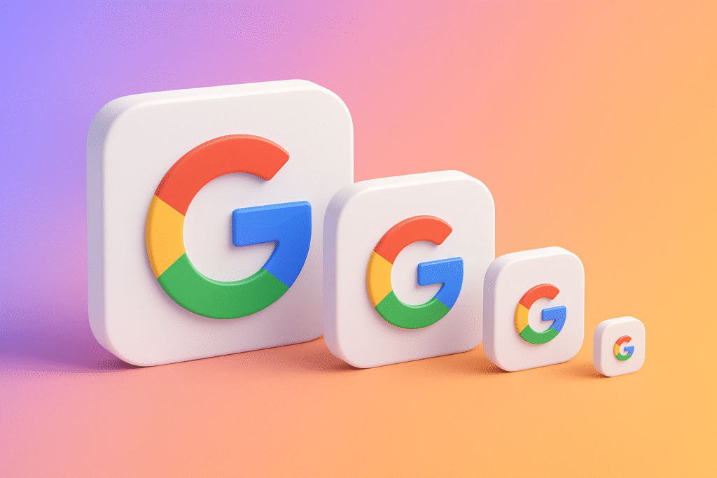
1. Google
Their famous multi-colored “G” icon is instantly recognizable—used as a favicon, app icon, and profile picture. It adapts beautifully across environments, yet still screams “Google.”
2. Spotify
Spotify uses its full logo when it needs gravitas (e.g., printed reports), but often switches to its three-wave icon on apps and ads. It’s fluid, responsive, and unmistakably Spotify.
3. Coca-Cola
They’ve created various lockups of their classic script wordmark—sometimes integrating it into the shape of a bottle, other times simplifying it to a swoosh-like curve.
🛠 How to Design an Adaptive Logo System
✍️ Step 1: Start with the Primary Logo
Make sure your full version includes all necessary elements—icon, logotype, tagline if needed. This is your foundation.
✂️ Step 2: Build Modular Versions
From the full logo, begin subtracting or rearranging elements while keeping the core DNA intact.
Side Note : Promote & earn with Letterhanna’s affiliate program.

Create:
-
Horizontal version
-
Vertical/stacked version
-
Standalone icon
-
Tiny size-friendly version (for 16×16 px use)
🎨 Step 3: Ensure Consistency
Use the same colors, spacing rules, and style across all versions. It’s okay to adapt layout—just don’t lose the brand’s voice.
📏 Step 4: Test at Different Sizes
Zoom it out. Shrink it to a favicon. Slap it on a mockup of an app icon. Your adaptive logo should perform like a champ under pressure.
💡 Adaptive ≠ Random
Let’s be clear: an adaptive logo doesn’t mean throwing different versions at the wall and seeing what sticks. It’s about creating intentional, cohesive variants that serve different needs.
Think of it like a jazz band. Each instrument plays its part, but they all follow the same rhythm.
🧠 Unique Fact of the Day:
The Whitney Museum’s “W” logo, designed by Experimental Jetset, is adaptive by design. The zigzag “W” literally stretches and shifts in form depending on the artwork it’s displayed with. It was one of the first major museum identities built on responsiveness as a concept, not just a tech need.
✍️ Design Mission: Create Your Own Adaptive Logo Set
Take a logo you’ve already created and build:
-
A primary version
-
A simplified icon
-
A wordmark-only version
-
A tiny-size favicon version
Put them into a slide deck or mockup. See how they play together. This is your logo orchestra. Conduct it with style.
Here Are Some Fonts You Might Love! 👀