Branding is what makes people recognize a soda can and instantly think Coca-Cola. It’s why you can spot an Apple product from a mile away, even with the logo covered. It’s not just about visuals—it’s about impressions.
So how do we, humble digital mortals, create branding that sticks like peanut butter in July? Let’s break it down.
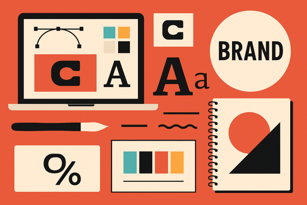
🧠 What Is a Brand, Really?
A brand isn’t just a logo. It’s the personality, values, voice, and vibe of a product, service, or company.
A brand includes:
-
Logo
-
Color palette
-
Typography
-
Voice & tone
-
Imagery style
-
Layout consistency
-
User experience
Think of it like a person: the logo is the face, the colors are their clothes, the tone is how they talk, and the experience is how they make you feel.
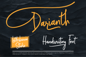
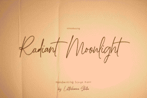
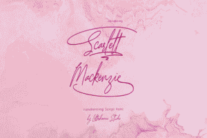
Try out and download our best font for free 👀


🧩 Why Branding Matters
-
Recognition: Strong branding makes you instantly identifiable.
-
Trust: Consistent design = professional = trustworthy.
-
Emotion: People connect with brands emotionally before logically.
-
Differentiation: It’s what sets you apart in a sea of sameness.
Bad branding? It’s like showing up to a job interview in pajamas. 🫠
🎨 Brand Elements in Design
Here’s what you’ll typically build as part of a visual identity:
1. Logo
-
Should be simple, memorable, and versatile.
-
You’ll need it in various formats: full-color, black & white, icon-only, etc.
-
Pro tip: Test it at very small sizes—if it turns into mush, simplify.
2. Color Palette
-
Most brands use 1–3 primary colors and a few accent or neutral tones.
-
Use color psychology: blue = trust, red = energy, green = calm, etc.
-
Tools like Coolors or Adobe Color can help you build a solid scheme.
3. Typography
-
Choose 1–2 fonts (max 3) that represent your vibe.
-
Serif for tradition. Sans-serif for modern. Display for flair. Script for elegance.
-
Consistency in sizes, spacing, and styles keeps everything unified.
4. Imagery Style
-
Decide on a style: photography, illustration, or a mix?
-
Set rules for filters, lighting, and composition.
-
Create a visual library or mood board to guide future projects.
5. Voice & Tone
-
Yes, even your text has a personality. Is your brand funny? Professional? Bold? Chill?
-
Voice stays consistent. Tone flexes depending on context (e.g., tweet vs. apology email).
🔧 Create a Brand Style Guide
This is your brand’s design bible. It outlines:
-
Logo usage rules (what NOT to do is just as important)
-
Color codes (HEX, RGB, CMYK)
-
Font choices (and when to use them)
-
Icon styles
-
Photography do’s and don’ts
-
Example layouts
You can DIY it with tools like Canva, Notion, Figma, or get super official with Adobe InDesign.
Side Note : Promote & earn with Letterhanna’s affiliate program.

🌐 Branding Across Platforms
Branding isn’t just for your website or packaging. It needs to show up everywhere:
-
Social media profiles
-
Email signatures
-
Ads
-
Presentations
-
Even your invoice design (yes, really)
Every touchpoint should feel like it’s coming from the same personality. If your website is minimal and sleek, but your social media is loud and chaotic—you’re sending mixed signals like a bad first date.
🧠 Unique Fact of the Day
The Nike Swoosh cost $35. That’s right. One of the most iconic logos in human history was designed by Carolyn Davidson in 1971 for a modest freelance fee. (Nike did eventually gift her stock… worth hundreds of thousands of dollars. Phew.)
Moral of the story: It’s not about how much something costs—it’s about how consistently and boldly it’s used.
Here Are Some Fonts You Might Love! 👀