🎨 Why Color Is a Big Freakin’ Deal
Imagine if McDonald’s used grey instead of red and yellow. Would kids still beg to go there? Would you even see it from the highway? Probably not.
Color isn’t just visual—it’s emotional. It’s a ninja sneaking into your subconscious, whispering things like “trust me,” “buy this,” or “this brand is eco-friendly, promise.”
In logo design, color choices aren’t random. They’re strategic decisions that support a brand’s personality, audience, and message.
Let’s decode the meaning behind common colors and see how brands wield them like psychological lightsabers.
🌈 The Color Breakdown
🔴 Red – Bold, Passionate, Urgent
Red is an attention magnet. It stirs up strong emotions—think love, danger, excitement, and appetite (yep, that’s why it’s everywhere in food branding).
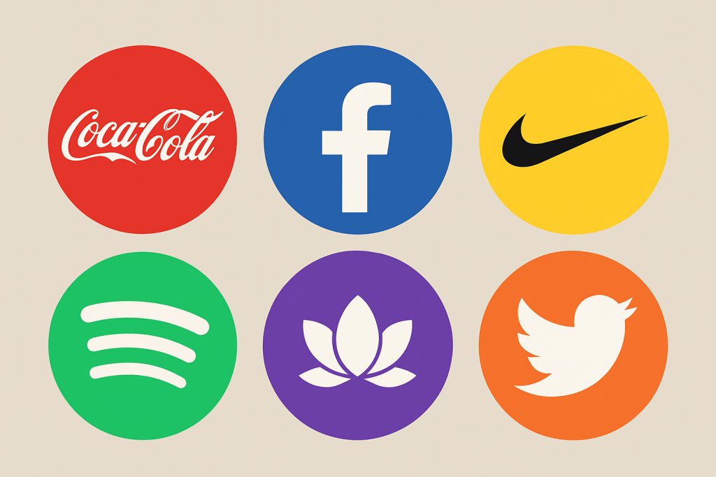
🧠 Used by: Coca-Cola, Netflix, YouTube, KFC
⚡ Use if: You want to spark energy, passion, or hunger. Avoid if your brand is about calm and serenity.
🔵 Blue – Trustworthy, Calm, Professional
Blue is the corporate crowd’s favorite child. It inspires trust, stability, and calmness. It’s like the dad of colors—dependable and always wears a polo shirt.
🧠 Used by: Facebook, Intel, PayPal, Ford
⚡ Use if: You want to communicate trust, technology, or healthcare values. But too much blue can feel cold or impersonal.
🟡 Yellow – Cheerful, Optimistic, Friendly
Yellow = sunshine in logo form. It grabs attention and feels warm, fun, and playful. It’s also highly visible from far away (hello, McDonald’s).
🧠 Used by: McDonald’s, Snapchat, Ikea
⚡ Use if: Your brand is youthful, friendly, and energetic. Just go easy—too much yellow can tire the eyes.
🟢 Green – Natural, Balanced, Fresh
Green whispers “I’m sustainable and maybe vegan.” It’s associated with nature, growth, health, and money.
🧠 Used by: Whole Foods, Spotify, Android
⚡ Use if: Your brand involves wellness, finance, or environmental focus. Green soothes and restores.
⚫ Black – Powerful, Sophisticated, Luxurious
Black is sleek, elegant, and serious. It’s often used in fashion and high-end brands. Think “I wear sunglasses at night” energy.
🧠 Used by: Chanel, Nike (paired with white), Apple (classic era)
⚡ Use if: You want to project authority, luxury, or minimalism.
Side Note : Promote & earn with Letterhanna’s affiliate program.

🟣 Purple – Creative, Royal, Mysterious
Purple combines the calm of blue and the fire of red. It suggests imagination, luxury, and the mystical. Ancient rulers literally hoarded purple dye—it was that rare.
🧠 Used by: Yahoo, Hallmark, Twitch, Cadbury
⚡ Use if: Your brand is whimsical, imaginative, or premium.
🧡 Orange – Energetic, Fun, Adventurous
Orange is the party animal of the palette. It’s bold but not aggressive, and it brings creativity and youthfulness.
🧠 Used by: Fanta, Nickelodeon, SoundCloud
⚡ Use if: You want a playful, bold look that’s less aggressive than red.
🎯 Strategic Color Combos
Many successful logos don’t stop at one color—they play with combinations that reflect layered meanings:
-
Red + Yellow: Speed and appetite (McDonald’s, Shell)
-
Blue + White: Clean trust (Oral-B, Ford)
-
Black + Gold: Premium luxury (Lamborghini)
-
Green + Blue: Nature and tech balance (Land Rover)
Color is like a recipe—get the proportions and pairings right, and it tastes (or looks) chef’s kiss.
⚖️ The “Don’ts” of Color in Logos
-
Don’t rely on color alone – Your logo should still work in black and white. Color enhances, but form is forever.
-
Don’t use too many colors – Keep it simple. Most top logos use 2 or fewer.
-
Don’t ignore cultural context – Red means luck in China, but danger elsewhere. Know your audience!
🧩 Unique Fact of the Day:
Cadbury purple is a trademarked color. That’s right—Pantone 2685C is legally off-limits unless you’re working with the chocolate royalty themselves. The company even fought Nestlé over it… and won. Talk about protecting your brand identity.
🖍️ Design Mission: Color Experimentation
-
Choose three brand adjectives (like elegant, bold, eco-friendly).
-
Use a color psychology guide (like this one!) to pick one main color and one accent.
-
Create a few logo variations using just shape and color—no text yet.
-
Convert your design to grayscale. Does it still feel “right”? If not, back to the drawing board!
Tools like Coolors.co or Adobe Color can help you experiment with palettes.
Here Are Some Fonts You Might Love! 👀