You might think you “just like blue.” But your brain has been tricked by decades of color psychology, cultural cues, and carefully constructed marketing. And now, you’ll learn to use that trickery for good (and excellent design).
🌈 What Is Color Theory, Exactly?
At its core, color theory is the study of how colors interact—with each other and with our emotions. It’s both art and science, helping you choose the right colors, combinations, and contrast to create meaning, mood, and magic.
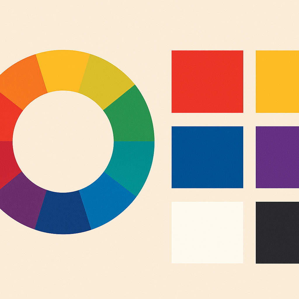
Let’s crack open the color wheel.
🎡 Meet the Color Wheel
It all starts here, a circle of hues organized by relationships:
-
Primary Colors: Red, Blue, Yellow
-
Secondary Colors: Orange, Green, Purple (made by mixing primaries)
-
Tertiary Colors: Mix a primary with a neighboring secondary (e.g., red-orange)
This wheel isn’t just pretty. It’s your map to color harmony.
🎨 Color Schemes 101: The Greatest Hits
1. Monochromatic
-
One hue, many shades/tints
-
Clean, minimal, calming
-
Easy to balance but can feel flat
2. Analogous
-
Colors next to each other on the wheel (like blue, teal, green)
-
Smooth and natural
-
Great for cohesive vibes
3. Complementary
-
Opposites attract (like blue + orange, red + green)
-
High contrast, energetic
-
Use one as dominant, the other as accent
4. Split-Complementary
-
A safer version of complementary: base + two adjacent to its opposite
-
Balanced yet vibrant
5. Triadic
-
Three colors evenly spaced on the wheel (like red, yellow, blue)
-
Dynamic, bold, fun
-
Needs careful balance
🔥 Hue, Saturation, and Brightness (HSB)
Understanding these three helps you control how a color feels:
Try out and download our best font for free 👀


-
Hue: The actual color (red, green, purple, etc.)
-
Saturation: Intensity (vibrant vs. muted)
-
Brightness: Lightness or darkness of the color
Change one, and you can make the same color feel soft and elegant—or loud and rebellious.
🧠 Color Psychology: Colors Have Feelings Too
Colors can subliminally influence how people feel about a design. Here’s a cheat sheet:
| Color | Feels Like | Common Uses |
|---|---|---|
| Red | Passion, urgency, power | Sales, food, alerts |
| Blue | Trust, calm, professionalism | Tech, finance, health |
| Yellow | Optimism, energy, caution | Warnings, kids’ products |
| Green | Nature, growth, wealth | Eco brands, finance |
| Purple | Luxury, mystery, spirituality | Beauty, high-end products |
| Black | Elegance, power, mystery | Fashion, luxury |
| White | Purity, minimalism, cleanliness | Health, design portfolios |
🚨 Warning: Color meaning varies culturally. In Western cultures, white = purity. In others, it might be associated with mourning.
🧪 Contrast & Accessibility
Good color design isn’t just about beauty—it’s about function. Poor contrast can make text unreadable or alienate people with visual impairments.
-
Use high contrast between text and background
-
Tools like WebAIM Contrast Checker help verify if your combos pass WCAG accessibility standards
Rule of thumb: If your grandma can’t read it comfortably on a dim phone screen, rethink it.
Side Note : Promote & earn with Letterhanna’s affiliate program.

🔧 Color in Action
Here’s how color shows up across design:
-
Logos: Should work in color and black/white
-
Websites: Use color for navigation, hierarchy, and emotion
-
Posters: Bold combos for grabbing attention fast
-
UI/UX: Use color to guide users and communicate feedback (e.g., red = error)
💡 Pro tip: Use color intentionally—not just because it looks cool. Every hue should serve a purpose.
🧠 Unique Fact of the Day
Blue was once considered evil in Ancient Rome. It was associated with barbarian tribes and frowned upon in elite circles. Fast forward a few centuries: now it’s the most trusted color in branding—used by Facebook, Twitter, PayPal, and every bank ever.
Also, Crayola has retired colors. Like “Dandelion” (RIP 2017), which had a good run before being booted for “Bluetiful.” Branding is serious business, even in crayon land.
🛠️ Tools to Help Your Color Game
-
Coolors.co – Instant palette generator
-
Adobe Color – Advanced harmonies with visual examples
-
Khroma – AI-based palette suggestions
-
Color Hunt – Curated trendy palettes
🚀 Today’s Challenge: Make a 3-Color Palette
Pick:
-
A dominant color – Your brand’s hero
-
A secondary color – To support or contrast
-
An accent color – For highlights or CTAs
Build a poster, a UI mockup, or just a sample layout with them. Then squint. If your eyeballs are still comfortable, you’re on the right path.
Here Are Some Fonts You Might Love! 👀