🎯 What Is Composition in Logo Design?
Composition is how the elements of your logo are arranged. It’s not just about placing stuff randomly and hoping it looks good (that’s how you get logos that look like ransom notes). It’s the intentional act of balancing visual weight, alignment, spacing, and flow to guide the viewer’s eye effortlessly.
Think of your logo as a well-choreographed dance—the shapes, letters, and icons all need to move together without stepping on each other’s toes.
⚖️ Types of Balance in Logo Design
1. Symmetrical Balance
This is when both sides of your logo are mirror images or evenly weighted. It feels stable, formal, and trustworthy.
🧠 Used by: McDonald’s, Mastercard, Toyota
🧩 Good for: Corporate, finance, heritage brands
🧘 It says: “We’ve got our stuff together.”
2. Asymmetrical Balance
Here, the elements are different, but still balanced by visual weight. It’s more dynamic and modern, creating tension and movement.
🧠 Used by: Nike, Adidas, Airbnb
🧩 Good for: Startups, lifestyle brands, tech
🧘 It says: “We’re flexible, innovative, and interesting.”
Try out and download our best font for free 👀


3. Radial Balance
Elements radiate outward from a central point. It’s less common but very powerful in the right context.
🧠 Used by: BP, Olympics
🧩 Good for: Institutions, global brands, events
🧘 It says: “We’re connected, inclusive, and centralized.”
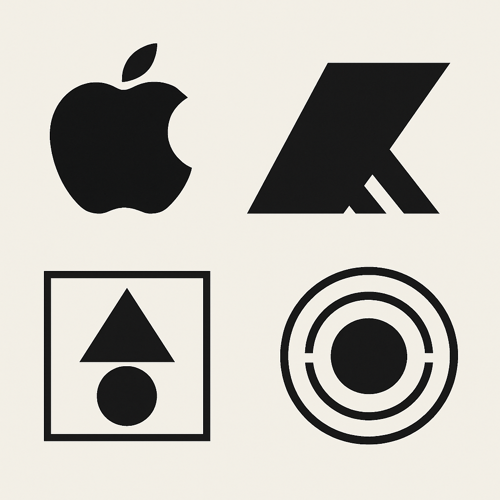
🧮 Key Composition Concepts
🔳 Visual Hierarchy
This is how you prioritize information. The most important parts (like your icon or brand name) should draw attention first.
👁️ Tip: Use size, contrast, and placement to guide the eye.
↔️ Spacing and White Space
Negative space isn’t “empty”—it’s breathing room. Too little space makes a logo feel cramped. Too much, and it drifts apart like a long-distance relationship.
Side Note : Promote & earn with Letterhanna’s affiliate program.

🧘 Tip: Make sure there’s enough space around and inside elements (like between letters).
🧲 Alignment
Elements should feel intentionally placed, not like you sneezed and everything landed somewhere.
-
Center-aligned = Balanced, formal
-
Left/right aligned = More editorial or directional
-
Off-center = Modern, creative, but tricky to get right
🧘 Tip: Use grids or guides during sketching and digital work.
🔄 Repetition and Rhythm
Repetition of shapes, colors, or angles can create cohesion. Rhythm in visual elements creates flow, guiding the viewer naturally.
🧘 Tip: Use repeating angles or curves to make everything feel like part of the same universe.
🧪 Examples in the Wild
Apple
Simple, centered, and balanced through negative space. Asymmetrical shape, but with weight balanced by the bite and stem.
Adidas
Three diagonal stripes? Asymmetrical balance + motion = bold and athletic.
WWF
Soft curves, central alignment, and loads of negative space around the panda = harmony + friendliness.
🧩 Unique Fact of the Day:
The Twitter logo is composed of 15 overlapping circles. That’s right—the bird isn’t just a bird. It’s a masterpiece of circular geometry and proportional balance, designed using the golden ratio. No wonder it feels so graceful in flight.
Here Are Some Fonts You Might Love! 👀