🔤 Why Start with ‘a’?
The letter ‘a’ is the first character in the Latin alphabet, but it didn’t begin that way. It’s one of the oldest and most consistently used letters in writing systems across centuries. It’s also the most frequently used vowel in the English language, making it an essential anchor point for any font designer.
📜 The History of ‘a’
The story of ‘a’ goes back thousands of years, beginning in Egyptian hieroglyphics and traveling through Phoenician, Greek, and Etruscan alphabets before becoming the Roman ‘A’ we know today.
-
Proto-Sinaitic Script (~1800 BCE): The ancestor of alphabetic writing, where ‘a’ likely began as a pictogram of an ox head, called “aleph”. If you squint at it sideways, you’ll see the horned animal. 🐂
-
Phoenician (1050 BCE): The letter became more abstract, resembling a rotated version of today’s ‘A’.
-
Greek (8th century BCE): Transformed into Alpha (Α), no longer just a soundless glottal stop but a full-fledged vowel.
-
Latin (3rd century BCE): The Romans adopted the Greek alpha, streamlined it, and gave us the capital A. Over time, the lowercase ‘a’ evolved as scribes needed faster handwriting techniques.
There are two lowercase ‘a’ forms in typography:
-
Double-storey ‘a’ – the more complex version you see in most serif and sans-serif fonts.
-
Single-storey ‘a’ – commonly found in handwriting and many script or rounded fonts.
Fun twist? They’re the same letter, but very different in structure and feel.
✒️ Anatomy of the Letter ‘a’
Let’s break down the parts of the double-storey lowercase ‘a’:
-
Bowl: The round enclosed shape.
-
Counter: The white space inside the bowl.
-
Stem: The vertical stroke at the left.
-
Terminal: The curved end on the upper right (sometimes a ball terminal).
-
Link: The little connector between the bowl and the upper part (or ear).
These components must be perfectly balanced to keep the letter legible and aesthetically pleasing.
The single-storey ‘a’, used often in calligraphy, consists of:
Try out and download our best font for free 👀


-
A circular bowl.
-
An upward-curved tail or stroke — elegant and minimalist.
🛠️ How to Design a Beautiful ‘a’
Designing a well-formed ‘a’ is a rite of passage for every aspiring type designer. It’s deceptively simple and absurdly complex. Here’s a step-by-step breakdown:
Step 1: Choose your style
-
Modern: Clean, geometric bowl, minimal contrast.
-
Humanist: Organic shapes with calligraphic influence.
-
Serif or Sans? Decide early—it affects terminals, proportions, and stroke contrast.
Step 2: Sketch the bowl
Start with a perfect circle, then refine it:
-
Pull slightly on the bottom right to counter visual weight.
-
Flatten the top slightly for readability.
Step 3: Add the stem
The left vertical stroke should anchor the letter, slightly thicker than the bowl.
Step 4: Balance the counter
Negative space matters just as much as positive form. The counter should feel airy but not hollow.
Step 5: Tweak the terminal
Whether it’s sharp, rounded, or has a serif, it must flow cleanly with the bowl.
Step 6: Spacing and context
Test your ‘a’ in pairs:
Side Note : Promote & earn with Letterhanna’s affiliate program.

-
“aa”
-
“ab”
-
“ra”
-
“am”
Seeing it in context helps you fine-tune kerning, weight, and rhythm.
🎨 Why Designers Obsess Over ‘a’
Some type designers spend days on the letter ‘a’ before moving on. Why? It sets the tone for the entire typeface.
-
In serif fonts, it defines the elegance and contrast.
-
In sans-serifs, it showcases geometric or grotesque tendencies.
-
In display fonts, the ‘a’ is often exaggerated or stylized as a signature element.
Designers often say: “If you can get the ‘a’ right, the rest of the typeface will follow.”
🤯 Unique Fact of the Day
The lowercase ‘a’ has starred in optical illusions! That’s right—when people are shown both the single-storey and double-storey forms and asked to draw an ‘a’ from memory, over 60% draw the wrong one. Most think we use the single-storey version more often (because of handwriting), but almost all printed text uses the double-storey form. Our brains trick us!
🧪 Try It Yourself!
Want to get hands-on? Open a sketchpad or font software and try:
-
Drawing both single-storey and double-storey ‘a’s.
-
Creating a custom ‘a’ with exaggerated features (elongated tail, high contrast, or asymmetry).
-
Comparing how different fonts treat ‘a’—look at Baskerville, Helvetica, Futura, and Comic Sans (if you dare).
Notice how the mood shifts completely?
🔮 Next Up: The Letter ‘b’
Tomorrow, we meet ‘a’s best friend — the letter ‘b’. We’ll talk vertical rhythm, stem-to-counter balance, and how it builds the backbone of a typeface’s character set.
Want an illustration of today’s star letter? I can generate one in a modern, scroll-stopping 3:2 image — just say the word!
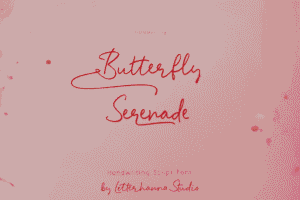
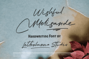
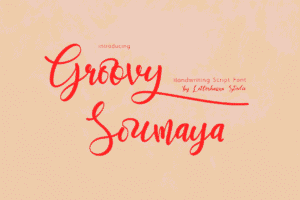
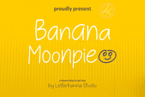
Here Are Some Fonts You Might Love! 👀