🔄 The Understated Performer
The lowercase ‘c’ is like that soft-spoken person in a room who says very little — but when they do, everyone listens. Open, airy, and subtle, it may seem simple at first glance. But in type design, the ‘c’ is deceptively complex. Its success depends entirely on curvature, balance, and precision. Think of it as the letterform equivalent of a perfectly measured espresso shot — tiny, but packed with character.
🕰️ A Quick Trip Through History
The letter ‘c’ traces its ancestry all the way back to Egyptian hieroglyphs that evolved into Phoenician “gimel”. Oddly enough, gimel originally represented a camel — yes, a literal camel. But bear with me.
-
Phoenician (1050 BCE): Gimel resembled a boomerang or staff — pretty abstract compared to today’s ‘c’.
-
Greek: The Greeks morphed gimel into Gamma (Γ). Still angular. Still no curve.
-
Etruscan and Latin: The Romans rounded out the hard angles, developing a character closer to the modern form — used for both the /k/ and /g/ sounds early on.
Eventually, the letter ‘g’ broke off to represent the voiced /g/ sound, and ‘c’ stuck to the /k/ and /s/ sounds, depending on the word. (Yes, that’s why “cat” and “cereal” both start with “c” but sound completely different.)
🧬 Anatomy of the Letter ‘c’
The letter ‘c’ is simple — but it’s the kind of simplicity that takes real skill to pull off.
-
Single Stroke: It’s a half-circle open on the right side.
-
No Stem, No Ascender: It stays within the x-height and baseline.
-
Open Counter: The key feature is its open space — too wide and it looks like a ‘u’ trying to escape. Too narrow and it becomes confused with ‘o’.
-
Terminal: The way the stroke ends — rounded, tapered, flat, or with a serif — drastically changes its tone.
🎨 Design Techniques for the Perfect ‘c’
Though it appears basic, designing a lowercase ‘c’ reveals the nuanced beauty of type. Let’s break it down.
Try out and download our best font for free 👀

1. Start with a Circle — then Betray It
Draw a perfect circle and then slice it open on the right. Now adjust the upper and lower ends so they don’t feel static or mechanical. A good ‘c’ curves like it’s alive, not like it’s doing geometry homework.
2. Apply Optical Corrections
-
The top terminal is usually a bit thinner and lighter than the bottom.
-
The overshoot at the top and bottom makes it appear balanced with other rounded letters like ‘o’.
3. Decide the Personality
-
Geometric ‘c’ (like in Futura): Perfectly round, symmetrical, a bit robotic.
-
Humanist ‘c’ (like in Garamond): More organic and calligraphic, with a soft taper.
-
Grotesque or Neo-grotesque ‘c’ (like in Helvetica): Subtle angle adjustments, more mechanical.
🧠 Pro Tip
The open space in a ‘c’ determines its tone. In display fonts, a wider aperture feels modern and spacious. In serif text fonts, a slightly closed aperture improves readability in small sizes.
Here’s a quick designer test: Place your ‘c’ next to ‘o’, ‘e’, and ‘r’. If it blends in smoothly, you’re on the right track. If it looks like the odd one out, time to go back to your bezier handles.
Side Note : Promote & earn with Letterhanna’s affiliate program.

🤯 Unique Fact of the Day
The letter ‘c’ is a shape-shifter in phonetics. It can take on three different sounds in English alone:
-
Hard /k/ as in “cat”
-
Soft /s/ as in “city”
-
Silent! (Hello, “muscle” 👋)
Its usage shifts across languages too. In Italian, it changes based on the vowel following it. In Turkish, the letter ‘c’ sounds like our English “j”. In other words — this little crescent moon of a character knows how to play the field.
💡 Creative Variants
-
In script fonts, ‘c’ can loop backward dramatically, as if doing a calligraphic twirl.
-
In ultra-modern sans-serifs, it’s reduced to a semi-circle with sharp edges — very sci-fi chic.
-
In experimental fonts, you might see the top and bottom terminals dramatically extended for flair.
Some logos use ‘c’ as a stylistic centerpiece — like Cisco, whose minimalism plays nicely with the openness of the letter.
🔮 Coming Tomorrow: The Letter ‘d’
Tomorrow we tackle the letter ‘d’ — a majestic ascender with a sturdy stem and generous bowl. It’s the letter that means business and brings balance to many a word. Get ready to explore its Roman roots, design challenges, and how it pairs so well with ‘a’ and ‘e’.
And yes, if you want a show-stopping thumbnail of the letter ‘c’ — curvy, sleek, and made for social — I can whip that up next!
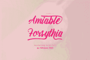
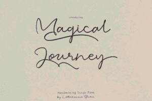
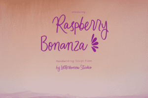
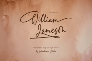
Here Are Some Fonts You Might Love! 👀