The lowercase g might just be the most enigmatic letter in the Latin alphabet. It’s elegant, it’s complicated, and — plot twist — it actually has two main typographic forms. If you’ve ever wondered why some fonts give you a looping beauty and others a simple tail, welcome to the curious, stylish world of the letter g.
History of the Letter ‘g’
Let’s rewind a couple of thousand years (because we love a good throwback).
-
The letter g finds its roots in the Phoenician letter gimel, which looked like a crooked camel’s neck — quite fitting, considering gimel meant “camel”.
-
The Greeks borrowed it as gamma (Γ, γ), and the Etruscans passed that to the Romans.
-
Here’s where it gets juicy: the Romans initially didn’t have a G! They used C for both the /k/ and /g/ sounds. Around the 3rd century BCE, a Roman named Spurius Carvilius Ruga (say that five times fast) decided enough was enough and added a small horizontal stroke to C to distinguish the voiced /g/. Boom — G was born.
By the time lowercase forms started developing in medieval manuscripts, g had begun its transformation into the complex beauty we know today.
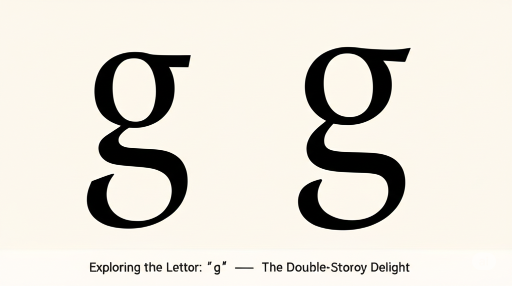
Single-Storey vs. Double-Storey ‘g’
Here’s where g starts showing off.
Try out and download our best font for free 👀


-
Single-storey ‘g’ (aka ‘opentail g’):
-
Looks like a circle with a tail.
-
Common in handwriting, and found in sans-serif typefaces (like Helvetica, Arial).
-
Simpler, easier to draw, more familiar for everyday writers.
-
-
Double-storey ‘g’ (aka ‘looptail g’):
-
The fancier cousin. Two closed bowls stacked vertically with a linking curve.
-
Common in serif fonts (like Times New Roman, Georgia).
-
Rarely written by hand — in fact, most people can’t draw it from memory. It’s the diva of the lowercase world.
-
This duality makes g incredibly unique — it’s the only letter with two entirely different typographic versions.
Anatomy of the Double-Storey ‘g’
If we were to break it down (and we will), the double-storey g has:
-
Upper bowl: The top circular enclosure.
-
Ear: A small stroke often sticking out to the upper right of the top bowl.
-
Link (or neck): The connecting curve between the two bowls.
-
Lower loop (or lower bowl): The rounded form at the bottom — often finishes with a closed loop, but some fonts have an open variant.
-
Terminal: The end of the loop or tail.
It’s essentially a typographic dance of curves, requiring precision and rhythm in its design.
Designing the Letter ‘g’
Designing g is not for the faint of heart. Here’s how it typically goes:
Side Note : Promote & earn with Letterhanna’s affiliate program.

-
Choose the style: Single-storey or double-storey? Your font’s personality will decide.
-
Sketch the primary bowl(s): Keep proportions consistent with other round characters like a, o, or d.
-
Work the link: In a double-storey, this connector must feel natural, not like a pretzel in crisis.
-
Tweak the ear: Optional but expressive — it gives your g a bit of flair.
-
Finalize the tail or loop: In opentail versions, the tail must feel balanced and not droop awkwardly. In looptail versions, the lower bowl needs to anchor the character gracefully.
And yes, spacing is crucial. The complex shape of the double-storey g can create awkward white space if not handled with care.
Unique Fact of the Day
💡 Most people can’t correctly draw the double-storey ‘g’ from memory.
In a study conducted by Johns Hopkins University, researchers found that only 1 out of 38 participants could accurately write a looptail g, despite reading it daily. This showcases how much of typography we see but don’t process consciously.
Typography: 1. Human memory: 0.
The letter g is a beautiful paradox. It’s simultaneously familiar and unfamiliar. Simple yet complex. It’s a designer’s challenge, a typographer’s delight, and a font nerd’s favorite conversation starter.
Here Are Some Fonts You Might Love! 👀