Flat design walked into the design world and politely removed all the skeuomorphic clutter from the table. Suddenly, buttons no longer needed to look like real buttons. Shadows? Gone. Wood textures and shiny plastic icons? Retired. Everything became… well, flat—and fantastically functional.
Let’s unfold the world of Flat Design, the UI darling that shaped a generation of web and app interfaces.
🔍 What is Flat Design?
Flat design is a visual style that emphasizes simplicity and two-dimensional elements. It strips away unnecessary decoration, mimicking neither physical objects nor realism. Instead, it focuses on usability through clean shapes, bold typography, and solid colors.
In short: Function meets minimal flair.
🧠 Why It Emerged
Back in the early 2010s, digital interfaces were cluttered with skeuomorphic design—an approach where digital elements mimicked real-world counterparts. Think: calculator apps that looked like actual calculators.
Try out and download our best font for free 👀


Then came a shift.
-
Apple’s iOS 7 redesign (2013) dropped skeuomorphism and embraced flat UI.
-
Microsoft’s Metro design language (Windows 8) had already paved the way with clean, grid-based design.
-
Google’s Material Design later evolved flat principles with a hint of depth and motion.
Flat design reflected the new digital era: fast, mobile, and clean.
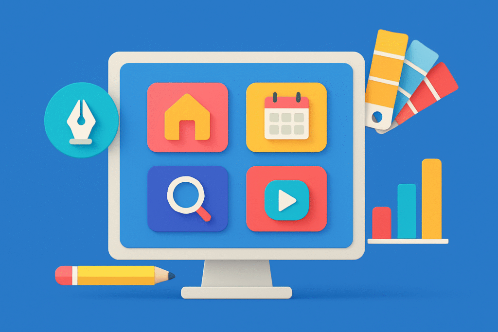
🎨 Key Features
-
Two-dimensional elements: No bevels, no embossing—just crisp lines and shapes.
-
Bold, solid colors: Flat design uses vibrant palettes for contrast and clarity.
-
Simple typography: Clean sans-serif fonts (think Roboto, Helvetica, Open Sans).
-
Minimal UI elements: Icons and buttons are stripped of gradients or shadows.
-
Grid-based layout: Consistency and structure are everything.
It’s all about intuitive clarity.
📈 Why It Became So Popular
-
Performance: Fewer visual elements = faster load times = happy users.
-
Scalability: Flat graphics work well across resolutions and screen sizes.
-
Mobile Friendliness: It’s easier to design clean, responsive layouts using flat principles.
-
Visual Clarity: Strong contrast and simplicity help users navigate with ease.
-
Aesthetic Trend: It just looked fresh and modern, especially after years of skeuomorphic overload.
🏆 Where You See It
-
App interfaces – WhatsApp, Instagram, and nearly every major app embraced flat or semi-flat design.
-
Modern websites – Especially SaaS platforms, educational sites, and corporate landing pages.
-
Infographics and dashboards – Where clean data visualization matters.
-
Logos and branding – Companies like Airbnb and Dropbox went flatter and cleaner with redesigns.
📚 Flat Design vs. Material Design
People often confuse the two. Here’s the difference:
Side Note : Promote & earn with Letterhanna’s affiliate program.

| Flat Design | Material Design |
|---|---|
| Completely 2D | Uses depth cues (like shadows) |
| Static and simple | Includes motion and interactive layers |
| Less stylized | More polished and “tactile” |
Material Design is like Flat Design’s more tech-savvy cousin with a bit more drama.
🚧 The Downside?
-
Over-simplicity: Flat design can become too abstract—users might not recognize interactive elements.
-
Lack of affordance: Without visual cues, it can be hard to tell what’s clickable.
-
Sameness: When overused, flat designs can look generic and lifeless.
The fix? Flat 2.0 or semi-flat design. A little depth and motion goes a long way.
📌 Unique Fact of the Day
The roots of flat design go back to the Swiss Style (aka International Typographic Style) from the 1950s, which favored clean layouts, sans-serif type, and grids. Flat design is its digital reincarnation, living its best life on the web.
🧪 Creative Challenge
Design a flat landing page for a fictional productivity app.
-
Use 3 bold colors
-
Include a clean hero illustration
-
Use a single sans-serif font
-
Minimal icons, no shadows, no gradients
Make it punchy, purposeful, and scroll-worthy.
Here Are Some Fonts You Might Love! 👀