Greeting cards are the pocket-sized canvases of the DIY world. They’re quick to make, easy to personalize, and ridiculously satisfying to hand out. And when you sprinkle in some clever typography? Chef’s kiss. Today we’ll explore how fonts, words, and layout can become the stars of your card-making game.
✨ Unique Fact of the Day:
Hallmark sells more than 6.5 billion greeting cards per year—but the most-shared cards on social media? Handmade ones with clever, bold typography. In other words: people still love a punny card with flair.
🎯 What You’ll Learn:
-
How to make bold typographic designs using stencils, stamps, or hand lettering.
-
How to incorporate puns and playful wording for next-level cuteness or snark.
-
Techniques for layering paper, using embossing tools, or adding dimension.
-
Font pairings and layout strategies that make words pop.
Whether it’s a birthday, a breakup (yes, even that), or a “just because,” today’s lesson ensures your message lands with style.
🧰 Supplies Checklist:
-
Blank cardstock or folded paper (A6 or A7 sizes are great)
-
Fine-liner pens or brush markers
-
Ruler and pencil
-
Letter stamps or alphabet stickers
-
Ink pads (in fun, non-sad colors)
-
Watercolors or colored pencils
-
Washi tape and/or ribbon
-
Embossing powder and heat gun (optional, for fancy folk)
-
Craft glue or double-sided tape
-
Scissors or craft knife
-
Optional: Printables of cute phrases or font templates
💌 Project 1: Minimalist Quote Card
Why:
Clean, minimal, elegant—this one’s for the font-nerds and less-is-more fans.
Try out and download our best font for free 👀


How:
-
Fold a white card in half.
-
Lightly pencil in your chosen quote (“You’re the serif to my sans” is a solid pick).
-
Use a fine liner or brush pen to ink it with style.
-
Add a subtle border or tiny hearts, stars, or dots for flair.
Typography tip: Use all caps in sans-serif for bold, modern looks. Script fonts add charm. Mix both? Now you’re a pro.
🧲 Project 2: Letter Stamp Magic
Why:
This gives your cards a typewriter-style, retro feel.
How:
-
Use alphabet stamps to spell out a message (test on scratch paper first!).
-
Ink each letter carefully, stamp slowly, and line things up with a ruler.
-
Layer with background paper, washi tape, or embossing for dimension.
Bonus idea: Use a gold ink pad on black paper for some dramatic drama. 💅
😂 Project 3: The Typographic Pun Card
Why:
Because everyone secretly loves a groan-worthy pun with nice handwriting.
Side Note : Promote & earn with Letterhanna’s affiliate program.

How:
-
Choose a punny phrase (try: “You light up my life” with a lightbulb illustration).
-
Sketch it out—make the text the hero, and add a small drawing if needed.
-
Outline with black pen, color it in, and embellish with stickers or sparkle.
Popular categories: food puns (“You’re one in a melon”), animal puns (“Paws-itively amazing”), and seasonal jokes (“Have an egg-cellent Easter”).
💥 Advanced Option: Heat Embossed Typography
For that professional finish that feels store-bought but better.
How:
-
Use a clear ink pen or stamp to write your message.
-
Sprinkle embossing powder over the ink while it’s still wet.
-
Shake off the excess, then heat it with a heat gun until it melts and shines.
Great for special occasions or just flexing your fancy supplies.
🧠 Typography Tips for Card Design:
-
Hierarchy wins hearts: Emphasize the most important word.
-
Balance is everything: Don’t crowd your card—white space is chic.
-
Try faux calligraphy: Draw a script font in pencil, then trace with ink, thickening downstrokes.
-
Use font pairings like a designer: Serif + script, sans-serif + blocky bolds—it’s a party.
🚀 Pro Move: Make a Batch!
Once you’ve designed a layout you love, make 5-10 cards with slight variations. You’ll be glad to have them on hand when inspiration (or birthdays) strike without warning.
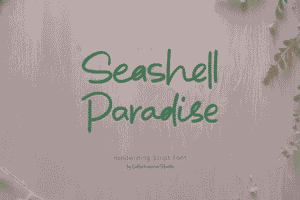
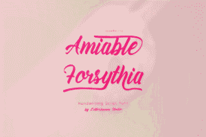
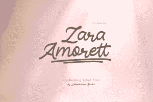
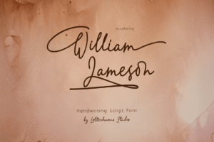
Here Are Some Fonts You Might Love! 👀