If typography is the voice of design, then layout and composition are the stage directions. They’re what keep your design from looking like a garage sale flyer from 1998.
Today we’re learning how to arrange all the moving parts—text, images, space—into a harmonious whole that says, “This was totally on purpose.”
🧱 What Is Layout & Composition?
Layout is how elements are arranged on a page or screen. Composition is the art behind that arrangement—how it feels, how it flows, and how it communicates.
Think of layout as architecture and composition as interior design. They work hand in hand. A great design layout:
-
Guides the eye smoothly
-
Highlights the key message
-
Feels balanced and cohesive
-
Gives everything room to breathe (R.I.P. clutter)
🔑 The 8 Core Principles of Composition
Let’s break down the key ingredients of a killer layout. Master these, and your work will start looking like you actually know what you’re doing—even if you’re winging it.
1. Alignment
Everything should line up—either along an edge or an invisible axis. When elements feel connected, your design looks more professional and polished.
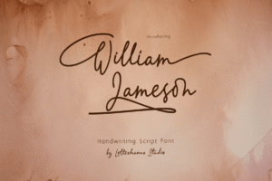
Try out and download our best font for free 👀


2. Hierarchy
Size, weight, color, and placement all help signal what’s most important. If everything is yelling, nothing gets heard.
3. Contrast
Opposites attract. Contrast helps differentiate elements and creates visual interest. Think bold vs. light, dark vs. bright, big vs. small.
4. Repetition
Repeat visual styles (colors, shapes, font styles) to create consistency. Repetition = rhythm = flow.
5. Proximity
Group related elements close together. It tells the viewer, “Hey, these things belong in the same box of thought.”
6. Balance
Symmetrical balance feels formal. Asymmetrical feels dynamic. Both are valid—pick based on the emotion you want to evoke.
7. White Space (Negative Space)
Don’t fear the void! Space between elements improves clarity, focus, and sophistication. Designers worship at the altar of white space. Join the cult.
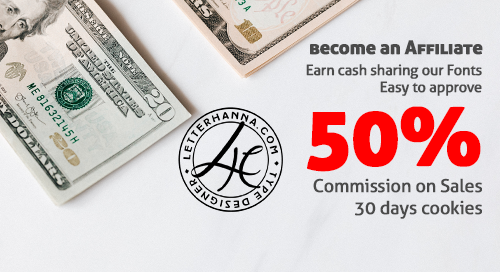
Side Note : Promote & earn with Letterhanna’s affiliate program.
8. Rule of Thirds
Divide your canvas into a 3×3 grid. Place key elements along these lines or intersections for natural, pleasing compositions (photographers swear by this too).
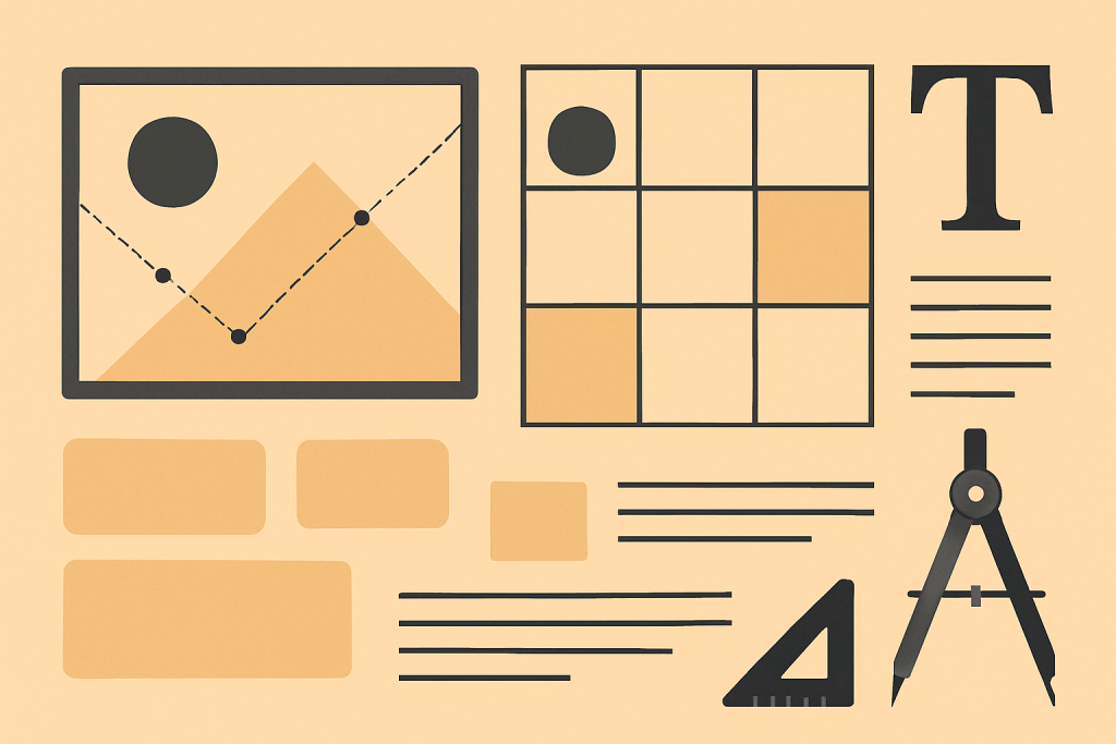
📐 Grids: The Skeleton of Design
A grid is a system of horizontal and vertical lines used to organize content. Think of it like scaffolding—essential, but invisible in the final product.
Types of grids:
-
Manuscript Grid: Great for blocks of text (books, articles)
-
Column Grid: Common in magazines, websites
-
Modular Grid: Grids within grids—super structured, great for complex content
-
Hierarchical Grid: More freeform, content-driven structure
🎯 Pro Tip: Use the 12-column grid for responsive web design—it’s the industry gold standard.
🎨 Composition in Action: Layout Examples
Let’s visualize some common design layouts:
-
Z-Pattern Layout: Eye moves in a Z shape (great for posters and web headers)
-
F-Pattern Layout: Eye scans top and left edges (works well for text-heavy pages)
-
Centered Layout: Symmetrical, formal, great for invitations or minimal designs
-
Asymmetrical Layout: Deliberately off-balance for energy and edge
🚫 Common Layout Mistakes (Avoid Like Expired Milk)
-
Cramped margins (let your design breathe)
-
Center-aligning everything (lazy symmetry is a crime)
-
Lack of visual hierarchy (don’t make your viewers guess)
-
Ignoring white space (more is more here)
-
Floating elements with no visual anchors
🧠 Unique Fact of the Day
Swiss design (a.k.a. the International Typographic Style) in the 1950s revolutionized layout thinking with grid systems and sans-serif typography. It gave birth to the clean, minimalist styles we see everywhere from Apple’s interface to modern art posters.
Fun twist: It came from a country that has four national languages—proof that clarity in visual communication transcends spoken words.
Here Are Some Fonts You Might Love! 👀