Sometimes, less really is more.
When your brand name is long (looking at you, International Bureau of Long-Windedness), a full wordmark just isn’t practical. Enter: the Lettermark—a clean, compact, and confident way to showcase identity using just initials.
🔠 What is a Lettermark?
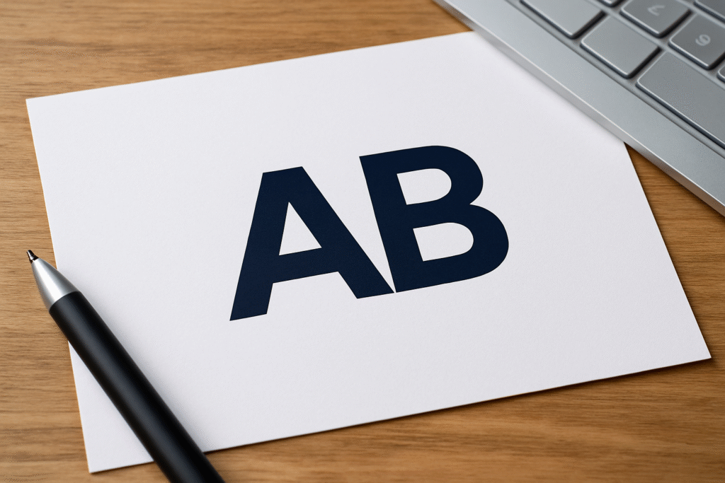
A lettermark is a logo built solely from the initials of a brand name. No icons. No illustrations. Just a few carefully crafted letters acting as the entire visual identity.
Think:
-
IBM (International Business Machines)
-
CNN (Cable News Network)
-
NASA (National Aeronautics and Space Administration)
-
HBO (Home Box Office)
These brands took long, formal names and distilled them into something punchy, iconic, and easy to remember.
🧩 When to Use a Lettermark
Lettermarks are ideal for brands that:
-
Have long or complex names
-
Want a modern, minimalist look
-
Need a logo that scales easily and remains readable
-
Rely heavily on typographic identity (think law firms, agencies, fashion houses)
You’re using visual simplicity to create verbal clarity.
✍️ Designing a Killer Lettermark
It might look simple, but crafting a good lettermark takes nuance. Here’s your cheat sheet:
Try out and download our best font for free 👀


1. Choose the Right Typeface
-
Serif = authority, class (great for law firms, finance)
-
Sans-serif = clean, modern (great for tech, startups)
-
Script = elegant, high-end (great for luxury, fashion)
2. Pay Attention to Spacing
The fewer the letters, the more every curve and corner matters. Kerning is king.
3. Play with Customization
Lettermarks often involve modified characters, ligatures, or unique connections between letters.
4. Keep It Bold (Sometimes Literally)
Thin, light fonts can disappear in small sizes. Test it at both favicon scale and billboard size.
🧠 Smart Branding with Initials
A lettermark doesn’t have to be cold. Done right, it can still:
-
Suggest movement
-
Convey elegance
-
Build personality
Take LV (Louis Vuitton). Those two little letters exude heritage and prestige—all without a full name in sight.
Side Note : Promote & earn with Letterhanna’s affiliate program.

🧠 BONUS: Hybrid Approach
Some brands start with full wordmarks and later transition into lettermarks once they gain recognition. This is a smart branding evolution strategy.
Example:
-
Pinterest uses its full name as a wordmark.
-
Later on? Just the “P” on the app icon.
⚠️ Common Mistakes
🚫 Generic Fonts – A plain Arial “HK” is not a logo. It’s a homework header.
🚫 Poor Scalability – Lettermarks must shine at all sizes, especially tiny.
🚫 No Brand Voice – A lettermark should still feel like your brand, even without extra elements.
🧠 Unique Fact of the Day
IBM’s lettermark logo was designed by legendary designer Paul Rand in 1972. The horizontal stripes weren’t just stylish—they suggested speed and dynamism, modernizing a tech giant without losing its serious tone.
(Aka: it said “we’re fast and futuristic—but still wearing suits.”)
🧾 Key Takeaway
Lettermarks are the sharp dressers of the logo world—clean, confident, and quietly powerful. When your name is long but your style is sleek, go for initials that speak volumes.
Here Are Some Fonts You Might Love! 👀


