Redesigning a logo isn’t just giving it a fresh coat of paint. It’s a strategic decision that can make your brand feel more relevant—or completely alienate your audience if you’re not careful. Yep, it’s a delicate dance between innovation and identity.
Let’s break down the why, the when, and the how of logo redesigns that don’t cause PR disasters.
🧭 Why Brands Redesign Their Logos
There are several legitimate reasons to rethink your visual identity. Here are the biggies:
1. Outdated Design
Your logo looks like it came out of a 90s clipart collection. Enough said.
2. Brand Evolution
The business has grown or shifted focus, and the original logo no longer reflects its mission.
3. New Audience
Maybe you’re targeting a younger crowd, going global, or entering a new market. Your logo needs to speak their language.
4. Digital Optimization
Logos made for print don’t always work on digital platforms, mobile apps, or tiny favicons.
Try out and download our best font for free 👀


5. Reputation Reset
If a brand has had some rocky PR history, a redesign can signal a new beginning (but it better be backed up by real change).
🔁 Evolution vs. Revolution
Here’s the million-dollar question:
Do you tweak the current logo (evolution) or scrap it entirely and start over (revolution)?
🧬 Evolution (Subtle Changes)
Pros:
-
Maintains brand recognition
-
Feels familiar and safe
-
Ideal for long-established brands
Cons:
-
May feel underwhelming if too subtle
🔧 Examples:
-
Google’s transition from serif to sans-serif
-
Pepsi’s many gentle curves through the years
⚡️ Revolution (Complete Overhaul)
Pros:
-
Makes a bold statement
-
Perfect for repositioning or relaunching
Cons:
Side Note : Promote & earn with Letterhanna’s affiliate program.

-
Risks alienating loyal users
-
Takes more time and money to roll out
🔧 Examples:
-
Airbnb’s transformation from “dull blue tech” to its modern abstract “Bélo”
-
Instagram’s leap from skeuomorphic camera to gradient minimalism
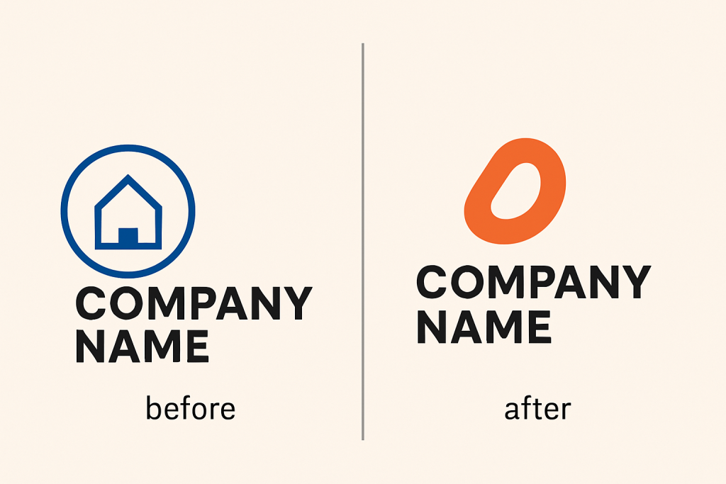
🚨 Redesign Disasters to Avoid
❌ Ignoring Brand Equity
If your old logo is beloved, don’t toss it like last season’s trend. Build on its legacy.
❌ Losing Distinctiveness
Generic “modern” logos often look the same—don’t let your brand get lost in a sea of sanitized sans-serifs.
❌ Going Trend-Only
Trendy fades. Functional lasts. Don’t sacrifice usability for what’s hot this month.
❌ Not Testing
A/B test new versions with different audiences. What you think is clever may just confuse the public.
🛠 The Redesign Process (Without the Headaches)
-
Start with Brand Strategy
Why are you redesigning? What’s changed about your mission, tone, or market? -
Audit Your Current Logo
What works? What doesn’t? What elements have equity? -
Sketch Multiple Directions
Explore evolutionary and revolutionary routes side-by-side. -
Test with Real People
Employees, customers, and a few design-minded friends (not just your cat). -
Refine, Iterate, Simplify
Good logos are rarely made in one go. Polish it. -
Roll Out Strategically
Update all your touchpoints: website, packaging, socials, signage. Consistency is key.
💡 Unique Fact of the Day:
The Gap logo redesign of 2010 lasted… wait for it… six days. That’s right. The new logo was so universally hated that public backlash forced them to revert to the original almost immediately. The lesson? Never underestimate the emotional bond people have with a brand’s logo.
✍️ Design Mission: Redesign Exercise
Pick a well-known logo (Starbucks, Uber, Twitter, etc.), and try:
-
A subtle evolution – Keep its soul, modernize the lines, maybe tweak colors or font.
-
A radical redesign – Reimagine it entirely from scratch as if it were a brand-new company.
Then compare:
-
Which design communicates the brand values best?
-
Which feels fresh but familiar?
-
Which could spark a Twitter war? 😅
Here Are Some Fonts You Might Love! 👀