🔺 Why Shapes Matter More Than You Think
Ever wonder why some logos feel powerful while others feel soft or stable? It’s not a coincidence—it’s shape psychology in action.
Shapes in logo design aren’t just about aesthetics. They influence how we perceive a brand, even before reading the name. The human brain associates geometry with emotion—so your logo’s form can instantly communicate ideas like trust, innovation, or fun.
Let’s decode the shapes hiding in plain sight.
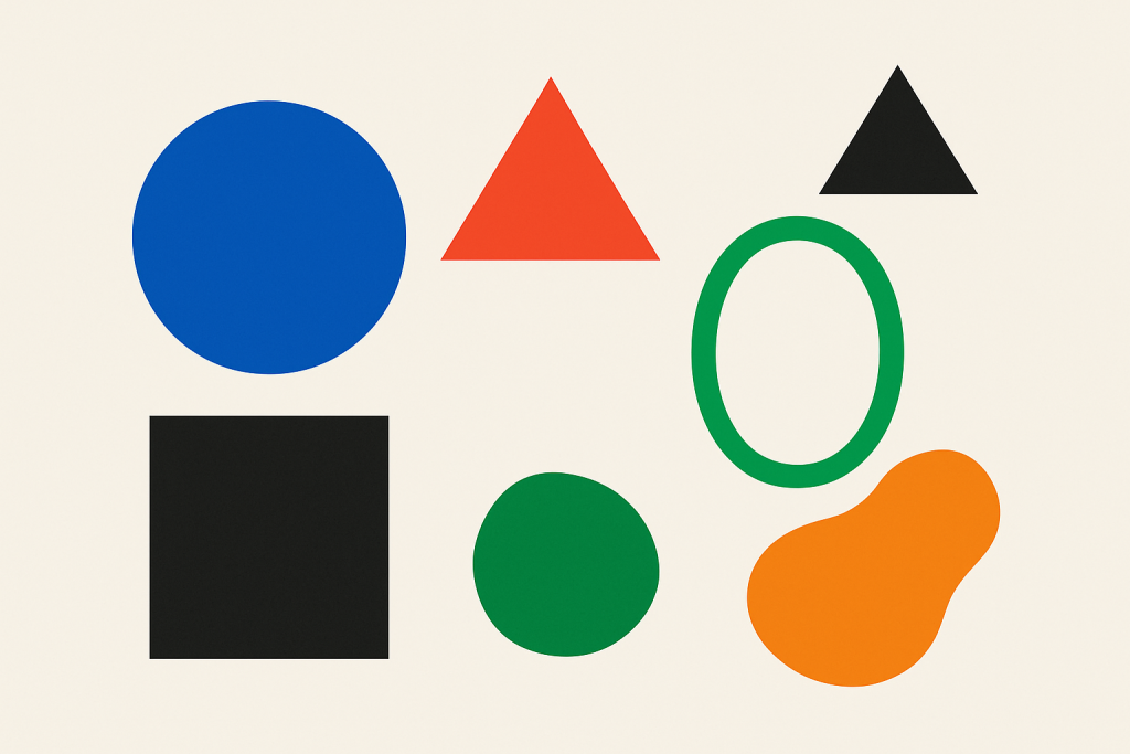
🔵 Circles, Ovals & Ellipses
Circles are friendly, inclusive, and unifying. They represent wholeness, community, and continuity.
🧠 Associations: Unity, protection, infinity, harmony
🧪 Used by: Pepsi, BMW, Spotify, Olympic Rings
✨ Why it works: Circles have no beginning or end—making them feel stable and complete. Ovals often give off a futuristic or techy vibe.
🟦 Squares & Rectangles
These shapes are solid, stable, and grounded. Think of them like the reliable best friend of design.
Try out and download our best font for free 👀


🧠 Associations: Trust, strength, logic, security
🧪 Used by: Microsoft, American Express, BBC
✨ Why it works: They represent reliability and professionalism. Rounded rectangles (like the Netflix app icon) soften this effect while staying dependable.
🔺 Triangles
Now we’re getting edgy—literally. Triangles are directional, dynamic, and full of tension. They often symbolize progress, movement, or even danger depending on how they’re oriented.
🧠 Associations: Direction, energy, conflict, hierarchy
🧪 Used by: Adidas (pointing up), Google Drive, Delta Airlines
✨ Why it works: A triangle can represent growth, strength, or movement upward. But flip it upside down, and it can feel unstable or rebellious.
💫 Organic & Abstract Shapes
Not every logo sticks to perfect geometry. Abstract or freeform shapes can evoke creativity, emotion, and uniqueness. Think of the blob-like Airbnb symbol or the dynamic Nike swoosh.
Side Note : Promote & earn with Letterhanna’s affiliate program.

🧠 Associations: Innovation, creativity, personality
🧪 Used by: Nike, Airbnb, BP
✨ Why it works: These shapes break the mold, literally. They give brands the freedom to express something more artistic or abstract.
🖼 Negative Space
Let’s not forget the invisible shapes—the ones that appear between or around elements. Designers love sneaking surprises into negative space:
-
FedEx: Hidden arrow
-
Toblerone: A bear in the mountain
-
WWF: The panda’s eye patches create the illusion of depth
✨ Clever use of negative space can make your logo feel sophisticated and memorable.
🤹♀️ Combining Shapes for Deeper Meaning
Logos often blend multiple shapes to create emotional complexity:
-
Circle + Triangle: Unity + Motion (Spotify’s play button)
-
Rectangle + Abstract: Stability + Creativity (Google’s evolving logo)
-
Symmetry + Asymmetry: Balance vs. energy
Shape combinations can build stories within your logo, even if people only feel them subconsciously.
🧩 Unique Fact of the Day:
Adidas’ triangle-shaped “mountain” logo symbolizes the challenges athletes overcome. It’s not just a sharp shape—it’s a metaphor for persistence and personal growth. So yeah, it’s basically your motivational poster in geometric form.
✍️ Design Mission: Shape Exploration
Time to play some creative Tetris:
-
Choose three shapes: one circle-based, one triangle-based, one square-based.
-
Sketch your logo idea using only one shape family at a time.
-
Add small variations (like curves or corners) to see how it affects the feeling.
-
Ask yourself: which version feels most like your brand’s personality?
Here Are Some Fonts You Might Love! 👀