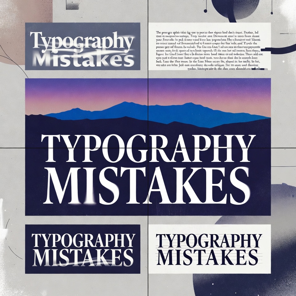
That Comic Sans menu at the upscale restaurant. The unreadable script on the medical website. The wall of text that makes eyes glaze over instantly.
Every designer has seen them. Typography mistakes so painful they make professionals wince. Yet these errors appear everywhere—on websites, business cards, presentations, and marketing materials—quietly destroying credibility and driving audiences away.
Here’s the uncomfortable truth: beautiful images and clever layouts mean nothing when the typography fails. Readers spend 80% of their time looking at text, not graphics. Get the typography wrong, and the entire design collapses.
The Silent Design Killer Nobody Talks About
Picture this: A startup spends $10,000 on a stunning website redesign. The photography is gorgeous. The color palette is sophisticated. But within seconds, visitors leave. Why? The body text uses a decorative font at 11 pixels. Nobody can read it comfortably.
This scenario plays out thousands of times daily. Businesses invest in design while overlooking the foundation—typography basics that separate amateur work from professional excellence.
The good news? Most typography errors follow predictable patterns. Fix these fundamental mistakes, and designs transform overnight.
Font Selection Gone Wrong: The Usual Suspects
The Display Font Disaster
Decorative fonts seduce designers with their personality. Brush scripts. Elaborate serifs. Neon-inspired display faces. They look fantastic in headlines—their intended purpose. But then comes the catastrophic error: using them for body text.
The reality check: Display fonts are designed for short bursts at large sizes. Force them into paragraphs, and readability plummets. Eyes strain. Comprehension drops. Visitors bounce.
A wellness blog once used an elegant script font for all article text. Traffic analytics revealed the average time on page: 12 seconds. After switching to a clean sans-serif, engagement time jumped to 4 minutes. Same content. Different typeface design.
The “More Fonts = More Personality” Fallacy
Five different fonts on one page. Each section gets a unique typeface. Headlines in one style, subheads in another, body text in a third, captions in a fourth, quotes in a fifth.
This isn’t personality. It’s chaos.
Typography rules for font mixing: Limit designs to 2-3 font families maximum. One for headlines, one for body text, occasionally one for accents. That’s it. This constraint doesn’t limit creativity—it channels it.
Professional designers master font pairing by understanding contrast and harmony. A bold geometric sans-serif headline paired with a traditional serif body creates visual interest without confusion. But mixing five trendy fonts creates a ransom note aesthetic.
The Trending Font Trap
Every year brings font trends. Variable fonts. Retro revivals. Brutalist typography. Designers rush to adopt them, swapping timeless choices for whatever’s hot on design blogs.
The problem? Trends fade. That edgy font dominating designs in 2023 looks dated by 2025. Worse, trending fonts often prioritize style over function—exactly backward for most design projects.
Smart font choices balance personality with longevity. A restaurant might use a trendy display font for its logo but pair it with classic body fonts for the menu. The brand stays current without sacrificing readability or requiring constant redesigns.
Spacing Sins That Sabotage Beautiful Designs
The Cramped Text Nightmare
Nothing screams amateur louder than text squashed together like sardines in a can. Line height (leading) too tight. Letter spacing (tracking) compressed. Word spacing inconsistent.
Try out and download our best font for free 👀


Proper text design requires breathing room. The general guideline: line height should be 1.5 to 1.7 times the font size for body text. Seems excessive? That space improves reading speed by up to 20%.
A financial services company once increased line spacing on their website from 1.2 to 1.6. Customer service calls about “confusing” content dropped by 30%. The information didn’t change—just the typography tips applied to make it readable.
The Alignment Anarchy
Left-aligned text. Center-aligned paragraphs. Right-aligned sections. Justified blocks creating random spacing gaps—all on the same page.
The principle: Consistency in alignment creates visual flow. Body text almost always works best left-aligned for Western languages. It creates a clean left edge that guides the eye down the page. Centered paragraphs work for invitations and poetry, rarely for articles or business content.
Justified text seems professional but creates problems. Without proper hyphenation and spacing controls (features many design tools lack), justified paragraphs develop “rivers” of white space that disrupt reading flow.
The Scale Catastrophe
Headlines barely larger than body text. Subheads the same size as captions. No clear hierarchy.
Effective typography creates a visual roadmap. Readers should instantly distinguish primary headlines, secondary subheads, body text, and supporting elements. This hierarchy isn’t just aesthetic—it’s functional. People scan before reading, and clear scale differences guide that scanning process.
Typography basics for scale: If body text is 16px, headlines should be at least 32px (2:1 ratio). Subheads might be 24px. This creates distinct levels that organize information visually.
Color Contrast: The Invisible Barrier
Gray text on gray backgrounds. Yellow on white. Dark blue on black. These color combinations might look sophisticated in theory but fail in practice.
Web accessibility standards require a 4.5:1 contrast ratio for normal text. This isn’t arbitrary—it ensures readability for people with visual impairments and anyone viewing content in bright light or on lower-quality screens.
An e-commerce site using light gray text (#999999) on white backgrounds saw conversion rates jump 18% after switching to darker gray (#333333). The design looked virtually identical. The readability difference was enormous.
Some designers avoid pure black (#000000) on pure white (#FFFFFF), claiming it’s too harsh. Fair enough. But #333333 on #FFFFFF provides excellent readability while maintaining that softer aesthetic. The key is maintaining sufficient contrast, not necessarily using absolute black.
Width and Line Length Lettering Mistakes
The academic research paper spanning the full width of a widescreen monitor. Lines stretching 200+ characters. Readers losing their place mid-sentence.
Optimal line length: 50-75 characters (including spaces). This range allows comfortable eye movement without excessive head turning or frequent line breaks. Go shorter for mobile devices, but never much longer for any screen size.
Newspapers figured this out centuries ago. Their narrow columns aren’t just about fitting multiple stories—they’re about comfortable reading. Digital designers often forget this lesson, letting text sprawl across massive screen widths.
A content platform redesigned their article template, constraining line width to 680 pixels maximum. Average article completion rates increased by 28%. Readers weren’t abandoning because the content was bad—they were leaving because reading was uncomfortable.
Side Note : Promote & earn with Letterhanna’s affiliate program.

All Caps: When SHOUTING Backfires
Headlines in all caps. Entire paragraphs capitalized for “emphasis.” Somehow, the message feels less impactful, not more.
The readability research is clear: All caps text reads 13-20% slower than standard sentence case. Why? Lowercase letters have distinct shapes (ascenders and descenders) that aid recognition. Capitalize everything, and words become rectangular blocks that the brain processes less efficiently.
All caps work for short labels, acronyms, and occasional emphasis. Used extensively, they’re design errors that reduce comprehension and give content an aggressive, dated feel.
The Font Weight Imbalance
Entire websites using only one weight—usually regular. No bold for emphasis. No light for subtle contrast. Monotonous typography that fails to guide attention.
Modern font families often include 6-9 weights (thin, light, regular, medium, semi-bold, bold, extra-bold, black). This variety exists for a reason: creating emphasis and hierarchy without changing font families.
Strategic weight variation improves scannability. Bold subheads stand out. Regular body text reads comfortably. Light text can work for less critical information (though never sacrifice readability for style).
A healthcare website used font weight to distinguish primary information (semi-bold) from optional details (regular). Patient comprehension scores improved, and customer service inquiries about instructions decreased significantly.
Mobile Typography: The Forgotten Priority
Typography that looks perfect on a 27-inch desktop monitor but becomes unreadable on a smartphone. Font sizes too small. Line spacing too tight. Paragraphs too long.
Mobile typography requires adjustments: Minimum 16px font size for body text (14px forces pinch-zooming on many devices). Slightly tighter line heights work better on narrow screens. Shorter paragraphs prevent endless scrolling through single thoughts.
The responsive design approach means testing typography at multiple screen sizes, not just scaling everything proportionally. What’s readable at desktop size might need distinct styling on mobile.
Fixing the Foundation: Typography Tips That Transform Designs
Start with readability, add personality second. The most beautiful font means nothing if people can’t comfortably read the content. Choose legible typefaces for body text. Save decorative choices for headlines and accents where they can shine without harming function.
Embrace constraints. The “less is more” principle applies powerfully to typography. Two well-chosen fonts, used consistently with clear hierarchy, outperform six fonts competing for attention.
Test with real content. Lorem ipsum hides problems. Test typography choices with actual text in the actual context. Does that elegant thin font still work in a full paragraph? Is the script heading readable at smaller sizes? Real content reveals real issues.
Consider the audience. Typography for children’s content differs from designs targeting seniors. B2B professional services need different approaches than lifestyle brands. Context matters.
Respect the basics before breaking rules. Every typography rule can be broken—by designers who understand why the rule exists. Learn the fundamentals first. Then experiment strategically.
The Typography Transformation
Great typography is invisible. Readers don’t notice it—they just find the content easy to read, professional, and credible. Bad typography screams for attention while pushing audiences away.
The difference between amateur and professional design often comes down to typography mistakes avoided. Not groundbreaking creativity. Not expensive tools. Just solid fundamentals applied consistently.
Every design improvement starts with a choice: continue with typography that undermines the work, or invest time in getting the foundation right. The fonts on the page either support the message or sabotage it. There’s rarely a middle ground.
The next time a design feels “off” despite beautiful imagery and clever layouts, look at the typography. Check the font selection. Examine the spacing. Test the readability. Often, the solution isn’t a complete redesign—just fixing the typography mistakes hiding in plain sight.
Typography doesn’t make or break designs alone. But it’s the foundation everything else builds upon. Get it wrong, and even brilliant creative work suffers. Get it right, and average content becomes surprisingly effective.
The fonts are either working—or they’re working against the design. Time to make sure they’re on the right side.
Here Are Some Fonts You Might Love! 👀