💘 Why Pair Fonts?
Using one typeface everywhere is like wearing a tuxedo to the beach — impressive, but maybe a little overkill. Font pairing adds variety, contrast, and personality to your design. But when done wrong, it’s like pineapple on pizza… controversial.
(Just kidding. Pineapple’s fine. But Comic Sans and Papyrus? No.)
🧪 What Makes a Good Font Pairing?
Great type pairings do two things:
-
Create contrast (to emphasize differences in hierarchy or tone)
-
Maintain harmony (so your design doesn’t look like it’s fighting itself)
Imagine a tall, elegant serif heading paired with a clean, modern sans-serif body text. Beautiful. Like Benedict Cumberbatch reading poetry on a smart speaker.
🎯 Strategies for Winning Combinations
Let’s break down the most reliable methods for pairing fonts:
1. Contrast Serif and Sans-Serif
Classic move. Pair an expressive serif with a neutral sans-serif.
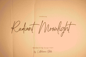
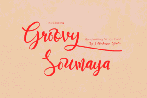
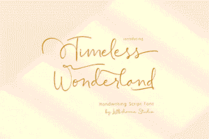
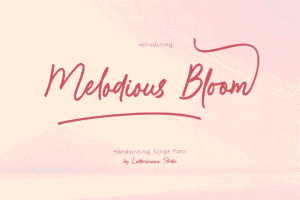
Try out and download our best font for free 👀


-
Headline: Playfair Display (serif)
-
Body: Open Sans (sans-serif)
It’s the equivalent of pairing a fancy blazer with sneakers. Bold and approachable.
2. Mix Width or Weight
Keep the font family the same, but vary the weight or width.
-
Headline: Roboto Bold
-
Body: Roboto Regular
This keeps your layout cohesive and classy — perfect for minimalist design.
3. Pair Fonts with Shared Roots
Fonts designed by the same type foundry often pair well.
Example:
-
Montserrat + Cardo: Both geometric, both elegant in different ways.
It’s like dating within the friend group. Fewer surprises.
4. Use Superfamilies
These are typefaces that include both serif and sans-serif versions.
Try: PT Serif + PT Sans, or Roboto Slab + Roboto
Side Note : Promote & earn with Letterhanna’s affiliate program.

These are the Swiss Army knives of font pairing.
⚠️ Common Type Pairing Sins
Let’s avoid these tragic design decisions:
-
Too similar = confusing: Don’t pair Helvetica with Arial. That’s just chaos.
-
Too wacky = distracting: Don’t mix five decorative fonts. This isn’t a ransom note.
-
Ignoring hierarchy: If everything looks like a title, your readers will get lost faster than a cat in IKEA.
🧠 Unique Fact of the Day
The phrase “font pairing” wasn’t even a thing until the digital design boom of the 2000s. Back in the print era, designers stuck with one typeface — but used its full family of styles creatively. Bold. Italic. Small caps. All within one font. Pairing became necessary when digital design tools opened the floodgates of font choice.
And thank goodness — otherwise we’d all still be living in Times New Roman.
🧪 Type Pairing Challenge
Create a simple landing page mockup with:
-
A large headline
-
A paragraph of body copy
-
A button
-
A quote or testimonial
Try these pairings:
-
Playfair Display + Lato
-
Roboto Slab + Roboto
-
Bebas Neue + Source Sans Pro
Then ask: Which feels most modern? Which feels luxurious? Which one screams “startup”?
Pro move: Try the same layout with a bad pairing — like Comic Sans and Impact — and watch your soul shrivel.
Here Are Some Fonts You Might Love! 👀