📚 Typography Books Dissected — Day 1 of 50
“Typography exists to honor content.” That single sentence, buried in the opening pages of Robert Bringhurst’s magnum opus, rewires how you think about every font choice you’ve ever made.
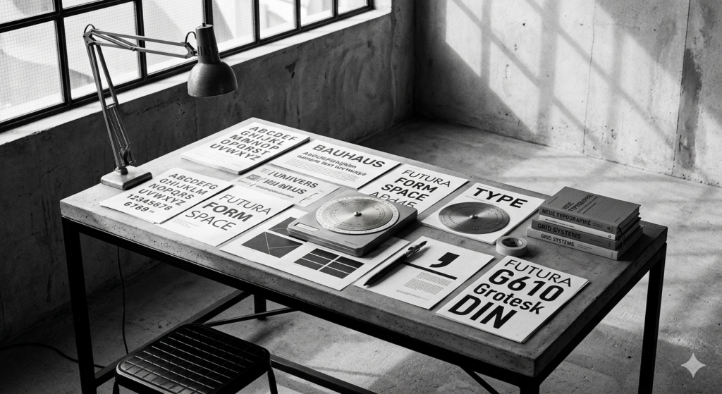
Most designers learn typography by accident. They pick Helvetica because it feels safe, nudge letter-spacing until something looks “right,” and call it a day. Then a book like The Elements of Typographic Style arrives and makes you realize you’ve been guessing in the dark.
Published in 1992 and revised several times since, this book has been called “the typographer’s bible” — and that title isn’t hype. It’s a manual, a history, a philosophy, and a technical reference all collapsed into a single volume. Matthew Butterick, who writes extensively about type, once said that any designer serious about letterforms needs to reckon with this book sooner or later. He’s right.
What the Book Is Actually About
Bringhurst doesn’t teach you how to pick fonts. That’s the first surprise. Instead, he teaches you why certain typographic decisions have survived centuries while others vanished. The book draws on classical proportion, music theory, Renaissance mathematics, and plain human biology — the way the eye moves, the way the brain processes rhythm in text.
The central argument is deceptively simple: type has a job to do, and that job is serving the reader. Every other consideration — aesthetics, branding, experimentation — is secondary to legibility and meaning. Not because creativity doesn’t matter, but because creativity divorced from purpose produces noise, not communication.
The Rules That Actually Matter
1. The Paragraph Is the Unit of Texture
Bringhurst asks designers to step back from individual characters and look at the paragraph as a whole. Does it form a consistent gray rectangle on the page? Does the eye move through it without snagging? Uneven texture — rivers of white space, erratic word-spacing — signals something is wrong with the setting, even before you read a single word.
This is why typefaces with poor spacing algorithms look “cheap” even when they’re technically well-drawn letterforms. The individual letters might be beautiful. The paragraph is still a mess.
2. Line Length Has a Formula
Somewhere between 45 and 75 characters per line is the ideal range for a single-column text block. The reason isn’t arbitrary — it maps to the natural span of peripheral vision. Too short, and the eye snaps back and forth like a ping-pong ball. Too long, and it loses its place returning to the start of the next line.
Try out and download our best font for free 👀


Bringhurst expresses this through a formula involving the type size: roughly 30 times the type size in points gives you a reasonable measure in points, which you convert to picas or millimeters. Designers who set their measure by gut feel are, most of the time, landing in the right zone anyway — but understanding why it works makes it possible to break the rule intelligently.
3. Leading Is Not Just Space
Vertical space between lines — leading — is commonly treated as an afterthought. Set it to 120% of the point size and move on. Bringhurst argues this is a missed opportunity. Leading should respond to line length: longer lines need more leading because the eye needs more of a visual channel to find the next line’s beginning. Narrow columns can breathe with tighter leading. Dense academic text needs different treatment than a novel.
He also argues that leading should reflect the x-height of the typeface. A face with a large x-height (like many contemporary grotesques) already feels dense at normal leading. A typeface with a smaller x-height reads more openly at the same setting.
4. True Italics vs. Sloped Romans
This is where Bringhurst gets surgical. Many digital typefaces that claim to have an italic variant are actually offering a sloped roman — a mechanically tilted version of the upright letters. A true italic is a different drawing entirely, with different letterform construction, different stroke modulation, a different rhythm.
The difference matters because true italics carry historical weight — they evolved from Renaissance handwriting. Sloped romans are a compromise invented when metal type made true italics expensive to cut. Using a sloped roman where a true italic is needed doesn’t just look slightly off; it misses the semantic function that the italic is supposed to perform.
5. Typographic Color Without Ink Color
Before digital tools gave designers a color picker, typographers talked about “color” to describe the overall darkness or lightness of a text block. A bold typeface has a different color than a light one. A condensed face set tight has different color than the same face set with generous tracking.
Side Note : Promote & earn with Letterhanna’s affiliate program.

Bringhurst uses this concept to explain why mixing typefaces is difficult: you’re trying to match weights, proportions, and rhythm across different historical traditions. When two typefaces have the same typographic color, they can coexist. When they fight for dominance, the page loses coherence.
What Makes This Book Unusual
Bringhurst writes with the confidence of someone who has made peace with the fact that most readers won’t care about the finer points. He doesn’t soften his opinions. Chapter titles are written in the imperative: “Don’t mix roman and italic without reason.” Not “Consider whether…” or “You might try…” — just the directive, direct and unvarnished.
There’s also a historical narrative woven through the technical content. You learn why certain typefaces were designed the way they were — the political and economic contexts, the constraints of the technology, the tastes of the era. Garamond makes sense once you understand sixteenth-century French publishing. Futura makes sense once you understand Weimar-era design philosophy.
Typography stops being a collection of aesthetic preferences and becomes a record of human thought about communication across five centuries.
Who Needs to Read This
Graphic designers, obviously. But also: web developers who set type in CSS and don’t understand why their body copy feels wrong. Product designers who choose typefaces from Google Fonts by scrolling until something looks “clean.” Writers who use word processors and think they don’t make typographic decisions (they do — every time they hit enter, choose a font, or adjust margins).
Anyone whose work involves putting words in front of other people’s eyes is making typographic decisions. This book argues that those decisions deserve the same careful thought as any other design choice — maybe more, because type is often invisible when it’s done well and painfully obvious when it isn’t.
The Takeaway Worth Keeping
Typography is not decoration. It’s infrastructure. The best typographic work creates conditions under which reading becomes effortless — where the reader can focus entirely on the content without being distracted by the medium carrying it.
That’s harder than it sounds. And The Elements of Typographic Style is the closest thing to a map for getting there.
Here Are Some Fonts You Might Love! 👀