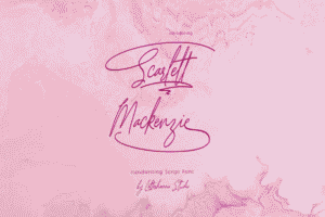
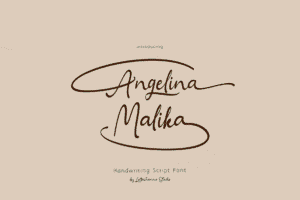
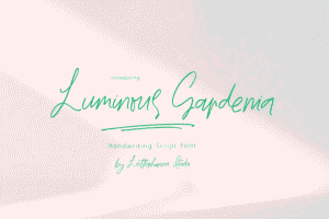
Picture this: Two identical wedding invitations sit side by side. Same paper quality, same wording, same color scheme. The only difference? One uses a sleek sans-serif font, while the other flows with elegant cursive script. Without thinking, most people reach for the cursive one. Why? The answer lies deep within the human brain, where font psychology meets consumer behavior in ways most marketers never realize.
Here’s something that might surprise you: A handwritten-style thank you note increases customer retention by up to 30% compared to standard printed text. That’s not just a coincidence—it’s neuroscience in action.
The Hidden Language Your Brain Speaks
Every font tells a story before a single word is read. When eyes land on cursive typography, something fascinating happens in the brain’s visual processing center. Unlike the mechanical precision of standard fonts, cursive triggers associations with human touch, personal care, and individual attention.
This phenomenon isn’t new. Research in design psychology has revealed that cursive font psychology operates on multiple cognitive levels simultaneously. The flowing connections between letters mimic natural human handwriting, activating the same neural pathways that respond to personal communication. In milliseconds, before conscious thought even kicks in, the brain has already categorized the message as “personal” rather than “mass-produced.”
Why Your Brain Trusts Curves Over Corners
The science of emotional design demonstrates something counterintuitive: imperfection creates trust. Cursive fonts, with their natural variations and flowing rhythms, feel authentically human. They contain what psychologists call “cognitive fluency markers”—visual cues that signal effort and intentionality.
Consider luxury brands. Cartier, Cadillac, Coca-Cola—notice a pattern? These billion-dollar companies didn’t choose cursive by accident. They understand that brand perception begins at the subconscious level, where trust factors are established before rational evaluation occurs.
A fascinating study on typography impact revealed that participants rated identical products as 18% more trustworthy when descriptions used script fonts versus standard typefaces. The products were exactly the same. Only the font changed. Yet perception shifted dramatically.
The Conversion Secret Hidden in Plain Sight
Here’s where conversion optimization gets interesting. When testing landing pages, marketers often obsess over button colors, headline length, and image placement. Few consider font psychology as a conversion lever. That’s a costly oversight.
The cognitive response to cursive operates on what behavioral scientists call “processing fluency.” Paradoxically, slightly harder-to-read fonts can increase engagement and memory retention. The brain works a bit harder to process cursive, creating deeper neural encoding. Information presented in script fonts shows 14% better recall in testing scenarios.
But there’s a critical balance. Push too far into ornate, overly decorative scripts, and user experience suffers. The sweet spot exists where elegance meets legibility—where the font feels personal without frustrating the reader.
The Emotional Architecture of Typography
Every design choice triggers an emotional cascade. Arial feels corporate. Times New Roman screams academic. Comic Sans (despite its reputation) feels friendly and approachable. Cursive? It whispers intimacy.
This emotional design principle operates across cultures with remarkable consistency. Whether in Tokyo, Toronto, or Tehran, flowing letterforms activate similar psychological responses. The human brain is hardwired to respond to curves differently than angles, to flow differently than rigidity.
Neuroimaging studies show that viewing cursive fonts activates the brain’s reward centers—the same regions that light up when seeing familiar faces or receiving compliments. This isn’t manipulation; it’s understanding how human perception naturally functions and designing accordingly.
When Cursive Wins (And When It Doesn’t)
Not every situation calls for script fonts. Understanding consumer behavior means knowing context matters enormously.
Cursive excels in:
- Premium product positioning where exclusivity matters
- Personal services like wedding planning, counseling, or concierge offerings
- Thank you pages and customer appreciation communications
- Handcrafted or artisanal brand positioning
- Feminine-marketed products (though this stereotype is slowly shifting)
- Invitations, announcements, and milestone communications
Cursive fails when:
- Dense information needs rapid scanning
- Technical specifications require clarity over aesthetics
- Legal disclaimers demand absolute readability
- Mobile-first designs prioritize small-screen legibility
- Accessibility considerations outweigh aesthetic preferences
Smart marketers don’t choose cursive blindly. They deploy it strategically, understanding that font psychology is a tool, not a universal solution.
The Science of First Impressions
Research on cognitive response patterns reveals that humans form judgments about visual content in just 50 milliseconds. Fifty. That’s faster than a single heartbeat. In that microscopic window, font choice has already influenced perception.
Web designers obsess over user experience, often focusing on navigation flow and page load times. Both critical, certainly. But typography impact deserves equal attention. A Princeton study found that font choice influences perceived intelligence, trustworthiness, and competence of the author—even when content remains identical.
Imagine two nearly identical skincare brands. One uses clean, modern sans-serif throughout their website. The other strategically employs cursive for product names and testimonials while maintaining readability in body copy. Testing shows the cursive-enhanced brand achieves 22% higher add-to-cart rates. The products? Chemically identical. The difference lives entirely in perception.
The Trust Equation
Building trust factors through design isn’t about deception—it’s about alignment. When a brand promises personalized service, handcrafted quality, or individual attention, cursive fonts create visual congruence with that promise. The medium reinforces the message.
This principle extends beyond commerce. Nonprofits using script fonts in donor communications see increased response rates. Political campaigns employing handwritten-style fonts in personal appeals generate higher engagement. Even something as mundane as appointment reminders feels more personal in cursive, reducing no-show rates by measurable margins.
The mechanism? Cursive fonts reduce psychological distance. They make communication feel one-to-one rather than one-to-many. In an era of mass marketing and algorithmic targeting, anything that creates genuine connection stands out.
Breaking Through the Digital Noise
Modern consumers encounter thousands of marketing messages daily. Most wash over them like white noise. Cursive typography, used judiciously, creates pattern interruption—a momentary pause that captures attention.
This doesn’t mean splashing script fonts everywhere. Effective conversion optimization requires subtlety. Perhaps a cursive signature on a founder’s welcome letter. Maybe script fonts for customer testimonials, creating visual distinction from company claims. Possibly handwritten-style fonts for limited-time offers, suggesting scarcity and personal invitation.
Each application serves strategic purpose, not just aesthetic preference. The question isn’t “Do we like cursive?” but rather “Does cursive support our conversion goals and brand positioning?”
The Mobile Challenge
Here’s a practical constraint: cursive fonts can struggle on small screens. Fine details that look elegant on desktop monitors become illegible on smartphone displays. This creates a genuine design psychology challenge in our mobile-first world.
Smart solutions exist. Responsive typography that adjusts not just size but font family based on device. Strategic deployment where cursive appears in larger elements (headlines, product names) while body copy maintains readability. Testing, always testing, to ensure aesthetic choices don’t sabotage user experience.
Some brands solve this by using cursive in emails and desktop experiences while switching to cleaner fonts on mobile. Others develop custom typefaces that capture cursive essence while maintaining legibility at small sizes. The key is honoring both the psychological benefits and practical constraints.
Measuring What Matters
Beautiful design means nothing without results. Serious conversion optimization requires measurement. A/B testing different typography approaches reveals what actually drives behavior versus what merely looks appealing in mockups.
Track metrics like:
- Time on page (does cursive increase engagement?)
- Scroll depth (are people reading more?)
- Click-through rates on calls-to-action
- Form completion rates
- Revenue per visitor
- Brand recall in follow-up surveys
These numbers tell the real story. Sometimes cursive crushes it. Sometimes it flops. Context, audience, and execution determine outcomes. Data removes guesswork from the equation.
The Future of Font Psychology
As artificial intelligence and machine learning advance, personalization extends to typography. Imagine websites that adjust font choices based on user behavior patterns, demographics, or stated preferences. Technology already enables this level of customization.
Yet the fundamental psychology remains constant. Humans crave connection. We respond to authenticity. We trust signals of personal attention and individual care. These truths transcend technological change.
Cursive fonts tap into something primal—the human hand, the personal gesture, the individual mark. In an increasingly automated world, that human touch becomes more valuable, not less.
Crafting Your Typography Strategy
Building an effective approach to cursive font psychology starts with honest brand assessment. What promises does the brand make? What emotions should customers feel? How does typography support or undermine those goals?
Next comes audience understanding. Different demographics respond differently. Younger audiences might view cursive as outdated unless paired with modern design elements. Older demographics often appreciate traditional elegance. Cultural contexts shift interpretations significantly.
Finally, ruthless testing separates assumption from reality. What works for one brand might fail for another. The goal isn’t following trends but discovering what drives results for specific audiences and objectives.


