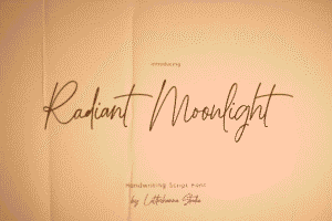
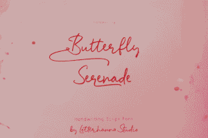
Picture this: Your guests open their mailbox, and there it is—your wedding invitation. Before they even read a single word, the elegant script font catches their eye, making their heart skip a beat. That’s the power of choosing the right typography for your special day.
Here’s something nobody tells you about wedding planning: while you’ll spend weeks agonizing over flowers and venues, the font you choose for your invitations will be the first impression your guests have of your celebration. And in 2026, that first impression matters more than ever.
Let me be honest with you. I’ve seen brides stress over napkin colors but overlook their invitation fonts—only to regret it when the printed invitations looked nothing like they imagined. Don’t let that be you.
Why Your Script Font Choice Makes or Breaks Your Wedding Invitations
Think about the last wedding invitation that genuinely impressed you. I’m willing to bet it wasn’t just the paper quality or the embossing—it was that gorgeous, flowing script that made you feel like you were holding something precious.
The right elegant script font for wedding invitations doesn’t just convey information; it tells your love story before your guests even step into the venue.
The Art of Choosing Luxury Wedding Fonts
Let’s talk about what separates a good font from a show-stopping one. When you’re investing in luxury wedding fonts, you’re not just buying letters—you’re purchasing elegance, sophistication, and a visual promise of the beautiful day ahead.
What Makes a Script Font “Wedding-Worthy”?
Not all script fonts are created equal. Here’s what you need to look for:
Legibility is non-negotiable. Your grandmother should be able to read your invitation without squinting. That ornate font might look stunning on Pinterest, but if your guests can’t decipher the date or venue, you’ve missed the mark entirely.
Flow and rhythm matter more than you think. The best script typography wedding designs have a natural, effortless quality—like someone took a calligraphy pen and created each letter with intention and grace.
Weight and presence create impact. Some scripts whisper elegance, while others announce it boldly. Neither is wrong, but knowing the difference helps you match your font to your wedding vibe.
The 2026 Trends in Elegant Calligraphy Typeface
This year brings something special to the typography world. We’re seeing a beautiful marriage (pun intended) of classic elegance and modern sensibility.
Timeless Meets Contemporary
Gone are the days when wedding fonts had to be either ultra-traditional or completely modern. The hottest elegant calligraphy typeface options in 2026 blend both worlds seamlessly.
Think classic letterforms with contemporary spacing. Traditional flourishes with minimalist restraint. It’s sophisticated without trying too hard—exactly what today’s couples want.
The Rise of Hand-Lettered Authenticity
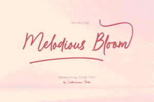
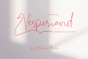
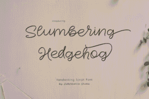
Here’s a trend I’m genuinely excited about: premium wedding script fonts that look like they were hand-written by a calligrapher, complete with natural imperfections and organic variations. These fonts feel personal and intimate—like each invitation was crafted specifically for that guest.
Romantic Font Styles That Never Go Out of Fashion
Let me share something I’ve learned from years of watching wedding trends come and go: truly romantic font styles transcend trends. They tap into something deeper—emotion, nostalgia, and timeless beauty.
The Power of Subtle Sophistication
The most effective sophisticated invitation fonts don’t scream for attention. They draw you in quietly, making you want to look closer. These are the scripts with delicate swashes, thoughtful ligatures, and letterforms that feel like they’re dancing across the page.
Cursive Wedding Lettering Done Right
Cursive wedding lettering walks a fine line. Too casual, and it feels like a child’s handwriting practice. Too ornate, and it becomes unreadable. The sweet spot? Scripts that maintain consistent slant, balanced stroke weight, and just enough flourish to feel special without overwhelming.
Timeless Script Fonts: Your 2026 Starter Kit
Ready for the good news? You don’t need to try every font in existence. Here’s what actually works:
Classic Elegance Category
These are your timeless script fonts that have graced invitations for decades—and will continue to do so. They’re reliable, beautiful, and universally flattering. Think flowing capitals, consistent letterforms, and a presence that feels both formal and warm.
Modern Romance Category
For couples who want tradition with a twist, modern romantic scripts offer cleaner lines, more contemporary spacing, and flourishes that feel fresh rather than fussy.
Luxury Statement Category
When you want your invitation to make people say “wow” the moment they see it, luxury statement scripts deliver. These are bold, confident, and undeniably elegant—perfect for formal affairs and grand celebrations.
Wedding Invitation Design: Bringing It All Together
Here’s where theory meets practice. You’ve chosen your gorgeous script font—now what? The magic happens in how you use it.
The Header Hierarchy Secret
Your names deserve the spotlight. Use your chosen elegant script at its largest, most impactful size here. Then step back to secondary fonts (we’ll get to elegant font pairing in a moment) for details like date, time, and venue.
White Space is Your Best Friend
Even the most stunning sophisticated invitation fonts need room to breathe. Don’t crowd your invitation. Let that beautiful typography shine by giving it generous margins and thoughtful spacing.
Color Considerations
Black on white is classic for a reason, but 2026 invites experimentation. Deep navy, rich burgundy, or even metallic inks can elevate your script font from beautiful to breathtaking.
Elegant Font Pairing: The Ultimate Cheat Sheet
This is where good invitations become great. Elegant font pairing is about contrast, balance, and hierarchy.
The Golden Rule
Your script font should handle the emotional heavy lifting—your names, perhaps a romantic quote. Pair it with a clean, simple serif or sans-serif for practical information. This contrast makes everything more readable while maintaining sophistication.
Pairing Formulas That Always Work
Bold script + delicate serif creates romantic elegance with perfect clarity. Flowing script + modern sans-serif gives you contemporary sophistication. Traditional script + classic serif delivers timeless luxury.
What Not to Do
Never pair two competing script fonts. Trust me on this—it’s visual chaos. Also, avoid fonts that are too similar in style or weight. The point of pairing is contrast and complement, not confusion.
Practical Tips for Implementation
Let’s get tactical. You’ve chosen your fonts—now here’s how to actually use them effectively.
Test Before You Commit
Order samples. Print them at actual size. Look at them in different lighting. Ask brutally honest friends for feedback. What looks perfect on your computer screen can look completely different on paper—especially with script fonts.
Size Matters More Than You Think
Your gorgeous cursive wedding lettering needs to be large enough to appreciate. Names should typically be at least 24-36 points, depending on the font. Details can go smaller but never sacrifice readability for style.
Digital vs. Print Considerations
If you’re sending digital save-the-dates, remember that scripts can render differently on various devices. Always send test files to yourself on both mobile and desktop before mass distribution.
Common Mistakes to Avoid
Let me save you from the pitfalls I’ve seen countless couples fall into:
The “More is More” Trap. Adding every flourish, swash, and stylistic alternate doesn’t make your invitation more elegant—it makes it cluttered. Exercise restraint.
Ignoring Your Wedding Theme. Your romantic font styles should echo your wedding aesthetic. A ultra-formal script for a bohemian beach wedding creates cognitive dissonance.
Forgetting About Envelopes. Your addressing font matters too. Make sure your chosen script (or a complementary option) works for envelope addressing and looks cohesive with your invitation suite.
The Technical Details You Can’t Ignore
Here’s the practical stuff that ensures your vision becomes reality:
File Formats and Printing
Always provide your printer with the proper font files or use PDF format that embeds fonts. The last thing you want is font substitution ruining your carefully chosen luxury wedding fonts.
Licensing Matters
If you’re printing invitations commercially, check your font license. Many beautiful scripts require commercial licensing for print use. It’s worth the investment to do it right.
Working With Designers
If you’re hiring a designer for your wedding invitation design, communicate clearly about font choices. Bring examples of scripts you love and explain what draws you to them. This helps your designer understand your aesthetic instantly.
Making Your Final Decision
After all this information, how do you actually choose? Here’s my advice:
Trust your gut. If a font makes you smile every time you see it, that’s probably your font. Your emotional response matters more than following trends.
Consider your venue. A ballroom wedding calls for different typography than a garden celebration. Let your setting guide your choices.
Think long-term. You’ll be looking at these invitations in your wedding album for decades. Choose timeless script fonts that won’t feel dated in five years.
Bringing It All Together
Your wedding invitation is more than paper and ink—it’s the opening chapter of your celebration story. The elegant script font for wedding invitations you choose sets the tone, creates anticipation, and shows your guests they’re invited to something truly special.
In 2026, the best approach blends timeless elegance with personal touches. Whether you gravitate toward traditional elegant calligraphy typeface options or more contemporary premium wedding script choices, the key is selecting fonts that feel authentically you.
Remember, the most unforgettable invitations aren’t necessarily the most expensive or elaborate. They’re the ones that make people pause, smile, and feel honored to be included in your celebration. Your font choice is the first step in creating that emotional connection.
So take your time, test your options, and trust that the perfect script is out there waiting to make your wedding invitations absolutely unforgettable. Your guests—and your future self looking back at wedding photos—will thank you for the care you put into this choice.


