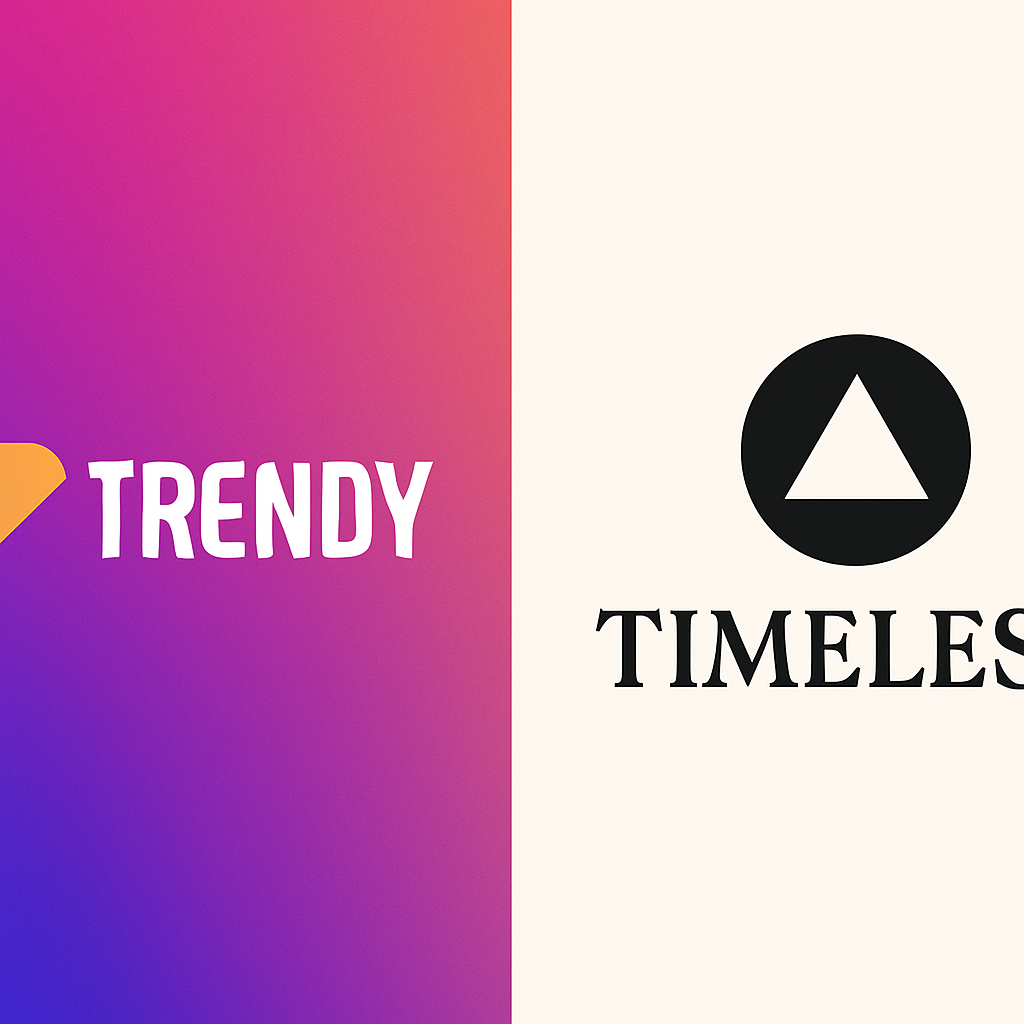
👓 Trendy vs. Timeless: What’s the Difference?
Trendy
Designs that follow current popular aesthetics. They’re often eye-catching, modern, and perfect for riding the “now” wave.
🎯 Good for: Startups, social media brands, fashion, entertainment
⏳ Lifespan: 1–3 years if you’re lucky
📉 Risk: Looks outdated quickly
Timeless
Designs that ignore fleeting fads and rely on solid design principles. They stay relevant and respected even decades later.
🎯 Good for: Legacy brands, institutions, anyone playing the long game
🕰 Lifespan: Potentially forever
💡 Bonus: They age like fine wine.
🔮 Logo Trends That Come and Go
Design trends are like mullets and neon windbreakers—cool one day, tragic the next. Here are some logo trends that burned bright (and burned out fast):
🌀 Gradient Overload
Think of Instagram’s logo glow-up. Super trendy… but try printing that on a receipt.
🧼 Over-Simplification
Many brands recently flattened or stripped their logos (hello, Google, Airbnb, Volkswagen). While this can boost readability, it can also remove personality.
Try out and download our best font for free 👀


📦 Geometric Minimalism
Perfect circles, triangles, and squares—great for digital apps, but sometimes indistinguishable from each other.
🧠 Neo-Brutalism and Anti-Design
Purposefully ugly, weird layouts—cool for designers, confusing for normal humans.
🏛 What Makes a Logo Timeless?
1. Simplicity
Less is truly more. Think Apple, Nike, McDonald’s. These logos can be recognized instantly, even without text.
2. Memorability
A unique form or visual hook (like the Nike swoosh or Twitter bird) sticks in people’s minds.
3. Scalability
Works perfectly from a favicon to a billboard.
4. Versatility
Looks great in black and white, full color, embroidery, animation, or as a cookie cutter (yep, that’s a real thing).
Side Note : Promote & earn with Letterhanna’s affiliate program.

5. Emotional Neutrality
Timeless logos don’t rely too heavily on pop culture references or current events—they let their brand personality shine over time.
🖼 Timeless Logo Case Studies
Nike
Created in 1971 for $35. It’s still in use today, untouched. Why? It’s simple, fluid, and loaded with motion.
Coca-Cola
Its script logo hasn’t changed much since 1887. It owns its red, owns its swirl, and screams “nostalgia” in the best way.
IBM
Paul Rand’s striped logo has been in use since the ‘70s. A modernist design that’s elegant and techy, without looking dated.
🎯 Should You Follow Trends?
Short answer: Sometimes.
If your brand is part of a rapidly changing space (tech, fashion, gaming), trendy logos can feel fresh and relevant. Just be ready to rebrand often, or at least keep a design evolution strategy in your back pocket.
If you want a brand to stand the test of time, invest in timeless principles from the start—even if it means bucking the current aesthetic wave.
🧩 Unique Fact of the Day:
The London Underground “roundel” logo (the red circle with the blue bar across it) has been in use since 1908—proving that a simple shape with strong composition can survive over a century of cultural and design shifts.
Here Are Some Fonts You Might Love! 👀