🎭 The Power of Type in Branding
Fonts aren’t just pretty letters. They carry mood, personality, trust, and memory. The typeface you choose can make your brand feel like a tech-savvy innovator, a luxury boutique, or a down-to-earth artisan bakery.
Typography is often the first impression your brand gives—long before a tagline is read or a product is touched.
Think about it:
-
Would you trust a law firm using Comic Sans?
-
Would a punk band look serious in Times New Roman?
-
Would Apple be Apple without that sleek, clean San Francisco type?
Exactly.
🏷️ What Typography Does for Your Brand
Let’s break down the brand magic that typography delivers:
1. Sets Tone and Voice
A typeface can whisper or shout, be warm or clinical, serious or playful.
Try out and download our best font for free 👀


-
Serif fonts (e.g., Garamond, Baskerville): Traditional, trustworthy, intellectual.
-
Sans-serif fonts (e.g., Helvetica, Futura): Modern, clean, approachable.
-
Script fonts (e.g., Pacifico, Great Vibes): Elegant, expressive, often feminine.
-
Display fonts (e.g., Blackletter, stencil, geometric): Bold, unique, used sparingly for punch.
2. Creates Consistency
Typography becomes part of a brand’s visual system. When you use the same fonts across websites, ads, packaging, and social media, it builds recognition and unity.
3. Elicits Emotion
Type triggers the subconscious. Luxury brands often use thin, high-contrast serifs. Youthful brands lean into rounded sans-serifs. Tech startups love minimal geometric fonts.
Why? Because these choices evoke specific feelings.
🧠 Typography + Logo = Identity Powerhouse
Most logos are typography. From Google’s primary-colored wordmark to Coca-Cola’s flowing script, a custom font or stylized lettering becomes a logo’s soul.
Some iconic examples:
Side Note : Promote & earn with Letterhanna’s affiliate program.

-
Netflix: Bold, custom sans-serif evokes cinematic impact.
-
Vogue: Elegant Didone serif screams sophistication.
-
LEGO: Chunky sans-serif in a red badge—fun and loud.
And let’s not forget Nike—the logo is just a swoosh, but the type? Clean, impactful, always italicized for motion.
🪄 Tips for Choosing Brand Typography
If you’re building or refreshing a brand, ask:
-
What do we stand for?
-
A high-end law firm won’t use the same typeface as a handmade soap brand.
-
-
Where will the type live?
-
Print? Web? Mobile? A variable font might be ideal for flexibility.
-
-
Is it readable?
-
Never sacrifice clarity for style—unless you’re making a metal band logo, in which case… unreadability is the vibe.
-
-
Do we need more than one font?
-
Pair wisely. Often, a bold display type for headlines and a neutral body font will do.
-
-
Do we need licensing?
-
Font licensing matters. Google Fonts are free. Commercial fonts may have usage fees. Don’t skip the legal stuff—Adobe isn’t playing.
-
💡 Unique Fact of the Day
Google’s logo is custom-drawn but inspired by schoolbook typefaces to appear friendly and neutral. And fun fact: the “e” in the Google logo is tilted slightly as a symbol of “playfulness.” That’s right—even a single character can carry a brand value.
🧪 Typography Branding Challenge
Pick one of the following brand types:
-
Organic food brand
-
Futuristic tech company
-
Children’s toy brand
-
Boutique fashion label
Then:
-
Choose a primary typeface
-
Select an optional secondary font
-
Describe the brand’s values, and how the type supports it
-
Mock up a simple logo or wordmark using just type
Bonus: Try making a moodboard with sample fonts, color palettes, and examples of brand typography in action.
🎯 Pro Examples to Study
-
Spotify: Circular sans-serif, bold and friendly, perfectly digital.
-
Airbnb: Clean sans-serif with a touch of warmth, showing modern hospitality.
-
Burberry (post-rebrand): Sleek all-caps serif for luxury.
-
Glossier: Soft sans-serif + spacing = millennial minimalism.
Watch how even letter spacing communicates mood.
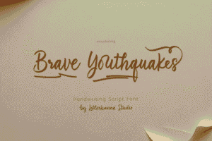
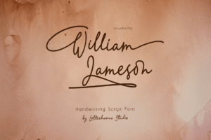
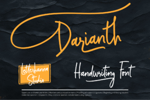
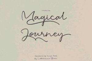
Here Are Some Fonts You Might Love! 👀