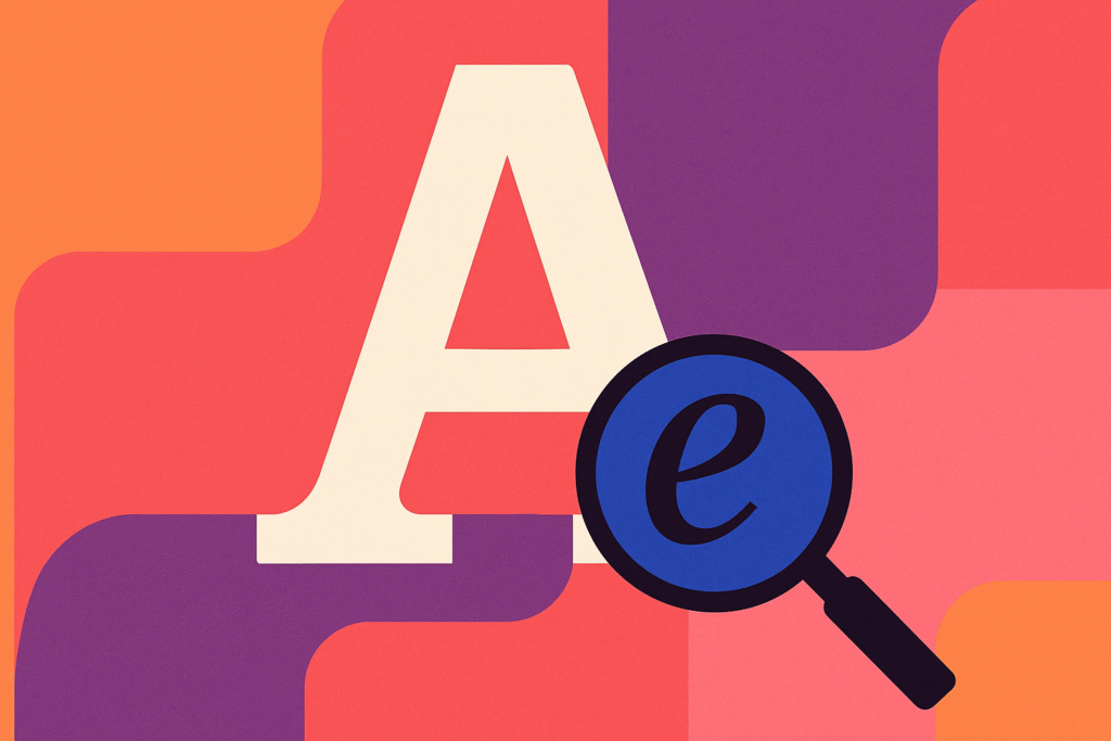
Typography isn’t just about picking a pretty font. It’s the art and technique of arranging type to make language visually engaging, readable, and expressive. Think of it as the tone of voice in your visual message.
Just like in music, timing, spacing, and rhythm matter. A well-set line of type can be a whisper or a shout, a gentle nudge or a power move.
🧠 Quick Typo-Vocab to Flex at Parties (or design critiques)
| Term | What It Means |
|---|---|
| Typeface | The family of fonts (like Roboto, Garamond, Helvetica) |
| Font | A specific style within a typeface (e.g. Garamond Italic 12pt) |
| Kerning | Adjusting space between individual characters |
| Tracking | Adjusting space between all letters in a word or block |
| Leading | Space between lines of text |
| Baseline | The invisible line letters sit on |
| X-height | Height of lowercase letters (excluding ascenders/descenders) |
| Serif/Sans Serif | With decorative feet (serif) vs. clean edges (sans) |
Yes, designers have a term for everything. We’re fancy like that. 🧐
✍️ Why Typography Matters
Typography communicates more than just words—it conveys tone, mood, and intention. It can:
Try out and download our best font for free 👀


-
Build brand identity
-
Create visual hierarchy
-
Improve readability
-
Set the emotional tone
Example:
-
A luxury brand? You might use elegant serifs like Didot.
-
A tech startup? Probably a geometric sans-serif like Montserrat or Inter.
-
A haunted house? Drippy, distorted display fonts. Spooky bonus points if it looks cursed.
📚 Font Categories You Should Know
| Category | Feels Like… | Great For… |
|---|---|---|
| Serif | Traditional, elegant | Print, books, formal brands |
| Sans-Serif | Modern, clean | Web, tech, minimalism |
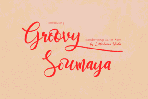
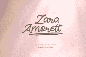
| Script | Fancy, personal | Invitations, headers, branding |
| Display | Bold, creative, weird | Posters, logos, short titles |
| Monospace | Technical, retro, geeky | Code, terminal-style designs |
🔥 Typography Principles That Make You Look Pro
1. Use Hierarchy Like a Boss
Your type should tell the viewer what to read first, second, and last. Use:
Side Note : Promote & earn with Letterhanna’s affiliate program.

-
Size
-
Weight (boldness)
-
Color
-
Style (italic, caps)
-
Positioning
2. Stick to 2-3 Fonts Max
Think of them like ingredients in a recipe. Too many, and it’s a typographic casserole gone wrong.
3. Pair Fonts with Personality
-
Contrast: A bold sans-serif header + a clean serif body = chef’s kiss 💋
-
Harmony: Fonts that look like they belong together (same mood or geometry)
4. Don’t Forget About Readability
If people can’t read it, it doesn’t work. Choose legible fonts, especially for small text or paragraphs.
5. Watch Your Spacing
-
Tight kerning = edgy, modern
-
Loose tracking = elegant, airy
-
Too much/too little leading? It’s like wearing pants that are too short or long.
🧠 Unique Fact of the Day
NASA uses a typeface called “Futura” on its spacecraft. Why? Because it’s modern, clear, and highly legible—even in the vacuum of space. Typography: it’s rocket science now. 🚀
Also, Helvetica is one of the most widely used fonts in the world—Apple, Toyota, Lufthansa, and countless others have used it. Love it or hate it, it’s everywhere.
Here Are Some Fonts You Might Love! 👀