If graphic design were a rock band, typography would be the lead singer. Loud, expressive, and impossible to ignore. But it’s more than just picking a cool font—it’s about arranging type so it speaks, even before anyone reads a word.
Let’s break it down, letter by letter.
✒️ What Is Typography?
Typography is the art and technique of arranging type. That includes choosing fonts, adjusting spacing, setting hierarchy, and balancing aesthetics with readability.
In simpler terms: it’s how you make text look good and work well.
Great typography:
-
Improves readability
-
Creates emotional tone
-
Guides the viewer’s eye
-
Builds brand identity
Bad typography:


-
Looks like a ransom note
-
Makes people squint, cry, or click away
🔠 Font vs Typeface (Wait, They’re Not the Same?)
Surprise! They’re not.
-
Typeface is the design (e.g., Helvetica).
-
Font is the file or variation (e.g., Helvetica Bold 12pt).
Think of typefaces as a music album and fonts as individual songs. Same vibe, different format.
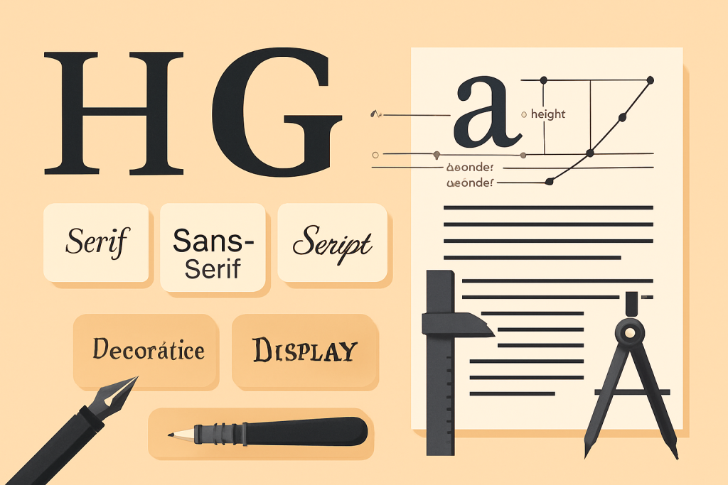
🧬 The Anatomy of Type
Let’s get nerdy. Every letter is a tiny architecture project.
-
Baseline – Where letters sit
-
Cap Height – Height of capital letters
-
X-Height – Height of lowercase “x” (and most lowercase letters)
-
Ascender – Part of a letter that rises above x-height (like in b or d)
-
Descender – Dips below the baseline (like in y or g)
-
Serif – The little feet on letters like Times New Roman
-
Sans-serif – No feet! Clean and modern (like Arial or Helvetica)
And yes, there’s also ear, loop, bowl, counter, and even a tittle (that dot on an “i” has a name, and it sounds like a snack). Typography is nothing if not weirdly poetic.
🧩 Types of Fonts (and Their Vibes)
1. Serif
-
Feels: Traditional, trustworthy, classy
-
Famous faces: Times New Roman, Georgia, Garamond
-
Great for: Editorials, books, serious brands
2. Sans-serif
-
Feels: Clean, modern, approachable
-
Famous faces: Helvetica, Arial, Futura
-
Great for: Web design, tech brands, clean interfaces
3. Script
-
Feels: Elegant, personal, artsy
-
Famous faces: Brush Script, Pacifico
-
Great for: Invitations, logos (use with caution)
4. Display/Decorative
-
Feels: Loud, unique, highly stylized
-
Famous faces: Lobster, Impact, Jokerman (gasp)
-
Great for: Headlines, branding—not body text!
🎯 Pro Tip: Use display fonts like hot sauce. A little goes a long way.
Side Note : Promote & earn with Letterhanna’s affiliate program.

🔧 Typography Principles That Actually Matter
-
Hierarchy
-
Make the most important info stand out.
-
Use size, weight, and spacing to guide the reader.
-
-
Alignment
-
Left, right, center, justified. Pick one and stick with it.
-
Random alignment? That’s chaos. We fear chaos.
-
-
Contrast
-
Bold vs regular, big vs small, serif vs sans—contrast creates clarity.
-
-
Spacing
-
Kerning: space between two letters.
-
Tracking: space between all letters in a word.
-
Leading: space between lines (fun fact: it’s pronounced “ledding”).
-
Tiny adjustments here can massively improve legibility and vibe.
🔠 Dos and Don’ts of Using Fonts
DO:
-
Limit yourself to 2–3 fonts per design.
-
Use font pairing tools like Fontjoy, Google Fonts, or Adobe Fonts.
-
Ensure legibility first, aesthetics second.
DON’T:
-
Use Comic Sans unless you’re 9 or it’s ironic.
-
Stretch fonts manually (use the proper weights instead).
-
Mix too many styles—it becomes a visual train wreck.
🎨 Want an easy pairing? Try Playfair Display (serif) for headers + Roboto (sans-serif) for body text.
🧠 Unique Fact of the Day
The first movable type system? Not Gutenberg. While Gutenberg gets the Western credit in the 1400s, Bi Sheng of China invented movable type in the 11th century, using porcelain characters. He was dropping type while Europe was still doodling in manuscripts.
Also: the infamous Comic Sans was originally made for Microsoft Bob, a cartoon interface that flopped. The font lived on… and on… and on… (much to designers’ collective horror).
Here Are Some Fonts You Might Love! 👀