Have you ever seen text that just looks right—clean, polished, and harmonious? That’s not just good luck; it’s the magic of kerning at work. While it might sound like some super technical design jargon, kerning is actually a straightforward (and fun!) concept once you get the hang of it. Let me walk you through what kerning is, why it’s essential, and how it gets a little trickier—yet more exciting—when working with script fonts.

What Is Kerning?
At its core, kerning is all about adjusting the spacing between individual letters in a word. Think of it as fine-tuning the gaps to make everything feel balanced. It’s not about changing the size of the letters or their overall spacing (that’s called tracking), but rather tweaking how specific letter pairs fit together.
For example, in the word “AVOID”, the letters A and V often need to be nudged closer together so they don’t look awkwardly spaced. Without kerning, the text might look clunky or uneven, and nobody wants that in their designs.
Try out and download our best font for free 👀


Kerning for Script Fonts: A Special Challenge
Now, when it comes to script fonts, kerning gets a little trickier—and a lot more important. Script fonts are designed to mimic handwriting, so the letters often flow into each other with connecting strokes or loops. This means that uneven spacing is way more noticeable and can completely ruin the illusion of a smooth, elegant script.
For example, in a script font, the letter pair “Th” might need extra attention to ensure the T’s crossbar doesn’t overlap awkwardly with the h’s ascender. Similarly, pairs like “oo” or “ly” need to look seamless, as if they were written in one continuous motion.
When kerning script fonts, designers often use optical kerning, where adjustments are made by eye to maintain natural flow. This can be a bit tedious since you have to fine-tune each pair individually.
Side Note : Promote & earn with Letterhanna’s affiliate program.

How Long Does Kerning Take?
Here’s where it gets real: kerning isn’t a quick task, especially if you’re working on a full typeface. To give you an idea, there are 2,704 kerning pairs to account for if you’re considering every combination of uppercase and lowercase letters from aa to ZZ.
Manually kerning all these pairs can take hours to days, depending on the complexity of the font and the designer’s experience. Script fonts, in particular, require extra care because of their flowing connections. A professional designer might spend 15-30 minutes per session tweaking and testing, but the total time can add up fast.
Practical Tips for Kerning
- Start with the most common letter pairs: Focus on pairs like AV, To, or oo, which appear frequently in text.
- Use a kerning tool: Software like FontLab or Adobe Illustrator allows you to kern letters manually and see the results instantly.
- Test in context: Write out full sentences or paragraphs to check how the kerning feels in real use, not just isolated words.
- Train your eye: Over time, you’ll get better at spotting awkward spacing. A great way to practice is by studying professional typography or playing online kerning games.
Kerning might seem like a small detail, but it’s one of those things that separates okay typography from truly stunning design. Whether you’re working with sans serif fonts, elegant serif styles, or flowy scripts, taking the time to perfect your kerning will elevate your work and make it feel more polished.
So next time you’re designing text, give kerning the attention it deserves. After all, great typography isn’t just about the letters—it’s about the spaces in between. 😊
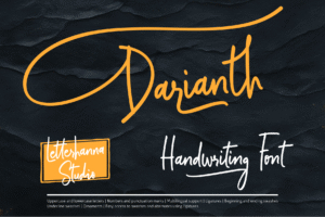
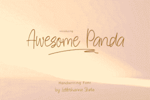
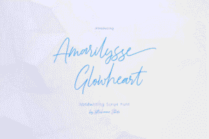
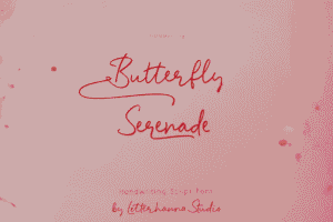
Here Are Some Fonts You Might Love! 👀