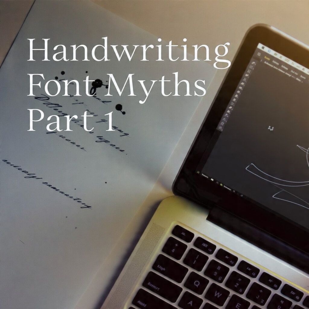
Handwriting Font Myths — The Series
60-Part Deep Dive into everything designers, typographers, and font lovers get wrong about handwriting fonts. Each part unpacks one persistent myth — from the studio, the classroom, and the internet — with real context, historical nuance, and practical clarity.
The Myth
Ask anyone to explain how a handwriting font works, and the answer almost always goes something like this: someone writes letters on paper, scans the result, traces it in software, and — done — a handwriting font is born. It sounds logical. It sounds clean. The reality, however, is considerably messier, far more technical, and honestly, far more interesting.
This myth is not entirely without basis. Some handwriting fonts do begin with actual handwriting. But the journey from ink on paper to a functional, installable typeface involves so many layers of transformation, compromise, and deliberate artifice that calling the final result “digitized handwriting” is a bit like calling a feature film a “filmed conversation.” Technically not wrong. But fatally incomplete.
Where the Myth Comes From
The digital tools that brought handwriting fonts to the mainstream — FontLab, Glyphs, Illustrator, even early bitmap editors — are often demonstrated with the exact workflow described above. Designer writes. Designer scans. Designer traces. That workflow exists, and it’s used. But what those demos skip past is everything that happens after the tracing, which is where the real craft lives.
Beyond the tools, there’s a broader cultural assumption at play: that handwriting is inherently natural and organic, and that technology’s job is simply to capture that nature faithfully. This idea makes intuitive sense. But type design, even when it imitates handwriting, has never been about faithful capture. It has always been about functional illusion.
What Actually Happens
Step 1: The Source Material Problem
Real handwriting is, by definition, inconsistent. The same letter written twice will never be identical. The angle shifts, the pressure varies, the spacing breathes differently depending on what came before and after. That inconsistency is part of what makes human handwriting feel alive.
A font, by contrast, is built on glyphs — single, fixed forms that stand in for every instance of a given character. When someone types the letter “a” forty times in a paragraph, a standard font renders the exact same “a” shape forty times. That uniformity is baked into how font technology works at the most fundamental level.
So the very first problem a handwriting font designer faces is this: how do you take something inherently variable and turn it into something necessarily fixed, while still making the result look natural?
The answer is not “scan and trace.” The answer involves a chain of carefully considered decisions about which version of each letterform to use, how to modify it for clarity and consistency, how to handle the spacing between letters, and how to manage all the edge cases — letter combinations, diacritics, punctuation — that real handwriting handles intuitively but that a font file must define explicitly.
Step 2: The Spacing Problem
In real handwriting, the space between letters adjusts automatically. The hand reads ahead, compensates, shifts. A narrow “i” next to a wide “m” is handled without thought. A looping “f” that reaches toward the next letter gets the room it needs.
Try out and download our best font for free 👀


Fonts don’t have hands. They have metrics: defined values that tell the rendering engine how much space to leave around each character. These metrics — advance width, side bearings, kerning pairs — have to be set manually for every character, and then fine-tuned for every character combination that looks awkward at the default setting.
For a typical Latin character set, a font designer might need to define hundreds of kerning pairs. For a handwriting font that’s trying to look natural across diverse settings, that number can run into the thousands. None of this appears in the “scan and trace” version of events.
Step 3: The Optical Illusion Problem
Here’s something counterintuitive: if you digitize real handwriting faithfully — tracing every stroke exactly, preserving every imperfection — the result usually looks worse than handwriting that’s been deliberately cleaned up and adjusted.
The eye and the brain are not cameras. They interpret letterforms through a complex mix of pattern recognition, expectation, and contextual reading. A perfectly circular “O” does not look circular — it looks slightly too tall. A diagonal stroke that measures exactly the same weight as a horizontal stroke looks thinner. These are optical illusions, and type designers have been compensating for them since the days of metal type.
Handwriting font designers face the same challenges. A stroke angle that scans accurately from the original handwriting may render on screen in a way that looks tilted or broken at small sizes. A letterform that looks beautiful in isolation may create confusing ambiguity at text size. Fixing these issues requires deliberate distortion of the source material — moving away from “what the handwriting actually looked like” and toward “what will make the reader’s eye parse this correctly.”
Step 4: The Legibility Problem
This one is particularly underappreciated. Handwriting that works in person — written by a specific person’s hand, in a specific context, for a specific reader — often fails completely as a font used by strangers, at arbitrary sizes, in unfamiliar layout contexts.
Personal shorthand creeps in. Ambiguous letterforms (is that an “a” or a “u”? a “1” or an “l”?) that are resolved in context when reading handwritten notes become genuine readability problems in fonts. Idiosyncratic stroke connections that feel natural to the writer can confuse anyone else. Letters that are recognizable at the size they were written may become unreadable when scaled up or down.
Side Note : Promote & earn with Letterhanna’s affiliate program.

A type designer working from real handwriting has to make judgment calls constantly — keeping what works, modifying what doesn’t, and sometimes abandoning letterforms from the source material entirely and constructing new ones that feel consistent with the overall style while actually functioning as readable type.
The Craft That Gets Erased
What gets lost in the “digitized handwriting” framing is that handwriting font design is design. Not capture. Not reproduction. Design.
It requires knowledge of type anatomy, optical compensation, spacing theory, and software fluency. It requires the ability to look at a letterform and ask not just “does this look like handwriting?” but “does this work as a glyph in a system of glyphs that will be used by strangers in contexts I cannot predict?”
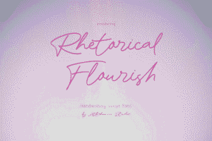
The best handwriting fonts — Burgues Script, Bickham Script, Adios Script, Lust Script — are not impressive because someone had beautiful handwriting. They’re impressive because a designer took something that originated in handwriting and transformed it into something that functions reliably at the technical and aesthetic level a professional typeface demands.
That transformation is invisible when it’s done well. Which is probably why the myth persists: the goal of the designer is to make the artifice disappear.
Why This Myth Matters
Believing that handwriting fonts are simply digitized handwriting has real consequences.
For clients, it leads to undervaluing custom handwriting font commissions — and to the assumption that anyone with “nice handwriting” can produce a usable typeface. For designers, it can create a false sense of ease that leads to under-prepared projects and disappointing results. For type buyers, it leads to confusion when cheap “scan-and-trace” fonts perform poorly in real-world use, with inconsistent spacing, ambiguous letterforms, and rendering problems at various sizes.
Understanding what actually goes into a handwriting font doesn’t just give a more accurate picture of the craft. It gives the vocabulary to make better decisions — about which fonts to buy, what to expect from custom commissions, and why the gap between a $5 font and a $150 font is often a gap in craft, not just branding.
The Short Version
Handwriting fonts start with handwriting the way architecture starts with a sketch. The sketch is real. But the building is something else entirely.
Series Note
This is Part 1 of 60 in the Handwriting Font Myths series — one myth per part, explored in full. The series covers design theory, historical context, technical realities, and the kind of nuanced typography knowledge that tends to get flattened into oversimplifications online.
Here Are Some Fonts You Might Love! 👀