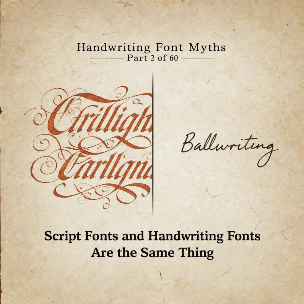
Handwriting Font Myths — Part 2 of 60
They share a shelf in every font marketplace. They are not the same genre.
The Myth
Walk through any font marketplace — Creative Market, MyFonts, Font Squirrel — and you’ll notice that “script” and “handwriting” are often used interchangeably. Filters overlap. Categories blur. A flowing calligraphic font sits beside a casual felt-tip scrawl under the same “handwriting/script” umbrella, as if the two things are simply different intensities of the same basic idea.
This conflation has become so common that even experienced designers use the terms without distinction. And while the practical consequences are often minor, the underlying confusion points to a real gap in typographic literacy — one that matters when choosing fonts for projects, briefing clients, or trying to understand why two “handwriting-style” fonts behave so differently in use.
Script fonts and handwriting fonts are related. They share aesthetic territory. But they come from different traditions, are built on different assumptions, and serve different purposes. Treating them as synonyms flattens all of that into noise.
Where the Confusion Starts
The most obvious reason for the confusion is visual. Both script and handwriting fonts depict letterforms that look like they were made by hand, using tools that produce flowing or irregular strokes. Compared to serif or sans-serif type — which signals “designed, mechanical, structured” — both categories read as “personal, organic, informal.” From a distance, the family resemblance is clear enough that grouping them seems reasonable.
Font marketing hasn’t helped. Marketplace categories are commercial before they are taxonomic. “Script/Handwriting” as a single bucket serves the needs of someone browsing for “something that doesn’t look like a regular font” without requiring them to know more. That’s a legitimate user need, and it drives how fonts are labeled and sold. But it trains users — including professional designers — to think of the distinction as cosmetic rather than categorical.
There’s also the fact that the boundary between script and handwriting genuinely blurs in some cases. A loosely drawn brush script can look very much like energetic handwriting. A tightly structured handwriting font can approach the formality of a casual script. Edges exist for a reason, and the honest position is that there’s a spectrum, not a hard wall. But spectrum doesn’t mean identical.
What “Script” Actually Means
The word “script” in typography has a specific historical and technical meaning that predates digital fonts by several centuries.
Try out and download our best font for free 👀


Script type originates from formal penmanship traditions — particularly the pointed-pen calligraphic styles that flourished in Europe from the 17th century onward. Copperplate, Spencerian, and later styles like English Roundhand were developed as formal writing systems for commerce, correspondence, and education. They were defined by specific pen angles, consistent stroke weights, deliberate letterform proportions, and — crucially — connecting strokes that linked letters together in a continuous flow.
When type designers began cutting metal type based on these styles, the goal was to reproduce the look of formal calligraphic writing in a medium that could be composed and printed. The resulting typefaces — and their descendants through the phototype and digital eras — carry those calligraphic origins in their DNA. They tend toward formality, elegance, and a high degree of internal consistency. The stroke modulation (the contrast between thick and thin strokes) follows rules derived from the pen angle. The letterform proportions reflect penmanship ideals.
Script fonts, in the technical sense, are calligraphic fonts. Their reference point is formal hand-lettering — an art form with structured rules, trained technique, and a centuries-long tradition of refinement. Bickham Script, Edwardian Script, Burgues Script, and their contemporaries belong to this lineage.
What “Handwriting” Actually Means
Handwriting fonts, by contrast, take their reference from everyday personal writing — not formal calligraphy, but the ordinary cursive or printed lettering that people develop organically, shaped by habit, education, and the tools they happened to use growing up.
The defining characteristics of a handwriting font are informality and personality. Where script fonts strive for elegance, handwriting fonts strive for authenticity. Where script fonts follow penmanship conventions, handwriting fonts celebrate deviation from them. Inconsistency, quirk, personal rhythm — these are features, not flaws.
The stroke tools associated with handwriting fonts are not calligraphic pens but everyday writing instruments: ballpoint pens, pencils, felt-tip markers, fountain pens used without calligraphic intent. The resulting letterforms have different structural logic. Stroke contrast is low or absent — a ballpoint pen produces lines of relatively uniform width, which is completely unlike the thin-and-thick rhythm of a pointed-pen calligraphic script. Letter connections are loose or nonexistent, reflecting the interrupted, lift-and-continue nature of ordinary handwriting.
Handwriting fonts also tend to include visible markers of the writing tool and the writer’s hand: slight irregularities in stroke paths, inconsistent baseline alignment, letters that lean and drift. These imperfections are intentional — they’re what distinguishes a handwriting font from a humanist sans-serif or an informal roman, which also read as hand-influenced but in a more structurally controlled way.
Side Note : Promote & earn with Letterhanna’s affiliate program.

The Technical Differences
Beyond aesthetics and history, the distinction between script and handwriting fonts plays out in specific technical ways that have real consequences in use.
Stroke contrast. Script fonts typically have high stroke contrast — significant variation between the thick and thin parts of each stroke, derived from the calligraphic pen. Handwriting fonts typically have low stroke contrast, reflecting the uniform-line tools of everyday writing. This affects how each type reads at different sizes and how it reproduces in different printing conditions. High-contrast script fonts can degrade significantly at small sizes or in low-resolution printing; handwriting fonts tend to be more robust across conditions.
Connecting strokes. Many script fonts are designed as connecting scripts — the letters are drawn so that the exit stroke of one letter flows directly into the entry stroke of the next. This creates the appearance of continuous, uninterrupted pen flow across a word. Achieving this in a font requires either careful design of consistent connecting stroke geometry, or sophisticated OpenType features (contextual alternates, ligatures) that substitute different letterform variants depending on what precedes or follows each character. Handwriting fonts rarely attempt true connecting strokes — they may include some connections, but they don’t depend on them for their visual logic.
Formality register. Script fonts, because of their calligraphic origins, signal formality. They read as deliberate, crafted, ceremonial — appropriate for wedding invitations, luxury branding, formal certificates. Handwriting fonts signal informality. They read as personal, casual, immediate — appropriate for greeting cards, personal branding, casual editorial contexts. Confusing the two in a design brief can result in a tonal mismatch that undermines the intended message: a handwriting font on a formal invitation looks careless; a formal script on a casual brand looks stiff and unapproachable.
Legibility at scale. Script fonts, designed with formal elegance as the priority, often have reduced legibility at large display sizes — the high contrast and ornate letterforms can feel overdressed. Handwriting fonts, designed to evoke everyday writing, often have the opposite problem: the irregularities that look charming at display size can become confusing or visually noisy at small sizes. Neither is universally better; the scales and use cases are simply different.
Where Things Legitimately Overlap
None of the above means the two categories are hermetically sealed. There are genuine hybrids — casual scripts that borrow from handwriting informality without fully committing to either tradition; brush scripts that straddle the line between calligraphic stroke logic and the looseness of quick gestural writing; informal handwriting fonts designed with enough internal consistency to function like a script in connecting-word applications.
The existence of hybrids doesn’t dissolve the distinction. It means the distinction is a spectrum with clear poles, not a binary switch. Understanding the poles — the formal calligraphic tradition of script type, and the personal informal tradition of handwriting type — makes it easier to place any given font correctly and to choose appropriately for a given brief.
Why Getting This Right Matters
For most casual users, the script/handwriting distinction might seem like typography pedantry. For anyone making professional font decisions, it matters in practical ways.
Knowing that a beautiful formal script requires OpenType-capable software to display its connecting alternates correctly — and that a handwriting font does not — is the difference between a project that works and one that doesn’t. Knowing the formality register of each category is the difference between a design that communicates what it intends and one that sends mixed signals. Knowing the technical rendering differences is the difference between choosing a font that holds up at 8pt in print and one that falls apart.
The myth that script and handwriting are the same thing isn’t just taxonomically imprecise. It collapses practical knowledge that designers actually need.
Here Are Some Fonts You Might Love! 👀