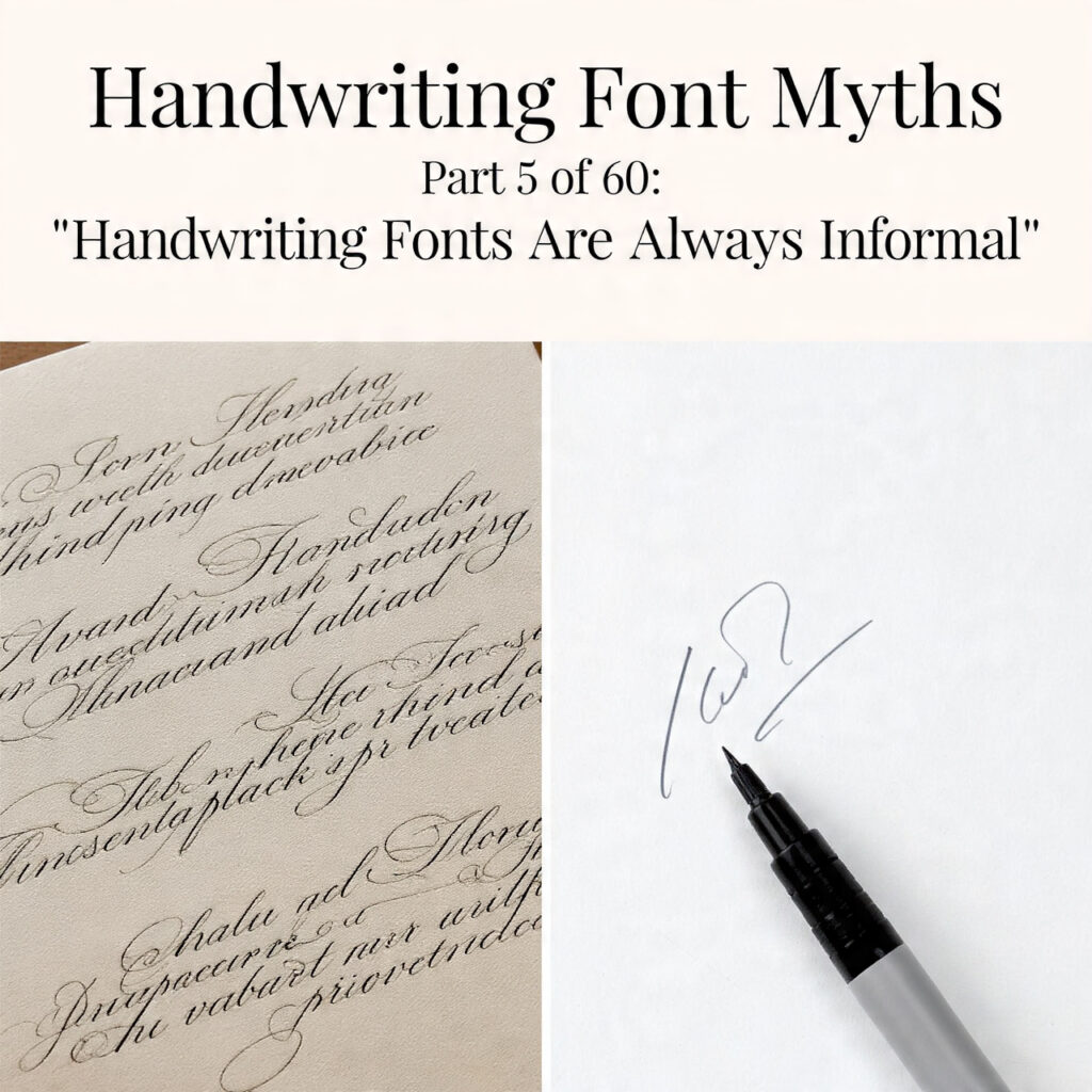
Casual scrawl and high ceremony live in the same category. Assuming otherwise cuts off half the toolkit.
The Myth
Ask most designers to describe a handwriting font and the picture that forms is almost always some version of the same thing: a casual, slightly messy letterform — a felt-tip marker or a quick pen — something that reads as personal, warm, and unpretentious. The word “informal” appears almost automatically, as if it were part of the definition rather than a description of one end of a very wide spectrum.
This assumption shapes how designers browse font libraries, how they brief clients, and how they respond to creative problems. When a project calls for something that feels human rather than mechanical, the handwriting font category gets opened — but often only the casual half of it. The formal end, with its centuries of ceremony and deliberate authority, gets overlooked entirely because the category as a whole has been mentally filed as “casual stuff.”
The reality is that handwriting fonts run from urgent sticky-note scrawl to the most formally coded penmanship in Western typographic history. Treating informality as the defining quality of the category doesn’t just misrepresent the taxonomy — it leaves a significant part of the designer’s toolkit unused.
The Formal Tradition in Handwriting Type
The most obvious counterevidence to this myth is the existence of formal script typefaces — and their dominance in some of the most ceremonially coded design contexts that exist.
Copperplate scripts, named for the engraving technique used to reproduce them in print, were the prestige writing style of European commerce and correspondence from the 17th through the 19th centuries. Banks, legal offices, government institutions, and high-end merchants used Copperplate handwriting — and Copperplate typefaces — specifically because of their associations with formality, precision, and authority. The letterforms are demanding to execute. The thin hairlines require skilled penmanship. The consistent slant and rhythm signal discipline and refinement. There is nothing casual about Copperplate, and there never was.
Spencerian script, developed in mid-19th century America by Platt Rogers Spencer, was designed as a practical formal handwriting system for business communication. Its flowing, graceful letterforms were taught in schools and used in commercial correspondence for decades. Spencerian-style typefaces carry that heritage: they read as elegant, cultured, and formally intentional.
English Roundhand, the penmanship style that underlies much of Western calligraphic tradition, and its descendants in type — Bickham Script, Burgues Script, and their contemporaries — occupy the same register. These are not casual fonts. They are among the most formally coded typographic tools available to a working designer.
Try out and download our best font for free 👀


Where Formal Handwriting Type Gets Used
The use cases for formal handwriting fonts are not fringe situations. They include some of the most high-stakes design contexts in professional practice.
Wedding stationery is perhaps the most obvious example. The entire formal end of the wedding invitation market — the designer categories, the luxury letterpress studios, the high-end custom stationery — runs almost entirely on formal calligraphic scripts. These are contexts where formality is not just desired but expected, where the type selection is read as a direct signal of how seriously the occasion is being treated. No designer working seriously in this space would describe their font choices as “informal.”
Luxury brand identity makes heavy use of formal script type. Heritage whiskey labels, fine perfume packaging, high-end jewelry branding, premium hotel wordmarks — these contexts use calligraphic and script-derived letterforms specifically because of the formal, prestigious associations they carry. The handwriting origin of the letterforms is part of the message: it signals artisanal, personal, crafted. But it does not signal casual or informal.
Legal and official documents have a centuries-long tradition of formal script type: diplomas, certificates, official commissions, deeds. The formal calligraphic letterforms signal authority and ceremony in ways that mechanically composed text does not. The choice is deliberate and deeply culturally coded.
Heritage and archival design — brand work for companies positioning themselves within long histories, museum and institutional design, restorations of historical visual identities — often draws on formal script and calligraphic type specifically for its ability to signal age, tradition, and cultural weight.
In none of these contexts is “informal” an accurate description of what the handwriting-derived type is doing. The opposite is true.
Side Note : Promote & earn with Letterhanna’s affiliate program.

The Spectrum, Not the Stereotype
Understanding the handwriting font category correctly means seeing it as a spectrum with formality and informality at opposite ends, and every point in between occupied by fonts with different cultural codings, different historical origins, and different use-case profiles.
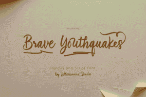
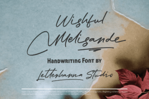
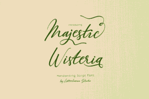
At the informal end: brush fonts, marker fonts, casual cursive, quick printed handwriting — letterforms that signal speed, personality, immediacy, and approachability. These are genuinely informal, and they work in contexts where those qualities serve the design.
At the formal end: pointed-pen scripts, Copperplate derivatives, Spencerian-influenced type, formal calligraphic designs — letterforms that signal deliberateness, refinement, ceremony, and prestige. These are not informal in any meaningful sense. They occupy the same cultural territory as high-end serif typefaces, but with the added dimension of handcraft specificity.
In the middle: a vast range of semi-formal scripts, humanized display lettering, flowing but approachable calligraphic styles that carry some warmth without sacrificing authority. Much of the most versatile work in the category lives here.
The point is that the middle and formal zones of this spectrum are not marginal — they represent a substantial portion of the category by volume and arguably a disproportionate portion by design significance.
The Practical Consequence of Getting This Wrong
When designers internalize “handwriting fonts are informal,” they make specific errors.
The most common is reaching for a casual marker-style or brush font when a project brief calls for something that feels personal, human, and warm — but still needs to carry genuine authority. The result is type that feels friendly but lightweight, personal but not prestigious. The formal calligraphic alternatives that would actually serve the brief better go unconsidered because they’ve been mentally excluded from the category.
A related error is treating handwriting fonts as inherently incompatible with formal design contexts — which leads to avoidance of the entire category in situations where a well-chosen formal script would be exactly right. The designer reaches for a conservative serif or an engraved-looking display face instead, missing the specific warmth and craft signal that a formal handwriting font would have provided.
Both errors have the same root: a category assumption that collapses a spectrum into a single point. Fixing the assumption doesn’t require abandoning the casual end of the category — it just means recognizing that the formal end exists, is well-developed, and serves real professional needs.