Logos often steal the show with iconic symbols: Nike’s swoosh, Apple’s… well, apple, and Twitter’s bird (RIP, little buddy). But sometimes, the most powerful branding tool doesn’t need an icon — it just needs letters. Welcome to the world of logotypes, where the typeface is the logo.
A logotype — or wordmark — is a text-only logo that uses unique font treatments, custom typography, and often subtle modifications to turn a brand name into a visual identity. It’s not just about writing the name of your business — it’s about making that name unforgettable at first glance.
What Exactly is a Logotype?
In simplest terms, a logotype is a logo made from words, not symbols. It’s the name of the brand, styled in a distinctive way. No icons. No mascots. Just pure typographic magic.
Some classic examples:
-
Google — multi-colored, clean, friendly
-
Coca-Cola — flowing script with nostalgic charm
-
Visa — bold, simple, and trustworthy
-
Canon — a customized serif typeface with instant recognition
These brands don’t need a separate icon. Their name is the icon.
Why Choose a Logotype?
There’s something beautifully direct about a logotype. It says: “Here’s who we are. No guessing. No abstraction. Just us.”
Benefits of logotypes:
-
Clarity & Recognition
People see your name front and center every time. You don’t rely on a symbol they have to mentally connect with your name later. -
Versatility
Logotypes scale beautifully — perfect for business cards, email headers, signage, and digital platforms. -
Typographic Expression
The font, weight, spacing, and letterforms express the brand’s tone. Sleek and techy? Go geometric sans-serif. Fancy and high-end? Try an elegant serif with ligature flair. -
Cost-Effective for Startups
Skip the symbol development phase. Start strong with a clean, distinct logotype.
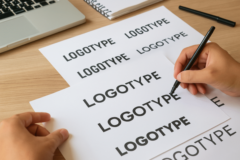
The Anatomy of a Great Logotype
Creating a great logotype isn’t just typing your business name in Helvetica and calling it a day. (Unless you’re really into Helvetica.)
Try out and download our best font for free 👀


Let’s break down the core components that make or break a logotype:
1. Typeface Selection
This is your personality. Think of it as your brand’s voice, but visual. Serif? Sans-serif? Monospaced? Script? Each carries meaning.
-
Serif fonts – Tradition, reliability (e.g., TIME, Vogue)
-
Sans-serif fonts – Modern, clean (e.g., Google, Facebook)
-
Script fonts – Elegance, personality (e.g., Coca-Cola)
-
Monospaced – Tech-savvy, methodical (e.g., IBM)
2. Customization
To avoid your logo looking like clip art, most strong logotypes involve customization — letter tweaks, unique ligatures, or spacing alterations that make it unmistakably yours.
Even small changes (like elongating the tail of a “y” or tilting the “e”) can create signature style.
3. Kerning & Spacing
Poor kerning can ruin everything. (Ever seen “CLINIC” with the L and I too close? Yikes.)
Every space between letters is a design choice. Adjusting tracking and kerning ensures visual harmony and professional polish.
4. Color Treatment
While many logotypes start in black and white (for clarity), adding brand colors can enhance recognition. Google’s primary colors, for instance, are integral to its identity.
Side Note : Promote & earn with Letterhanna’s affiliate program.

Real-World Examples
Let’s flex those observation muscles. Here’s how different brands used logotypes to carve iconic niches:
-
FedEx: Uses a bold sans-serif with a hidden arrow between the “E” and “x” — subliminally reinforcing speed and delivery.
-
Pinterest: Combines script and a subtle “pin” shape in the “P.”
-
Disney: A custom, playful script that instantly evokes nostalgia and magic.
None of these use symbols — but the typography is the symbol.
Best Practices for Logotype Design
Here’s your go-to checklist when designing or evaluating a logotype:
✅ Is it legible at all sizes?
✅ Does it reflect the brand’s tone and industry?
✅ Is the spacing even and intentional?
✅ Has it been tested in black & white first?
✅ Can it stand alone without supporting graphics?
✅ Does it avoid font clichés? (Papyrus, Comic Sans — we’re looking at you.)
Bonus tip: Avoid over-relying on free fonts. While Google Fonts is a gift to mankind, your brand deserves something more custom. Hire a type designer or modify a base font if possible.
Unique Fact of the Day
📏 The Coca-Cola logotype hasn’t changed significantly since 1887. That makes it one of the oldest continuously used logos in the world — proof that strong logotype design can be incredibly durable across centuries and cultures.
When Should You Use a Logotype?
Here are some ideal scenarios:
-
You’re just starting and want to prioritize clarity.
-
Your name is unique or catchy enough to be memorable on its own.
-
You want to lean into elegance, minimalism, or directness.
-
Your brand will operate primarily in digital spaces where icons can get crowded.
But remember: logotypes work best when your name is not too long or overly complex. “The Consortium for Reusable Bamboo Solutions Inc.” might want to rethink things.
Final Thoughts
In a world full of symbols, sometimes the boldest thing you can do is just spell it out — with style. A well-designed logotype doesn’t need bells, whistles, or mascots. It whispers your name and gets remembered anyway.
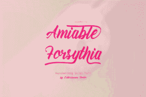
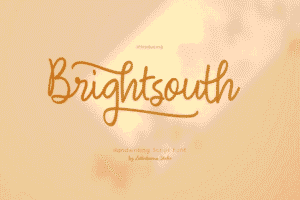
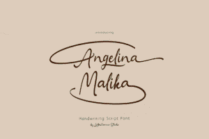
Here Are Some Fonts You Might Love! 👀