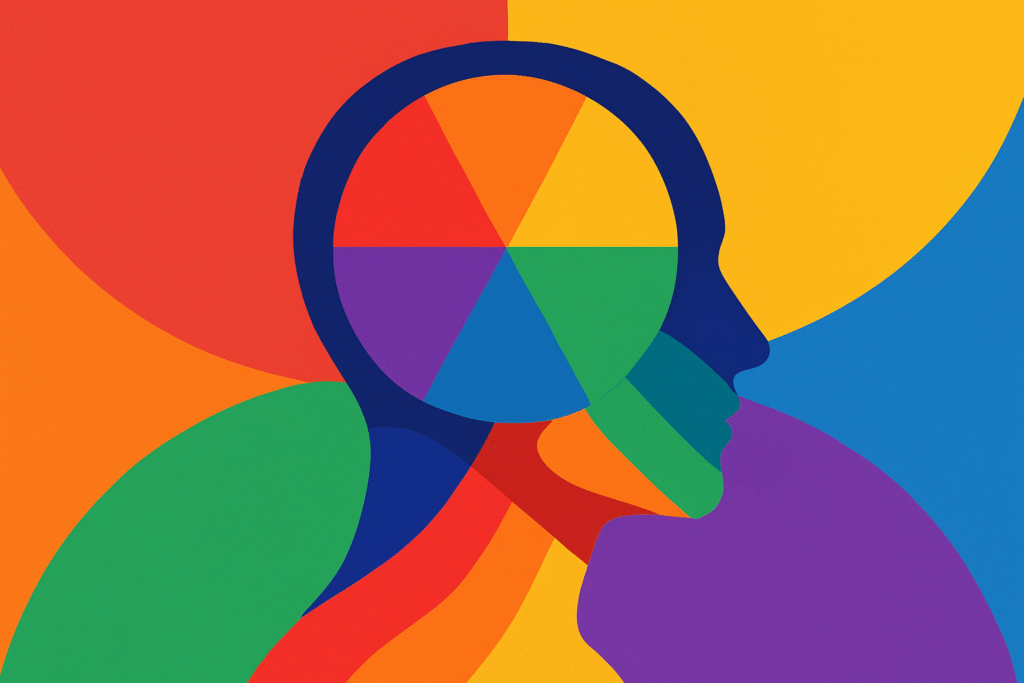
Color isn’t just decoration—it’s a secret weapon. It influences emotions, decisions, and even behavior. Want your audience to trust you, crave your product, or feel like they just got a warm hug? It’s all in the color choices.
Color is the non-verbal voice of your design. It’s what makes people stop scrolling or decide if they like your brand before they even read a single word.
Let’s decode that rainbow.
🧠 Color Psychology 101: What Colors Say to the Brain
| Color | Emotional Impact | Brands That Use It |
|---|---|---|
| 🔵 Blue | Trust, calm, professionalism | Facebook, LinkedIn, PayPal |
| 🔴 Red | Urgency, passion, appetite | Coca-Cola, YouTube, Netflix |
| 🟡 Yellow | Optimism, energy, attention | McDonald’s, IKEA, Snapchat |
| 🟢 Green | Growth, health, balance | Starbucks, Spotify, Whole Foods |
| 🟣 Purple | Creativity, luxury, mystery | Cadbury, Twitch, Yahoo |
| ⚫ Black | Power, sophistication, elegance | Nike, Chanel, Apple |
| ⚪ White | Cleanliness, simplicity, clarity | Apple, Tesla, Wikipedia |
| 🟠 Orange | Enthusiasm, fun, friendliness | Fanta, SoundCloud, Nickelodeon |
Of course, meanings can shift depending on culture—white means purity in the West, but mourning in some Eastern cultures. Context is king (or queen, or majestic sovereign of color).
🎯 Choosing Colors with Purpose
You’re not just picking what “looks nice.” You’re building emotional bridges. Ask yourself:
-
What do I want my audience to feel?
-
What’s the brand personality?
-
Is this digital or print? (Different color modes apply!)
💡 Color Schemes That Designers Swear By
1. Monochromatic
One color, many shades. Classy, harmonious. You can’t really mess this up.
Try out and download our best font for free 👀


2. Analogous
Colors next to each other on the wheel (like blue, teal, green). Feels natural and cohesive.
3. Complementary
Colors opposite on the wheel (blue + orange, red + green). High contrast, high energy.
4. Triadic
Three colors evenly spaced around the wheel (red, blue, yellow). Balanced, vibrant, playful.
5. Tetradic (Double Complementary)
Two pairs of opposites. Can be tricky, but powerful when done right.
Side Note : Promote & earn with Letterhanna’s affiliate program.

🧑💻 Pro Tip: Use Tools
Not sure where to start?
-
Coolors.co: Auto-generate palettes
-
Adobe Color: Find schemes based on mood or harmony
-
Khroma: Uses AI to generate color combos you love
🎨 Color + Typography = Design Harmony
Color isn’t just for backgrounds or buttons—use it in typography to emphasize hierarchy and mood. A warm color for headers draws the eye; a cooler tone for body text keeps things readable and balanced.
🧠 Unique Fact of the Day
Studies show that up to 90% of first impressions are based solely on color. In fact, using a signature color can increase brand recognition by 80%. That’s why brands guard their brand palettes like dragons guard gold.
Fun twist: The color pink wasn’t associated with femininity until the 1940s. Before that? It was considered a strong masculine tone. History has taste-shifted.
🎨 Today’s Creative Challenge
Design a color palette for an imaginary brand. Pick a theme (e.g., eco-friendly skincare, futuristic tech, retro diner) and:
-
Choose 3–5 colors.
-
Assign roles: Primary, Secondary, Accent, Neutral.
-
Create a simple mockup (social post, business card, or landing page header) using only these colors.
Bonus: Use color psychology to justify your palette choices. Think like a designer and a psychologist.
Here Are Some Fonts You Might Love! 👀