Picture this: Someone is scrolling through Instagram at 2 AM, thumb on autopilot, barely registering the hundreds of posts flying past. Then suddenly—they stop. Their thumb hovers. They actually read something.
What made them stop?
It wasn’t another perfectly filtered sunset photo. It wasn’t a celebrity cameo. It was a simple post with the perfect font choice that whispered, “Hey, this is different.”
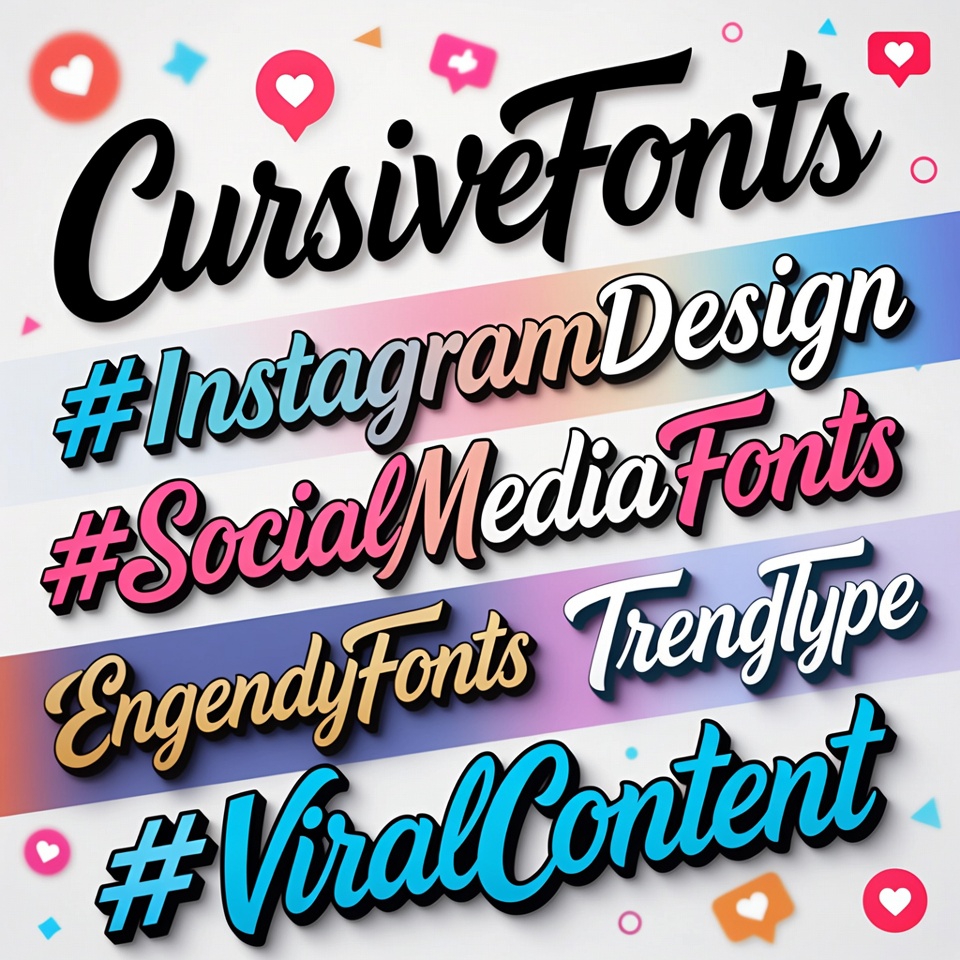
Here’s what most people don’t realize: In the battle for attention on Instagram, cursive fonts are the secret weapon hiding in plain sight.
Think about the last time a post made you pause mid-scroll. Chances are, the design caught your eye before the content did. That’s not shallow—it’s human nature. The brain processes visual information 60,000 times faster than text. Typography isn’t just decoration; it’s the difference between being seen and being invisible.
The Cursive Font Renaissance Nobody Saw Coming
Something fascinating is happening on Instagram right now. While everyone’s chasing the latest AR filters and trending audio, a quieter revolution is taking place in the world of Instagram design.
Cursive fonts are having a moment. But not just any moment—a full-blown takeover.
Walk through the explore page of any successful influencer or brand crushing it right now, and there’s a pattern. The posts that rack up saves, shares, and actual engagement aren’t just well-photographed. They’re thoughtfully designed with social media fonts that feel intentional, personal, and impossible to ignore.
There’s a reason for this. In a platform drowning in AI-generated content and cookie-cutter templates, cursive fonts signal something rare: human touch. They feel handcrafted in a world of mass production. They’re the calligraphy on a wedding invitation in a sea of spam emails.
Why Cursive Fonts Create Instant Emotional Connections
Let’s talk psychology for a second. When the brain encounters a cursive font, something interesting happens. Unlike standard typography that gets processed as “information,” cursive triggers emotional centers. It reads as:
- Authentic rather than corporate
- Personal rather than mass-produced
- Creative rather than formulaic
- Intentional rather than rushed
This isn’t marketing theory—it’s how humans are wired. Handwritten-style aesthetic fonts tap into something primal: the recognition that someone took time to craft something special.
Think about receiving a handwritten note versus a printed letter. Same words, completely different emotional impact. That’s the power of cursive in post design.
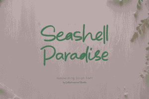
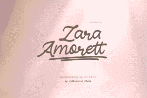
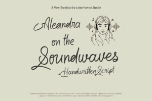
The Seven Cursive Fonts That Actually Work
Now for the practical stuff. Not all cursive fonts are created equal. Some scream “trying too hard,” while others whisper “effortlessly cool.” Here are the ones that consistently deliver for content creation:
1. Playlist Script – The Casual Conversation Starter
This font has mastered the art of looking effortless. It’s the typography equivalent of a friend texting you something genuinely interesting. Slightly imperfect, totally readable, and authentically cool without trying.
Perfect for: Behind-the-scenes content, casual stories, relatable quotes Why it works: Feels like a real person wrote it, not a brand committee
2. Allura – The Sophistication Statement
When content needs to look expensive, Allura delivers. Those flowing loops and elegant curves transform ordinary announcements into special occasions. It’s the little black dress of story fonts.
Perfect for: Product launches, special announcements, upscale content Why it works: Makes everything feel more important and curated
3. Dancing Script – The Community Builder
Warm, approachable, and instantly likable. Dancing Script is that font that makes people want to engage, comment, and connect. It feels like a conversation, not a broadcast.
Perfect for: Community posts, Q&A sessions, personal updates Why it works: Lowers barriers and invites interaction
4. Pacifico – The Bold Attention-Grabber
Thick, confident, and unapologetically fun. Pacifico brings retro California vibes with modern relevance. It doesn’t ask for attention—it commands it.
Try out and download our best font for free 👀


Perfect for: Bold statements, event promotions, call-to-action posts Why it works: Impossible to scroll past without noticing
5. Great Vibes – The Understated Elegance
Thin, refined, and quietly confident. This font doesn’t shout; it knows people will lean in to listen. It’s for content that doesn’t need to prove anything.
Perfect for: Minimalist designs, fashion content, artistic posts Why it works: Projects confidence through restraint
6. Satisfy – The Authentic Storyteller
Genuinely looks handwritten, complete with natural imperfections. In an era where authenticity is currency, Satisfy is pure gold for engagement fonts.
Perfect for: Personal stories, vulnerable moments, real-talk content Why it works: Feels honest in a way polished fonts can’t replicate
7. Lobster – The Showstopper
The nuclear option. When content absolutely must break through the noise, Lobster delivers. It’s bold, distinctive, and memorable in ways subtle fonts can’t achieve.
Perfect for: Major announcements, sale launches, controversial takes Why it works: Creates immediate visual impact
The Art of Using Cursive Fonts Without Looking Amateur
Here’s where things get tricky. Discovering these beautiful cursive fonts is like finding a powerful tool—use it wrong, and the results are disastrous.
The cardinal rule: Less is always more. One cursive font per post. Maybe two if they’re strategically paired, but that’s advanced territory.
Think of cursive as seasoning, not the main dish. A perfectly chosen cursive headline paired with clean, readable body text? Chef’s kiss. An entire paragraph in looping cursive? Unreadable disaster.
For Instagram Stories: Use cursive for the hook, the key phrase, the thing that must be remembered. Everything else should be simple and scannable. The eye should know exactly where to look.
For Feed Posts: If text is overlaying an image, give that cursive room to breathe. White space isn’t wasted space—it’s the frame that makes the art shine. One powerful line in the perfect font beats a cluttered composition every time.
The Strategy Behind Viral Content Typography
There’s a method to creating viral content with trendy typography. It’s not about randomly picking pretty fonts and hoping for the best. It’s about understanding the psychology of stopping power.
Step 1: Know the emotion first. Different cursive fonts trigger different feelings. Elegant Allura creates aspiration. Friendly Dancing Script builds connection. Bold Lobster demands action.
Step 2: Create contrast. Cursive fonts work best when paired with their opposites. A flowing script headline with a bold sans-serif subtext creates visual tension that keeps eyes engaged.
Step 3: Test readability ruthlessly. If viewers need more than two seconds to read the text, it’s already failed. Instagram is a speed-reading environment.
Step 4: Consider the platform. What looks stunning on desktop might be illegible on mobile. Since most Instagram browsing happens on phones, mobile-first design isn’t optional.
Step 5: Watch the background. The most beautiful cursive font becomes invisible against the wrong background. Contrast isn’t just important—it’s everything.
Common Mistakes That Kill Engagement
Even armed with perfect influencer fonts, there are pitfalls that can sink an otherwise great post:
Side Note : Promote & earn with Letterhanna’s affiliate program.

The Paragraph Problem: Using cursive for more than a sentence or two. Cursive fonts are designed for impact, not dissertations.
The Trend Trap: Jumping on a font trend after it’s peaked. By the time everyone’s using it, it’s already losing its distinctive edge.
The Color Catastrophe: Beautiful cursive in a color that blends into the background. If it’s not readable, it doesn’t exist.
The Consistency Confusion: Using different cursive fonts in every post. Successful Instagram design often comes from recognizable patterns, not constant reinvention.
The Mobile Blindspot: Designing for desktop and forgetting that 98% of Instagram users are scrolling on phones where intricate details get lost.
What Actually Makes Content Go Viral
Let’s be honest about viral content for a moment. There’s no guaranteed formula. Anyone claiming otherwise is selling something.
But there are patterns. Posts that break through tend to share certain qualities:
They stop the scroll within two seconds. They communicate clearly and quickly. They trigger an emotional response. They feel designed with intention, not thrown together in a rush.
Cursive fonts, when used strategically, check all these boxes. They create that split-second moment of “wait, what?” that makes thumbs pause. They signal that the creator cared enough to make something visually special. They add personality in a platform where personality drives connection.
The Future of Social Media Fonts
Here’s an interesting prediction: As AI-generated content becomes more prevalent, human touches become more valuable. Cursive fonts, with their handcrafted feel, are perfectly positioned for this shift.
The Instagram algorithm is increasingly prioritizing authentic engagement over passive scrolling. Content that makes people stop, read, save, and share gets boosted. And typography that feels personal and intentional naturally encourages that kind of interaction.
The creators who understand this—who treat every post as a mini design project worthy of thought—will have an advantage as the platform evolves.
Taking Action: The Practical Starting Point
Theory is useless without application. Here’s a realistic action plan:
Choose one cursive font from this list. Just one. Spend a week creating content with it. Pay attention to which posts perform better. Notice what feels right.
Test it in stories first—lower stakes, immediate feedback. See how the audience responds. Adjust based on actual results, not assumptions.
Track the metrics that matter: saves, shares, comment quality (not just quantity), profile visits. These indicate genuine engagement, not just passive scrolling.
Gradually refine the approach. Maybe Allura works better for certain content types while Dancing Script crushes it for others. These insights come from doing, not theorizing.
The Reality Check
Here’s the truth nobody wants to hear: Beautiful typography won’t save bad content. If the message is weak, no font can fix it.
But if the content is already strong and just not getting seen? If valuable posts are drowning in algorithmic obscurity? If the audience exists but isn’t stopping to engage?
That’s where strategic Instagram design and thoughtful aesthetic fonts make the difference. They’re not the whole story—they’re the compelling opening chapter that makes people want to read more.
The best content deserves to be seen. The right cursive font might just be the bridge between “scrolled past” and “stopped to engage.”
The Bottom Line
Instagram is a visual platform. That’s not a limitation—it’s an opportunity. Every element of post design, including typography, either helps or hurts the chances of breaking through.
Cursive fonts work because they tap into something fundamentally human: the desire for connection, authenticity, and beauty in a chaotic digital landscape.
They’re not magic. They’re tools. Powerful tools in the right hands, wielded with intention and paired with strong content.
The question isn’t whether to use them. It’s whether to use them thoughtfully, strategically, and in service of content that deserves attention.
The scroll never stops. But maybe, just maybe, the right cursive font can make someone’s thumb pause. And in that pause, everything changes.
Here Are Some Fonts You Might Love! 👀