Emblem logos are the wise elders of the logo world. Classic. Bold. Intricate. They hold power and prestige and often carry a sense of heritage. If logos were houses, emblem logos would be the vintage mansions with stained glass windows.
🛡️ What Is an Emblem Logo?
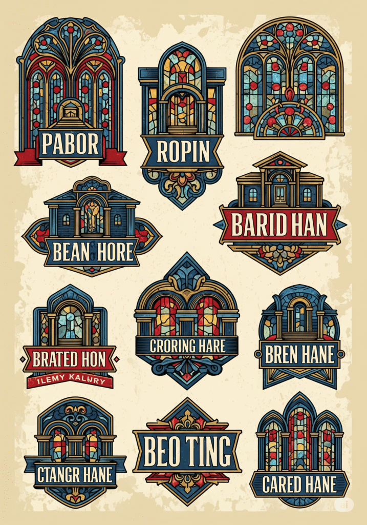
An emblem logo is a design where text, symbols, and shapes are all integrated into a unified frame or seal. The design is often contained within a circle, shield, crest, or badge.
It’s not “symbol + wordmark.” It’s all-in-one, baby.
Famous Examples:
-
Starbucks (That circular seal wraps it all up.)
-
Harley-Davidson (The winged shield? Iconic.)
-
BMW (Classic, clean emblem style.)
-
Harvard University (If it has Latin, it’s probably an emblem.)
🧭 Why Use an Emblem Logo?
Emblems scream credibility and legacy. Whether you’re a craft brewery, a sports team, or a school, emblems say “We’ve been around. We’re not messing around.”
Perfect for:
-
Schools & universities
-
Sports teams & clubs
-
Automotive brands
-
Coffee shops & craft products
-
Law firms & financial institutions
📚 Emblem Logo Advantages
✅ Strong Visual Identity
Everything lives in one tight unit—great for patches, stamps, stickers, and merch.
✅ Instant Heritage Feel
They suggest tradition, authority, and story. Even if you started last week.
✅ High Recognition
They’re dense, but when done well, they’re memorable from a mile away.
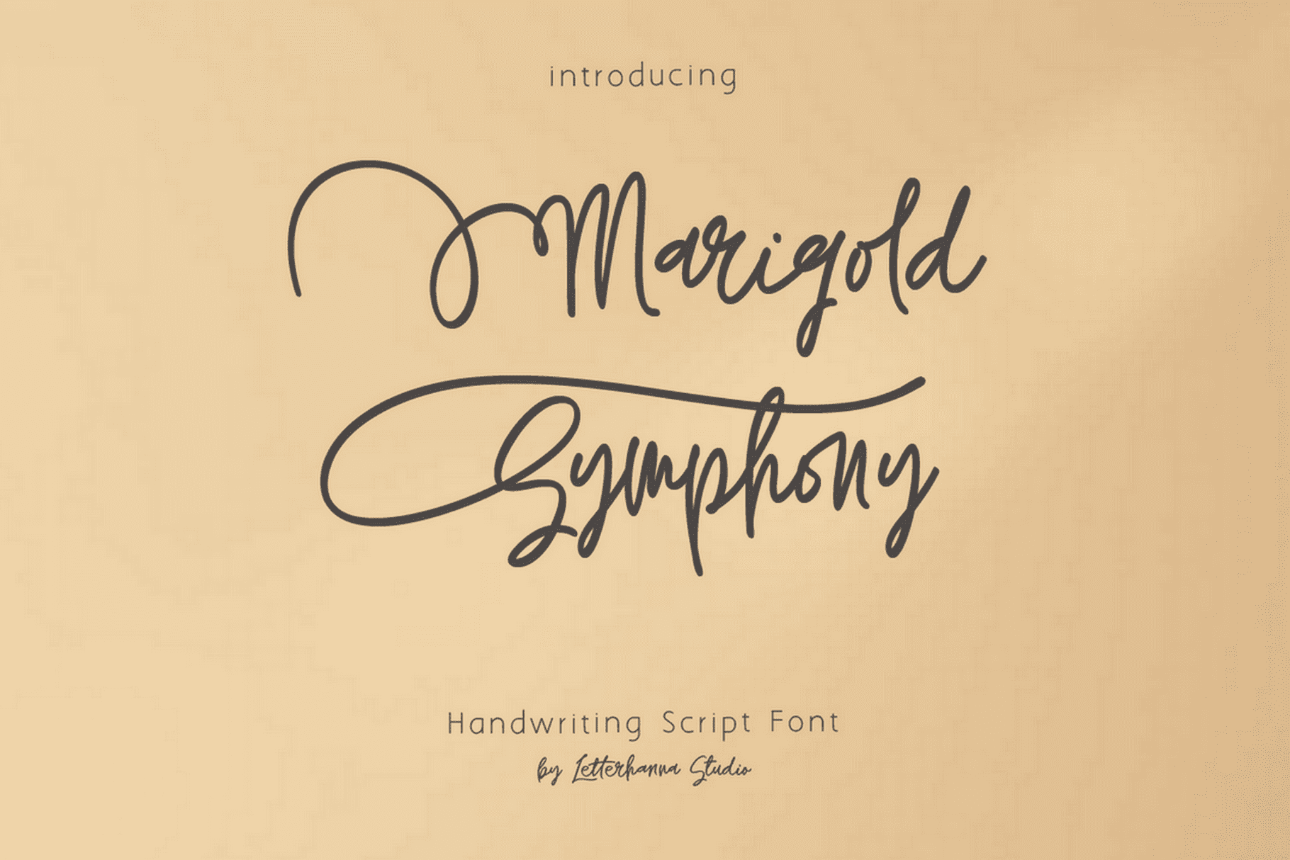
Try out and download our best font for free 👀


⚠️ Emblem Pitfalls to Avoid
❌ Over-Detailing
If it looks like a medieval coat of arms on a smartphone, scale it back.
❌ Bad Scalability
Because emblems are intricate, they can suffer at small sizes. Always test your logo in both large and tiny formats.
❌ Typography Chaos
Cramming too much text into a badge shape leads to a clutter-fest.
🛠️ How to Design a Modern Emblem Logo
Here’s how to make your emblem logo roar like a lion, not squeak like a hamster:
1. Start With a Shape
Shield, circle, badge—choose a frame that suits your vibe.
2. Combine Type and Symbol Creatively
Think of your name, year founded, iconography. Blend them with intention.
3. Keep It Balanced
Symmetry is your friend. Emblems rely on harmony.
Side Note : Promote & earn with Letterhanna’s affiliate program.

4. Modernize the Classic
Use clean lines, flat colors, and smart spacing to avoid looking dated.
🔁 Emblem + Minimalism?
Yes, you CAN modernize emblems! Many designers now create minimal emblems—flat, geometric versions that keep the traditional feel without the Renaissance flair.
Think Warner Bros. updated shield, or Stella Artois’ cleaner badge variations.
💡 Pro Tip:
Try mocking your emblem onto a coffee cup, notebook, or t-shirt. Emblems love merch. That’s their natural habitat.
🔍 Unique Fact of the Day
The Starbucks emblem evolved from a 16th-century Norse woodcut of a twin-tailed siren. Over the years, it’s been simplified from a detailed mythical creature to the modern, clean green goddess we sip today.
Yes, your overpriced latte has logo lore.
🧠 Key Takeaway
Emblem logos are perfect for brands that want to build legacy, authority, or just look like they’ve been around since the dawn of time (even if they launched last week on Shopify).
They may be traditional, but they’re not stuck in the past—especially when given a modern twist.
Here Are Some Fonts You Might Love! 👀