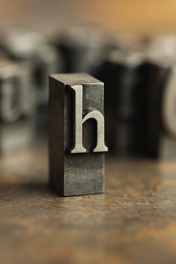
Some letters demand attention (cough g), while others carry the show behind the scenes. Meet ‘h’, the dependable backbone of words like hello, hero, and harmony. It may not flaunt loops or flamboyant tails, but its strong form and rich history make it a foundational character in the world of typography.
Let’s dive into its past, examine its design, and uncover why this vertical marvel deserves your typographic affection.
A Historical Hello to ‘h’
The story of ‘h’ dates back to the Phoenician letter “heth”, which symbolized a fence. Visually, it looked more like a ladder than a modern ‘h’. As alphabets evolved:
-
The Greeks turned it into eta (Η, η), which gradually shifted in use from a consonant to a vowel (fun fact: language evolves just like fashion).
-
The Etruscans and Romans preserved its basic form but adapted the pronunciation.
-
In Latin, ‘H’ was used for a breathy aspirated sound, just like in home. Interestingly, this sound faded in Classical Latin, which made ‘h’ somewhat of a “ghost letter” in certain Latin words.
Fast forward to Old English and Middle English, and ‘h’ regained its status as a crucial consonant — especially when paired with other letters, like in sh, th, and ch.
The Design of ‘h’
Unlike the split personality of ‘g’ or the flamboyance of ‘y’, the lowercase h is structurally grounded and confidently upright.
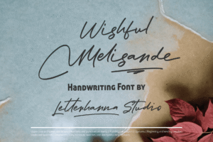
Try out and download our best font for free 👀


-
Single-stemmed and proud, ‘h’ consists of two basic parts:
-
Stem: A vertical stroke, aligned with similar letters like l, k, and b.
-
Shoulder: A graceful arching stroke that rises and curves into the right side.
-
Its form embodies both strength and balance. In a typeface, ‘h’ is a measuring stick. Designers often use it to define vertical rhythm and x-height. If the x-height is off in ‘h’, the entire alphabet might feel wobbly.
In script and calligraphic styles, the shoulder of ‘h’ can take on elegant loops or flicks, giving the letter expressive flair without losing its structural integrity.
Crafting the Letter ‘h’ in Typeface Design
Designing ‘h’ is a rite of passage for every type designer. Here’s a step-by-step breakdown of how it’s typically constructed:
-
Begin with the stem: This should be straight and stable — it’s the pillar of the character.
-
Set the x-height: This is the horizontal line where the shoulder ends — crucial for keeping the typeface rhythm consistent.
-
Draw the shoulder: It can be narrow or wide, round or sharp, depending on your font’s tone (serif vs sans-serif, playful vs serious).
-
Spacing matters: The counter (space inside the shoulder) must be open and airy to prevent a cramped look, especially in smaller sizes.
Fun bonus: If you’re making a monospaced font, designing a balanced ‘h’ with equal-width constraints is extra tricky. But also extra satisfying.
Side Note : Promote & earn with Letterhanna’s affiliate program.

The Role of ‘h’ in Ligatures and Pairs
The letter h often works in tandem with others:
-
th, ch, sh: These digraphs represent completely different sounds than the letters do alone. Typography often merges them into ligatures in stylized fonts.
-
‘fh’ and ‘lh’: Though less common, these pairs appear in certain Gaelic typefaces with their own unique ligature styles.
Despite being structurally plain, ‘h’ plays a flexible role in letter relationships, morphing into countless sounds and expressions.
Unique Fact of the Day
💡 In Old English, the sound of ‘h’ had three different pronunciations, depending on placement:
-
At the beginning of a word: a breathy aspirate (like “hat”).
-
After a back vowel: like the ch in loch.
-
After a front vowel: like a guttural sound, almost like the German ich.
So, the humble ‘h’ has worn many sonic disguises over the centuries — from whisper to growl.
Why ‘h’ Matters in Typography
Designers adore ‘h’ because it reveals so much about a font:
-
Its proportions help set the mood: is the font upright and serious, or quirky and curved?
-
Its spacing gives insight into rhythm and readability.
-
It’s also one of the first lowercase letters written when testing a new font. Why? Because it combines vertical and curved elements — a perfect preview of a typeface’s DNA.
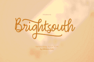
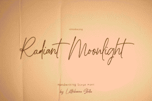
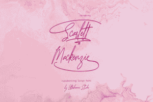
Here Are Some Fonts You Might Love! 👀