Welcome back to our design trend series! On Day 6, we’re peeling back the layers—literally—with a style that quietly snuck onto the design scene, brought softness back to interfaces, and divided the design community faster than you can say “drop shadow.” Say hello to Neumorphism, or as some like to call it, Soft UI.
Let’s dive into the dreamy, pillowy world of Neumorphism and see why it became such a visual sensation (and UX debate starter).
What is Neumorphism?
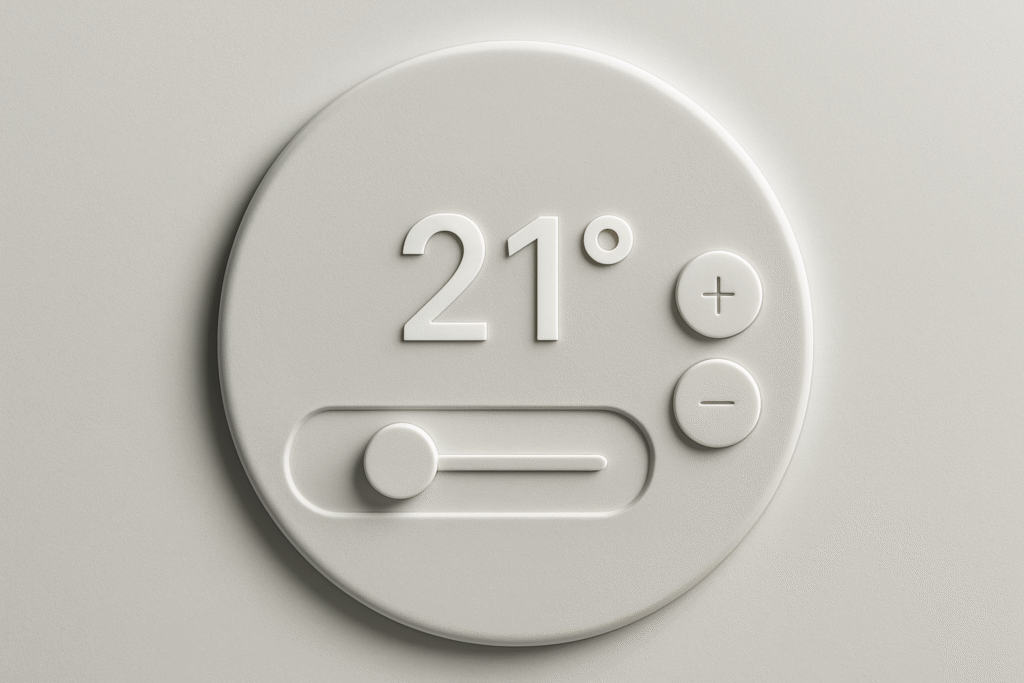
Neumorphism is short for “New Skeuomorphism.” It reimagines the shadows and highlights used in the old days of real-world mimicry (like a calculator app that looked like a real calculator), but with a modern, minimal twist.
Imagine this: a soft, monochromatic background where buttons and cards look like they’re being gently pushed in or popped out of the surface—like clay impressions. Neumorphism focuses on subtle depth, low contrast, and a visual language that feels incredibly tactile.
It’s clean, futuristic, and soothing… unless you’re trying to design a highly accessible interface (more on that soon).
A Bit of Background: Where Did Neumorphism Come From?
The term gained traction around late 2019 to early 2020 when designer Alexander Plyuto shared some concept UI work on Dribbble that quickly went viral. People were fascinated by how “real” everything looked without using any photos or textures—just light, shadow, and elegant shapes.
Try out and download our best font for free 👀


Soon after, designers started experimenting with this style across UI kits, dashboards, login forms, and mobile apps. It became the darling of Behance and Dribbble portfolios for a while. But, like every fashion trend, the honeymoon phase didn’t last forever.
Key Features of Neumorphic Design
Let’s break it down into its signature components:
-
Soft Shadows (Both Light & Dark): Elements have shadows going in two directions—light shadow from one side and a dark shadow from the other—creating an embossed or debossed effect.
-
Monochrome or Subtle Gradients: Usually based on a single pastel or neutral tone (grey, beige, soft blue).
-
Minimal Color Contrast: The elements blend into the background rather than stand out sharply.
-
Rounded Corners & Smooth Edges: Giving the UI a friendly, modern, and very “huggable” look.
-
3D-Like Visuals: Without any actual 3D rendering, everything feels tangible.
-
Flat Meets Realism: It’s like flat design with just a little extra oomph.
Pros of Neumorphism
Despite its criticisms, Neumorphism did bring a few lovely things to the design table:
-
Aesthetic Appeal – There’s no denying it: Neumorphism looks modern, stylish, and clean when done well.
-
Freshness – It offered a fresh alternative to flat design, which had been dominating for years.
-
Great for Minimal Interfaces – Neumorphism shines in environments where visual complexity isn’t needed, like smart home apps or digital dashboards.
The Downsides (Let’s Be Real)
Alright, time for the roast.
-
Accessibility Issues: With such low contrast, buttons can be invisible to users with vision impairments or in poor lighting.
-
Overuse of Shadows: If you’re not careful, it can become a soft, fluffy mess with no visual hierarchy.
-
Lack of Flexibility: Neumorphism doesn’t work well with colorful or dynamic content—it thrives in static, monotone systems.
-
Hard to Scale: Try designing a full-fledged e-commerce site in pure Neumorphism. Good luck making those CTA buttons stand out.
This is why most Neumorphism implementations are either concept-only or used in small, contained components.
Side Note : Promote & earn with Letterhanna’s affiliate program.

Where Neumorphism is Used Today
Despite the drawbacks, Neumorphism hasn’t vanished. It’s evolved—often being blended with other styles like minimalism, glassmorphism, or even flat design to create hybrid interfaces.
Popular uses include:
-
Smart home controls
-
Music player apps
-
Portfolio websites
-
Finance dashboards
Designers often use neumorphic elements sparingly—one or two soft cards within a more robust design system.
Design Tip: How to Use Neumorphism Effectively
If you want to add a touch of Neumorphism without making your whole interface feel like it’s floating in a marshmallow pit, try this:
-
Use it for non-critical UI elements: cards, stats, avatars, etc.
-
Always check your contrast ratios. WCAG standards exist for a reason!
-
Combine it with flat UI styles to keep things readable and interactive.
-
Don’t rely on Neumorphism for buttons unless you provide backup visual cues.
Fun Fact of the Day
Neumorphism became so popular so fast that Figma, Adobe XD, and even CSS generators were flooded with “neumorphic” UI kits within weeks of its rise. Some of them were downloaded over 100,000 times—proving once again that design trends are the fastest-moving fashion statements of the internet.
Neumorphism may not have taken over the world, but it left a soft, pillowy footprint on the design landscape. And in the right hands, it still feels fresh and modern today.
Here Are Some Fonts You Might Love! 👀


