If 2016–2020 was the era of refinement, then 2011–2015 was the disruption phase. Digital design shifted dramatically, moving away from realism toward simplicity and usability. Flat design didn’t just arrive—it stormed in, kicked over the bookshelf, and changed everything.
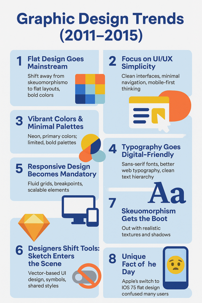
📱 1. Flat Design Goes Mainstream
The early 2010s brought a rejection of skeuomorphism—the style that mimicked real-world textures (wood, leather, shadows). Apple’s shift from iOS 6 to iOS 7 in 2013 was the watershed moment. Suddenly, icons were flat, colors were bold, and gradients were exiled.
Why it mattered:
-
Flat design prioritized clarity and speed
-
It was easier to scale across responsive devices
-
It looked “modern” and digital-native
Popularized by: Microsoft’s Metro UI and Apple’s iOS 7. Google soon followed with Material Design in 2014 (but that’s more next article).
🎯 2. Focus on UI/UX Simplicity
As mobile apps boomed, user experience became the center of attention. Designers trimmed the fat from interfaces, removing clutter in favor of clean navigation and touch-friendly elements.
Key trends:
-
Larger buttons
-
Minimal menus
-
Icon-based navigation
-
Mobile-first mindset
Tools like Sketch (launched in 2010) gained traction as designers ditched Photoshop for digital-focused UI work.
Try out and download our best font for free 👀


🎨 3. Vibrant Colors & Minimal Palettes
This era loved two extremes:
-
Bright, punchy neons and primary colors (think Windows 8)
-
Or ultra-minimal color schemes (black, white, grey + 1 accent color)
Color wasn’t just for decoration—it was used for hierarchy, feedback, and accessibility.
✍️ 4. Typography Goes Digital-Friendly
Web typography got a serious glow-up in this era:
-
Web-safe fonts evolved to include open-source options like Google Fonts.
-
Sans-serif fonts ruled: Helvetica, Open Sans, Lato, and Roboto were in every designer’s toolbox.
-
Designers used font weight and size creatively to guide user flow—bold headlines, clean body text.
It wasn’t fancy, but it was functional and consistent.
💡 5. Responsive Design Becomes Mandatory
The age of one-size-fits-all websites was over. Enter: responsive design. With the iPhone, iPad, and countless Android devices flooding the market, designers had to think in fluid grids, breakpoints, and scalable elements.
Milestones:
Side Note : Promote & earn with Letterhanna’s affiliate program.

-
2010: Ethan Marcotte coins “responsive web design”
-
2011–2015: Every respectable site goes mobile-friendly or dies trying
🧰 6. Designers Shift Tools: Sketch Enters the Scene
Photoshop was great for photo editing. But for UI? It was… clunky. Enter Sketch, a vector-based tool tailored for interface and web design. By 2015, Sketch had become the go-to app for digital designers.
Why it changed the game:
-
Symbols and shared styles
-
Pixel-perfect precision
-
UI kits galore
🖌️ 7. Skeuomorphism Gets the Boot
Remember leather-bound calendar apps and felt-textured Game Centers? Yeah, Apple does too—and regrets it.
From 2013 onward, skeuomorphism was no longer considered “classy.” It was… cringe. Designers embraced flat shapes, simple icons, and clean surfaces.
Fun twist: That old leather calendar? It was actually based on the one in Steve Jobs’s yacht.
🤯 Unique Fact of the Day
When Apple launched iOS 7 with flat icons, it reportedly confused millions of users. The visual leap was so dramatic that many thought their phones had a bug. It sparked hundreds of memes—and a few app redesigns in panic.
🎨 Creative Challenge
Design a mock app dashboard using flat design principles:
-
No gradients, no shadows
-
Use bold color blocks
-
Stick to two fonts max
-
Keep spacing tight but readable
Extra credit: make it responsive across mobile, tablet, and desktop mockups.