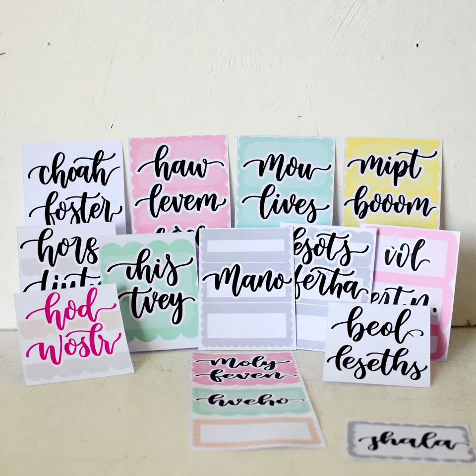
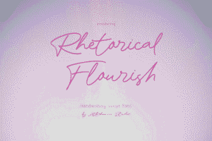
Picture this: A planner enthusiast scrolling through Etsy at midnight, coffee in hand, searching for that perfect sticker set. They pause. Something catches their eye. It’s not just the design—it’s the handwriting. That casual, authentic script that looks like it was penned by a creative friend. Within seconds, they’re clicking “Add to Cart.”
This scenario plays out thousands of times daily on Etsy, and successful sticker shop owners know the secret ingredient: the right handwriting fonts for planner stickers can transform a decent product into an irresistible bestseller.
Why Typography Makes or Breaks Planner Stickers
The planner community isn’t just passionate—they’re borderline obsessive about aesthetics. These dedicated organizers spend hours curating the perfect layouts, color schemes, and sticker combinations. When a sticker’s font feels off, even slightly, it disrupts their entire vision.
Sarah, a top-selling Etsy sticker maker with over 50,000 sales, learned this lesson the hard way. Her first sticker collection used generic system fonts. Sales were sluggish. After switching to carefully selected Etsy sticker fonts that mimicked natural handwriting, her conversion rate jumped 340% within two months. The designs stayed the same. The colors remained unchanged. Only the typography shifted—and everything changed.
The Psychology Behind Handwriting Font Success
Human brains process handwritten text differently than typed text. Researchers have found that handwritten-style content feels more personal, trustworthy, and memorable. For planner addicts who view their planners as extensions of their personalities, this psychological connection matters immensely.
Sticker making fonts that replicate authentic handwriting trigger emotional responses. They evoke feelings of receiving a handwritten note from a friend, creating intimacy between the product and the buyer. This emotional connection translates directly into sales, reviews, and repeat customers.
Essential Categories of Handwriting Fonts for Sticker Success
Casual Script Fonts
These are the workhorses of planner sticker design. Casual scripts balance readability with personality—crucial for functional stickers like habit trackers, to-do lists, and appointment reminders. The best planner fonts download options in this category feature slight imperfections that make them feel genuinely hand-drawn rather than artificially generated.
Popular characteristics include varied letter heights, natural spacing inconsistencies, and organic stroke weights. These subtle irregularities convince the eye that a real person crafted each letter.
Bouncy Handwriting Fonts
Bouncy fonts feature letters that dance along the baseline, creating dynamic, energetic compositions. These bullet journal fonts work exceptionally well for motivational quotes, weekend banners, and celebration stickers. The playful movement adds visual interest without sacrificing legibility.
Successful Etsy sellers often reserve bouncy fonts for larger text elements where the letterforms have room to shine. Pairing them with simpler fonts for smaller text creates professional hierarchy while maintaining that coveted handmade aesthetic.
Brush Lettering Styles
Brush lettering fonts simulate the look of marker or brush pen calligraphy. These digital planner fonts command attention and work beautifully for headers, month names, and special occasion stickers. The thick-to-thin stroke variation adds sophistication while maintaining approachability.
The key with brush styles is authenticity. Digital planners and printable planners both benefit from brush fonts that show realistic texture and natural flow rather than overly perfect vector shapes.
Neat Print Handwriting
Not every planner owner loves cursive. Many prefer the clean, organized look of printed handwriting—the kind teachers praised in elementary school. These printable planner fonts excel for functional stickers where clarity trumps decorative flair.
Neat print styles are particularly popular among minimalist planners, students, and professionals who want organization without excessive embellishment. They’re also easier to read at smaller sizes, making them perfect for tiny stickers and detailed layouts.
Whimsical and Quirky Fonts
For planner addicts who embrace maximalism and vibrant aesthetics, whimsical bujo handwriting fonts deliver personality by the bucketload. These fonts feature unexpected details: extra flourishes, unconventional letter shapes, or playful inconsistencies that make designs memorable.
These fonts perform exceptionally well in niche markets: kawaii planners, art journaling supplies, creative business planners, and themed collections. They help sticker shops establish distinctive brand identities that loyal customers recognize instantly.
How Top Etsy Sellers Choose Their Typography
Successful sticker shop owners don’t randomly select fonts—they follow strategic principles that maximize appeal and functionality.
Testing for Readability
Before committing to any font, smart sellers test readability at various sizes. A gorgeous script that becomes illegible at 0.5 inches tall won’t work for many sticker applications. Creating sample sheets and printing them at actual size reveals whether a font truly works.
Many Etsy sticker fonts that look beautiful on screen become muddy or lose detail when printed. This testing phase saves countless headaches and refund requests down the line.
Considering the Target Audience
Different planner communities have distinct aesthetic preferences. Academic planners gravitate toward neat, organized typography. Creative planners embrace artistic irregularity. Bullet journal enthusiasts often prefer fonts that look hand-lettered since many bullet journalers do their own lettering.
Understanding the target customer’s taste influences font selection more than personal preferences. This customer-first approach separates thriving shops from struggling ones.
Building a Cohesive Font Library
Rather than using different fonts for every product, successful sellers curate signature font collections that create brand consistency. They might have one primary script for body text, one bold option for headers, and one playful accent font—using these consistently across products.
This approach makes design work faster while building brand recognition. Customers begin associating specific planner supplies fonts with particular shops, increasing loyalty and word-of-mouth recommendations.
Legal Considerations Every Seller Must Know
Here’s where many new sellers stumble: not all fonts are licensed for commercial use. Using an unlicensed font in products sold on Etsy violates copyright law and can result in shop suspension or legal action.
Before downloading any planner addict fonts, sellers must verify the license terms. Some fonts are free for personal use but require purchasing a commercial license. Others are completely free for commercial projects. Still others prohibit use in digital products entirely.
Reputable font marketplaces clearly display license information. When uncertain, contacting the font creator directly clarifies usage rights. This due diligence protects businesses from devastating takedown notices or lawsuits.
Many professional sticker makers invest in premium font bundles that include extended commercial licenses. While the upfront cost seems significant, it provides legal protection and access to higher-quality typography that free alternatives rarely match.
Pairing Fonts for Professional Results
Using multiple fonts in a single design requires finesse. The wrong combinations create visual chaos; the right pairings elevate designs from amateur to professional.
The classic approach pairs a decorative script with a simple sans-serif or clean print font. The script handles attention-grabbing elements while the simpler font ensures readability for functional text. This contrast creates visual hierarchy that guides the viewer’s eye naturally.
Another successful strategy combines fonts with similar “personalities” but different styles. For example, pairing a bouncy script with a playful print font maintains consistent energy while providing contrast through structure.
What doesn’t work? Combining two ornate scripts or using fonts that clash stylistically. When every element competes for attention, nothing stands out. Professional designers typically limit designs to two or three fonts maximum.
Staying Current with Font Trends
The planner community evolves rapidly. Fonts that dominated Etsy searches two years ago may feel dated today. Staying relevant requires awareness of current trends without abandoning timeless classics.
Recent trends favor authenticity over perfection. Fonts with visible texture, irregular baselines, and organic inconsistencies outperform overly polished options. This shift reflects broader cultural movements toward authenticity and handmade aesthetics.
Retro revival fonts—especially those evoking 1960s-70s handwriting or 1990s nostalgia—have surged in popularity. These styles tap into emotional nostalgia while feeling fresh to younger planners discovering them for the first time.
Monoline scripts (uniform stroke weight throughout) are gaining traction in minimalist and modern planning circles. Their clean simplicity pairs beautifully with the stripped-down aesthetic many organizers now prefer.
Technical Tips for Using Handwriting Fonts
Even perfect fonts can look amateurish without proper technical execution. Professional results require attention to spacing, sizing, and formatting details.
Letter Spacing Adjustments
Many handwriting fonts need custom letter spacing (tracking) adjustments. Default spacing often feels too tight or too loose. Taking time to adjust spacing for each text element makes enormous visual impact.
For script fonts, slight negative tracking often improves flow and connectivity. For print fonts, neutral to slightly positive tracking enhances readability.
Size Hierarchy Matters
Establishing clear size differences between headers, subheaders, and body text creates professional polish. Timid size variations make designs feel flat; bold contrasts add dynamism and clarity.
A good rule: headers should be at least 1.5-2 times larger than body text, with subheaders falling proportionally between them.
Color and Contrast
The most beautiful font becomes useless if users can’t read it. Ensuring sufficient contrast between text and background prevents eye strain and frustration. This consideration matters especially for functional stickers that users read frequently.
Testing designs in grayscale reveals whether contrast is adequate. If text disappears or becomes difficult to read without color, adjustments are necessary.
Where to Find Quality Handwriting Fonts
The internet overflows with font resources, but quality varies dramatically. Knowing where to look saves time and ensures legal, high-quality results.
Creative Market and Design Cuts offer curated collections of premium fonts with clear commercial licensing. While not free, the quality and legal clarity justify the investment for serious sellers.
Google Fonts provides free, commercially-licensed options, though handwriting selections are limited compared to script or serif categories. For beginners testing the waters, these risk-free options provide solid starting points.
Font Bundles frequently offers massive collections at steep discounts. These bundles provide extensive libraries for relatively modest investments, ideal for sellers wanting variety and flexibility.
DaFont and similar free repositories require careful license checking. While gems exist among the offerings, many fonts have unclear or restricted commercial licenses. Extra diligence prevents legal headaches.
Measuring Font Performance in Your Shop
Data-driven decisions separate guesswork from strategy. Tracking which fonts correlate with higher sales and better customer feedback guides future design choices.
Monitoring which product listings receive the most favorites, views, and purchases reveals font preferences among the target audience. If stickers featuring a particular script consistently outperform others, that font deserves prominent placement in new designs.
Customer reviews occasionally mention typography specifically. Comments like “love the handwriting style” or “the font is so cute” validate font choices and suggest directions for future products.
A/B testing different font options for similar sticker designs provides concrete performance data. Creating two versions of a popular sticker—identical except for typography—reveals which font resonates more strongly with customers.
Building a Signature Font Style
While variety matters, developing a recognizable typographic voice helps shops stand out in Etsy’s crowded marketplace. Customers begin recognizing products before even seeing the shop name.
This doesn’t mean using only one font forever. Rather, it means establishing a consistent aesthetic approach—perhaps favoring organic imperfection over mechanical precision, or leaning toward elegant scripts rather than casual print.
Over time, this consistency becomes brand equity. Loyal customers actively seek out new releases because they trust the aesthetic quality. New customers attracted by one product often purchase multiple items because the cohesive style appeals to them.
The Future of Handwriting Fonts in Planner Stickers
As AI and digital tools advance, truly unique handwriting fonts will become even more valuable. Fonts created by human letterers—especially those with distinctive personalities—will stand out against algorithmically generated alternatives.
The planner community’s emphasis on authenticity suggests that perfectly imperfect fonts will continue dominating preferences. Fonts showing natural variation, organic texture, and human touch will outperform sterile, mathematically perfect alternatives.
Customizable and variable fonts are emerging technologies that may revolutionize sticker design. These fonts allow designers to adjust weight, slant, and other characteristics within a single font file, providing unprecedented flexibility.
Taking Action: Choosing Your Next Font
For sellers ready to upgrade their typography, the process begins with self-assessment. Which current products perform best? What do those successful designs have in common typographically? What gaps exist in the current product line that new fonts could fill?
Starting with one or two high-quality fonts rather than downloading dozens prevents overwhelm and decision paralysis. Mastering a small collection produces better results than superficially using many fonts.
The investment in quality typography pays dividends across every aspect of an Etsy sticker business. Better fonts attract more customers, generate higher conversion rates, reduce refund requests, and build lasting brand recognition.
The most successful sticker shops didn’t stumble into the right fonts accidentally. They studied their markets, invested in quality resources, tested relentlessly, and refined continuously. This intentional approach to typography transforms casual side hustles into thriving businesses.
Every planner sticker that sells represents someone trusting a shop to enhance their daily organization ritual. When typography feels right—when it speaks to that customer’s aesthetic sensibilities and functional needs—it creates satisfaction that transcends the transaction. It builds relationships, encourages reviews, and generates word-of-mouth marketing that money can’t buy.
The right handwriting fonts don’t just make stickers sell. They create connections, inspire creativity, and help people bring beauty into their everyday lives. And that’s worth far more than any sales graph could measure.

