From jaw-dropping photography to charming illustrations and punchy icons, imagery is the part of your design that grabs people before they even know what it’s about. If typography whispers the message, imagery yells it across the street (politely, of course).
So let’s get visual!
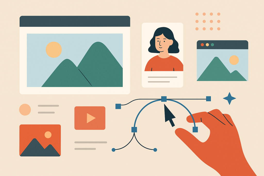
📸 What Counts as Imagery?
Imagery includes:
-
Photos (stock, original, product shots)
-
Illustrations (hand-drawn, vector, 3D, etc.)
-
Icons & Symbols
-
Textures & Patterns
-
Infographics & Data Visuals
Basically, anything that isn’t text qualifies. But here’s the kicker: not all images are created equal.
Try out and download our best font for free 👀


🎯 Why Imagery Matters
-
Sets the tone: A moody black-and-white photo vs. a playful cartoon completely changes perception.
-
Enhances communication: Especially when explaining abstract or complex ideas.
-
Increases retention: People remember 65% of visual info 3 days later vs. only 10% of text.
-
Engages emotions: The right image connects to viewers on a gut level.
-
Breaks monotony: A wall of text without visuals is a digital sedative.
🔍 Choosing the Right Image
Don’t just slap a photo into your layout because there’s empty space. You need images with:
1. Relevance
-
Every image should have a purpose. If it doesn’t enhance the message, delete it.
2. Consistency
-
Keep a consistent style (color tone, lighting, format). Mismatched visuals = chaotic vibes.
3. Authenticity
-
Skip cliché stock photos (handshake in front of a skyline, we’re looking at you). Look for images that feel genuine, or better yet—create your own.
4. Quality
-
Resolution matters. Grainy, pixelated images will tank your credibility. Aim for 300 DPI for print, 72 DPI for web.
🧑🎨 Photography vs Illustration: What’s the Difference?
Photography
-
Feels realistic, grounded
-
Great for products, people, events
-
Can be expensive or require gear
Illustration
-
Offers flexibility and control
-
Ideal for abstract ideas, brand storytelling, or when photography isn’t practical
-
Comes in many styles (flat, isometric, 3D, hand-drawn)
Pro tip: Combining both can work wonders—but only if they harmonize stylistically.
Side Note : Promote & earn with Letterhanna’s affiliate program.

🛠️ Editing & Enhancing Visuals
You don’t always need to use images as-is. Here’s how to elevate them:
-
Crop with purpose (think about the focal point)
-
Adjust brightness/contrast for clarity
-
Apply filters to unify aesthetics
-
Use overlays (a tinted color block) to make text readable over photos
-
Masking to blend or create dynamic shapes
Tools like Photoshop, Canva, or Figma let you tweak images without needing a photography degree.
🧩 Icons, Textures & Patterns: The Spice of Design
Icons
-
Minimal, symbolic graphics to represent actions or ideas.
-
Use icon libraries like Feather, FontAwesome, or Heroicons.
-
Keep the stroke weight and style consistent!
Textures & Patterns
-
Can add depth and tactility.
-
Subtle is key—grunge textures, noise, gradients, or repeating motifs.
-
Use sparingly to avoid sensory overload.
🧠 Unique Fact of the Day
NASA photos were once hand-retouched. Before digital editing, NASA’s moon landing photos were manually edited using paintbrushes and dyes. Yes, someone literally painted over cosmic dust. That’s dedication.
Also, the infamous “Distracted Boyfriend” meme? It’s from a stock photo shoot, and the model’s name is Mario. He became accidentally iconic—proving that even the most generic imagery can become unforgettable with the right (or wrong) context.
Here Are Some Fonts You Might Love! 👀