Irregular letterforms are supposed to hide spacing problems, right? They don’t. They do the opposite.
The Myth
The logic sounds reasonable on the surface: handwriting is already irregular, already imperfect, already organic — so uneven spacing between letters will just blend into all that natural variation and disappear. Nobody notices bad kerning in a handwriting font because the whole aesthetic is already a little rough. Kerning is for the uptight world of serif and sans-serif type. Handwriting fonts can skip it.
This myth is wrong in almost every particular, and it leads to fonts that look unfinished in ways that undermine whatever authenticity the designer was trying to achieve. Bad kerning in a handwriting font doesn’t read as natural variation. It reads as bad kerning. The eye is quite good at distinguishing between the two — even without the viewer being consciously aware of what they’re seeing.
Why the Myth Persists
The confusion comes from conflating two different things: the organic irregularity of letterforms, and the spatial relationships between those letterforms.
Organic variation in letterforms — the slight differences in stroke angle, weight, rhythm, and shape from letter to letter — is a desirable quality in a handwriting font. It’s part of what makes the type feel human rather than mechanical. When designers and buyers talk about a handwriting font “looking natural,” this is often what they mean: that the letterforms don’t look like identical copies stamped out by a machine.
Spacing between letters is a different property entirely. The gap between an “A” and a “V” is not determined by the organic texture of the letterforms — it’s determined by the font’s spacing metrics: the advance widths, side bearings, and kerning values that tell the rendering engine where to position each glyph relative to the ones around it. Those values can be well-judged or poorly-judged independently of how beautiful or irregular the letterforms themselves are.
A handwriting font with organic, characterful letterforms and poor kerning looks like a handwriting font with poor kerning — not like natural handwriting. The irregularity people associate with real writing lives in the shapes of the letters. It does not live in randomly inconsistent gaps between unrelated letter pairs.
Try out and download our best font for free 👀


What Kerning Actually Does in a Handwriting Font
In a conventional text font, kerning adjusts the spacing between specific letter pairs that the default sidebearing metrics handle badly. The classic examples — “AV,” “To,” “WA,” “LT” — are pairs where the geometric shapes of adjacent letters create optical gaps that look much larger than the intended spacing, or occasional cases where letters crowd uncomfortably close.
In a handwriting font, the kerning problem is both similar and more complex.
It’s similar in that specific letter combinations will always produce spacing that looks wrong at the default metric values — this is a universal feature of typeface design, and handwriting fonts are not exempt.
It’s more complex for several reasons specific to the category.
Irregular outlines create more collision scenarios. A conventional serif lowercase “f” has a predictable top extension and a defined right-side profile. A handwriting “f” might have a loop, a swash, an irregular ink-spread at the stroke end, or a top that angles unexpectedly into the space where the next letter needs to sit. Every non-standard outline feature is a potential collision point with adjacent glyphs — and in a handwriting font, nearly every outline has non-standard features.
Side Note : Promote & earn with Letterhanna’s affiliate program.

Varied stroke angles produce more optically awkward gaps. In a well-constructed geometric sans-serif, the consistent stroke angles and predictable letterform geometry mean that the default side bearings handle most letter combinations reasonably well. In a handwriting font, letters lean at different angles, exit strokes go in unexpected directions, and the overall texture of the font is built on deliberate inconsistency. That deliberate inconsistency creates more situations where two adjacent letters produce a gap that looks optically wrong — either too wide or too tight — regardless of what the advance widths say.
The expectation of natural variation raises the stakes. In a geometric or transitional text font, readers expect regularity. Slightly mechanical spacing goes unnoticed because it matches the overall aesthetic register of the type. In a handwriting font, readers are primed to expect something organic and fluid. An awkward spacing gap or a collision between two letters breaks that expectation sharply — it signals “this is a font trying to look like handwriting” rather than “this is handwriting.” The tolerance for spacing errors is lower, not higher, in handwriting fonts.
The Scale of the Work
Kerning a typeface thoroughly is a significant undertaking for any font category. A full-featured Latin font might require hundreds of kerning pairs covering the combinations that optical judgment identifies as problematic. A font released for professional use typically goes through multiple rounds of kerning review, where the designer sets representative text samples in dozens of different combinations and hunts for gaps and collisions that need adjustment.
For handwriting fonts, this process doesn’t get shorter because the aesthetic is casual. If anything, the irregular outlines and varied stroke angles mean there are more problematic letter combinations to identify and address, not fewer.
Some handwriting font designers approach this by using kerning classes — grouping letters with similar left or right profiles so that kerning adjustments can be applied to families of similar shapes rather than individual pairs. This is efficient and sensible, but it still requires the designer to correctly identify which letters belong in which class based on the actual optical behavior of the specific font’s letterforms — which, in a handwriting font, is less predictable than in a geometric or humanist design.
There’s also the question of punctuation, numerals, and special characters. A handwriting font that kerns its lowercase letters carefully but ignores the spacing around quotation marks, hyphens, parentheses, and numerals will still produce bad-looking text in real-world use — because those characters appear constantly in actual text settings.
What Poor Kerning Does to a Handwriting Font
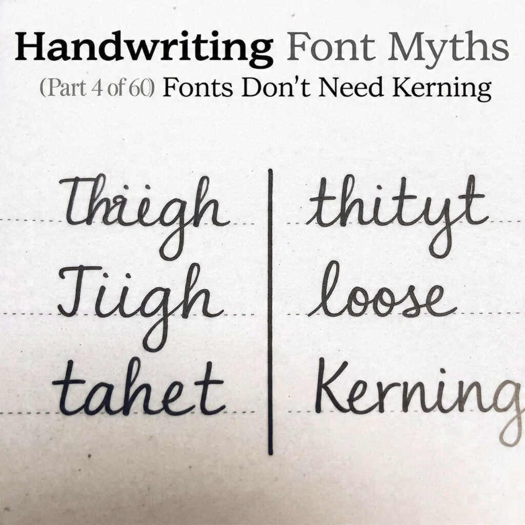
The visual effect of under-kerned handwriting fonts is recognizable once you know what to look for. Words develop uneven color — patches that look too open or too tight within the same word or line. Specific letter combinations stand out as obviously wrong: a “r” and “n” so close they read as an “m,” a capital letter with a slanted right side sitting next to a letter with a slanted left side and producing a white gap that looks like a missing character.
These problems don’t read as charming authenticity. They read as carelessness. And they undermine the entire premise of a handwriting font, which is to convince the viewer — even subconsciously — that what they’re looking at is closer to a human hand than to a mechanical process.
Here Are Some Fonts You Might Love! 👀