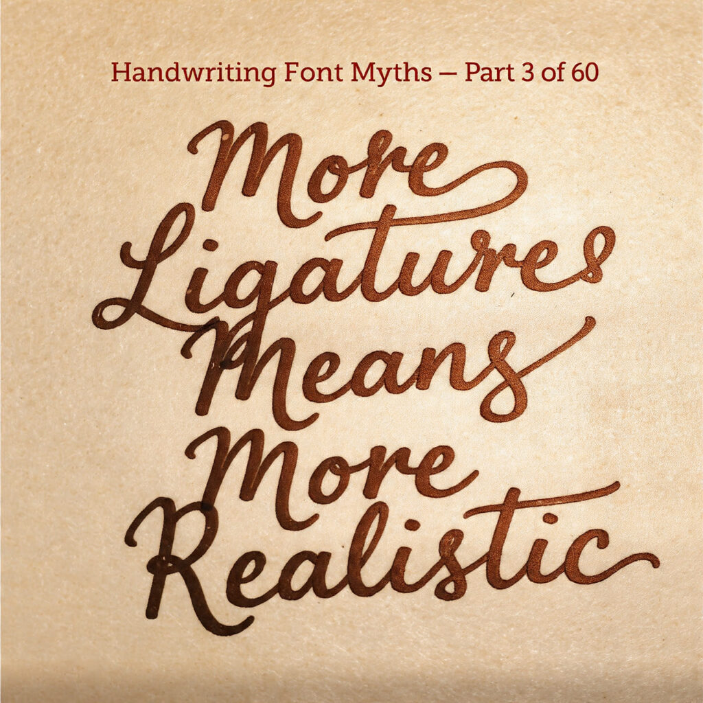
Stacking ligatures is the first thing designers try. It’s also one of the most misunderstood levers in the whole craft.
The Myth
There’s a moment that happens reliably when someone discovers OpenType ligatures in a handwriting font for the first time. They turn on every available feature — standard ligatures, discretionary ligatures, contextual alternates, swashes — and watch the font transform. Letters start connecting differently. Decorative loops appear. Words that looked mechanical suddenly look hand-drawn. It feels like unlocking the font’s true potential.
The conclusion that follows almost writes itself: more ligatures equal more realism. The more substitutions firing, the more the font behaves like actual handwriting. Pile on every available OpenType feature and the result will look the most authentic.
This logic is intuitive, and it’s wrong — or at least, it’s only occasionally right, and often produces the opposite of what’s intended. Understanding why requires a closer look at what ligatures actually do, what makes handwriting look real, and why those two things are not the same question.
A Quick Primer on Ligatures and OpenType Features
Before unpacking the myth, it helps to be clear about what these terms mean in practice.
A ligature in traditional typesetting is a single glyph that replaces two or more characters that would otherwise collide or look awkward when set side by side. The classic examples are “fi” and “fl” in serif text fonts, where the dot of the “i” or the top of the “l” would bump into the overhanging arm of the “f.” The ligature solves the collision with a single, purpose-drawn combined form.
In handwriting and script fonts, ligatures do something related but broader. They allow specific letter combinations to be replaced with forms that simulate the natural pen connections that would occur between those letters in real handwriting. An “ov” ligature might replace the separate “o” and “v” glyphs with a single flowing form where the exit stroke of the “o” curves naturally into the entrance of the “v.” The result looks less like two glyphs placed side by side and more like a single continuous pen movement.
Contextual alternates take this further. Instead of replacing fixed pairs, they substitute alternate glyphs based on context — what comes before, what comes after, where in a word the letter falls. A well-designed contextual alternate system might give a letter different forms depending on whether it appears at the start of a word, in the middle, or at the end — simulating the way handwriting naturally adjusts letterforms based on what the hand is doing at each point in a word.
Discretionary ligatures and swashes add decorative elements: extended flourishes, ornamental connections, stylistic variants that go beyond functional linking into purely aesthetic territory.
All of this is genuinely powerful. The question is what it does and doesn’t achieve.
Try out and download our best font for free 👀


What Ligatures Actually Solve
Ligatures in handwriting fonts primarily solve one problem: the mechanical regularity of glyph placement.
In a font without any ligature substitution, every letter is placed according to its advance width and side bearings. The “a” goes here, the “n” goes there, the spacing between them is a fixed value. This produces text that looks typeset — because it is typeset, in the most mechanical sense. The letters sit in their assigned positions like tiles in a grid, regardless of what’s beside them.
Real handwriting doesn’t work this way. The hand responds to the shape of the previous stroke, adjusting the starting position, angle, and form of the next letter. An “a” after a rounded letter like “o” starts differently than an “a” after an angular letter like “k.” The spacing breathes, compresses, and expands based on letter shapes and writing rhythm.
Ligatures and contextual alternates simulate this responsiveness. When the font substitutes an “ov” ligature, it’s not just joining two letters — it’s replacing a pair of mechanically-spaced glyphs with a single form that was specifically drawn to look like what happens when those two letters are written in sequence by hand. The result is a more convincing simulation of handwriting’s contextual fluidity.
This is real and valuable. But it’s solving a mechanical problem — the rigidity of fixed glyph spacing — not the deeper visual problem of what makes handwriting look human.
What Ligatures Don’t Solve (And Can’t)
Here’s the gap in the “more ligatures = more realistic” logic: the qualities that make handwriting look genuinely human go well beyond how letters connect.
Variation in letterforms. Real handwriting never produces the exact same glyph twice. The second “e” in “between” is not identical to the first. The “t” at the start of a word is slightly different from the “t” in the middle. This variation is part of what the eye reads as human — repetition of identical forms reads as mechanical, even when those forms are beautifully drawn and lavishly ligated.
Some advanced handwriting fonts address this with glyph alternates — multiple versions of each letter that rotate through as the font is set, preventing any single form from appearing twice in a row. This feature does more for perceived realism than almost any number of ligatures. A font with three alternates for each common letter and modest ligature support will almost always look more natural than a font with extensive ligatures but no glyph variation.
Baseline variation. Real handwriting doesn’t sit perfectly on a horizontal baseline. Letters drift slightly above and below the line. Words tilt. This organic quality is nearly impossible to simulate with standard font technology — baseline is controlled by the software, not the font — but its absence is one of the things that makes even well-ligated handwriting fonts look obviously typeset at close inspection.
Side Note : Promote & earn with Letterhanna’s affiliate program.

Stroke texture. The physical quality of ink on paper — the slight roughness, the pressure variations, the way ink pools at the start of a stroke and thins at the end — is not reproduced by smooth vector outlines. Some fonts address this by building texture into the glyph outlines themselves, creating slightly irregular stroke edges that simulate ink behavior. No amount of ligatures replaces this quality.
Rhythm. Handwriting has a temporal dimension that type cannot capture: the speed of the hand, the pauses between words, the momentum of a particularly flowing passage. Ligatures hint at this rhythm by creating connections that suggest continuous motion, but they can’t fully reproduce it.
When More Ligatures Actually Hurts
Beyond the limits of what ligatures can achieve, there’s a specific failure mode that comes from applying too many: visual congestion.
Every ligature substitution produces a form that was drawn for a specific context. When ligature systems are stacked — when contextual alternates, standard ligatures, discretionary ligatures, and swashes are all firing simultaneously — the result can be a text setting where too many things are happening at once. Connections that look graceful in isolation start competing with each other. Flourishes from adjacent glyphs collide or visually interfere. The overall texture becomes busy rather than fluid.
This is especially pronounced with swash variants and decorative alternates. Swashes are designed to be used selectively — at the beginning or end of a word or line, where a flourish has space to breathe. When swash forms appear throughout running text because every available feature is enabled, the flourishes pile up and the text becomes visually exhausting rather than elegantly handwritten.
There’s a useful analogy in music: dynamics. A piece that is uniformly loud is not more expressive than one with variation — it’s less expressive, because it has eliminated the contrast that makes emphasis meaningful. Ligatures work the same way. Used selectively, they create moments of flowing naturalness against a slightly more neutral baseline. Used everywhere, they lose their effect in the noise.
The Actual Drivers of Perceived Realism
Based on how handwriting recognition actually works — both cognitively and aesthetically — the features that most convincingly simulate real handwriting are roughly as follows, in approximate order of impact:
Glyph alternates that prevent identical repetition of letterforms within a word or nearby text. Even two or three alternates per character makes a significant difference.
Optical irregularity in stroke paths — slight imperfections in outline quality that suggest ink and paper rather than perfect digital vectors.
Natural stroke endings — the way a stroke starts and stops, which in real handwriting produces specific entry and exit shapes depending on tool and speed.
Contextually appropriate spacing — not just kerning, but the overall color and rhythm of the text block, which in handwriting varies in ways that fixed advance widths can only approximate.
Ligatures contribute to several of these by creating natural connections and avoiding mechanical glyph gaps. But they’re one tool among many, and often not the most powerful one.
Here Are Some Fonts You Might Love! 👀