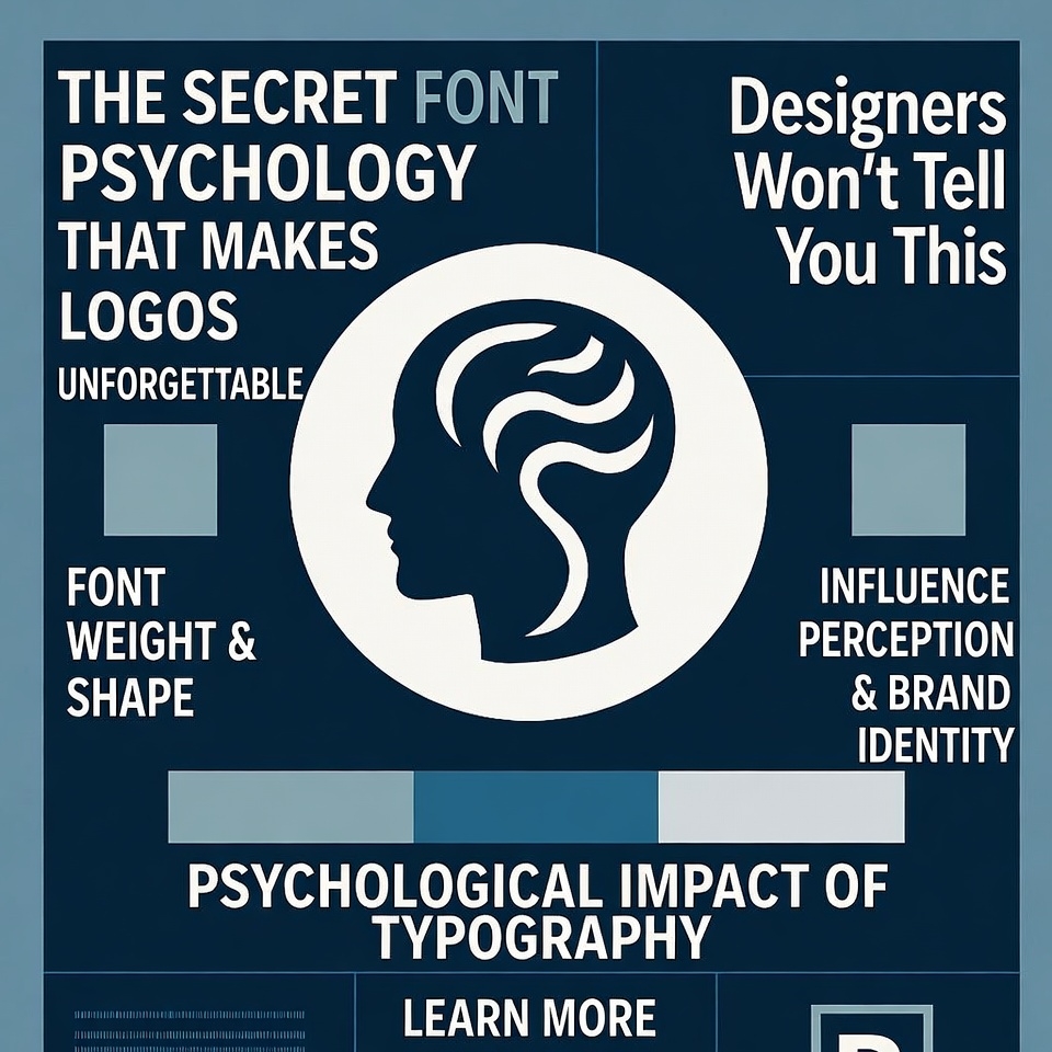
Ever wondered why you can instantly recognize a Coca-Cola logo from across the street? Or why certain brands feel trustworthy while others scream “cheap” before you even read the text? The answer isn’t magic—it’s font psychology, and it’s been hiding in plain sight this whole time.
Here’s something most designers won’t admit: choosing the right typeface isn’t about what looks pretty. It’s about manipulating human psychology to create instant emotional connections. And the techniques they use? They’re surprisingly simple once you know what to look for.
By the time you finish reading this article, you’ll never look at logos the same way again. You’ll spot the psychological tricks that billion-dollar brands use to burrow into your subconscious. And if you’re building a brand yourself, you’ll discover the font psychology secrets that separate forgettable logos from iconic ones.
Why Font Psychology in Logo Design Actually Matters More Than You Think
Before we dive into the secrets, let’s establish why font psychology for branding is such a game-changer. Studies show that people form opinions about a brand within 50 milliseconds of seeing its logo. That’s faster than a single heartbeat.
In that split second, your brain isn’t just reading words—it’s processing shapes, curves, weights, and spacing. Each element triggers specific psychological responses that have been hardwired into us through years of cultural conditioning and evolutionary psychology.
The best logo font choices aren’t arbitrary. They’re calculated decisions based on how typography affects consumer perception and influences buying behavior. When designers talk about “brand personality through typography,” they’re really discussing how to hack your brain’s pattern recognition system.
The Hidden Psychology Behind Different Font Styles and What They Really Communicate
Serif Fonts: The Trust Builders That Whisper “Tradition”
When you see serif fonts in logo design—those little decorative strokes at the ends of letters—your brain automatically associates them with reliability, heritage, and sophistication. There’s a reason why banks, law firms, and luxury brands gravitate toward serif typefaces.
Think about Times New Roman, Garamond, or Baskerville. These fonts carry centuries of typographic history. Newspapers used them, prestigious universities adopted them, and government documents featured them. Your subconscious mind has learned to connect these visual patterns with authority and credibility.
The psychology of typography in branding shows that serif fonts increase perceived trustworthiness by up to 18% in financial services. That’s not coincidence—it’s calculated emotional manipulation through typeface selection.
But here’s the twist: not all serifs are created equal. Modern serifs like Playfair Display communicate sophistication with a contemporary edge, while classic serifs like Garamond whisper old-money elegance. Understanding these subtle typeface personality traits separates amateur designers from masters.
Sans-Serif Fonts: The Modern Minimalists That Scream Innovation
Strip away those decorative elements, and you get sans-serif fonts—clean, modern, and brutally efficient. Helvetica, Arial, Futura—these are the typefaces of Silicon Valley, startups, and brands that want to project forward-thinking innovation.
The font choice impact on brand identity is massive here. Sans-serif typography tells your brain: “We’re cutting through the noise. We’re efficient. We’re modern.” It’s why tech giants like Google, Facebook, and Apple all use variations of sans-serif typefaces in their logos.
But there’s a darker side to this minimalism. Without personality markers, sans-serif fonts can feel cold or impersonal. That’s why selecting the right sans-serif for your logo requires understanding the subtle differences between geometric sans-serifs (perfect circles, precise angles) and humanist sans-serifs (slight irregularities that feel warmer).
The best typography for memorable logos often involves customizing these clean typefaces to add just enough personality without sacrificing that modern aesthetic.
Script Fonts: The Personality Injectors That Create Instant Connection
Script and handwritten fonts are the wild cards of logo typography. They can convey elegance (like Coca-Cola), creativity (like Instagram’s early logo), or authenticity (like countless coffee shop brands).
The emotional response to font styles is strongest with scripts because they mimic human handwriting. Your brain processes them differently than standard typography—they feel personal, handcrafted, and unique. This triggers mirror neurons that make you feel more emotionally connected to the brand.
Try out and download our best font for free 👀


However, script fonts are dangerous territory. Use them wrong, and your logo looks amateurish or outdated. The key is context: luxury brands can use elegant scripts, creative businesses can embrace playful handwriting, but tech companies should probably stay away unless they’re deliberately going for whimsy.
Display Fonts: The Attention Grabbers That Risk Everything
Display fonts are the peacocks of typography—bold, distinctive, and impossible to ignore. They’re custom-designed to stand out, often sacrificing readability for pure visual impact.
These typography tricks for brand recognition work brilliantly when executed well. Think about Disney’s magical custom lettering or the FedEx logo with its hidden arrow. These aren’t just fonts—they’re visual experiences engineered to burn into your memory.
The risk? Display fonts have shorter lifespans. What feels cutting-edge today might look dated in five years. That’s why most successful brands using display fonts in their logos focus on timeless principles rather than trendy aesthetics.
How Font Weight and Spacing Manipulate Your Subconscious Mind
Here’s where we get into the really sneaky stuff that most articles about font psychology in marketing never mention. It’s not just about the style—it’s about how the letters are weighted and spaced.
Font Weight: The Confidence Communicator
Thin, light fonts whisper elegance and sophistication. Think luxury fashion brands like Vogue or high-end beauty products. Your brain interprets the delicate letterforms as refined, exclusive, and expensive.
Heavy, bold fonts shout confidence and power. Sports brands, energy drinks, and automotive companies love bold typography because it triggers associations with strength and dominance.
Medium weights occupy the sweet spot—professional without being aggressive, confident without being overwhelming. Most corporate logos for lasting brand impressions use medium-weight fonts because they’re psychologically versatile.
Kerning and Tracking: The Invisible Manipulators
Kerning (space between individual letter pairs) and tracking (overall letter spacing) are the secret weapons of professional logo designers. Adjust these by even a few pixels, and you completely change how typography influences brand perception.
Tight spacing creates urgency and modernity. Loose spacing suggests luxury and breathing room. The psychology behind typeface selection in branding often comes down to these microscopic adjustments that most people never consciously notice but definitely feel.
The Color-Font Combination That Multiplies Psychological Impact
Here’s something designers rarely discuss openly: font psychology doesn’t work in isolation. The interaction between typeface and color creates compound psychological effects.
A playful script font in black feels completely different than the same font in pink. A bold sans-serif in navy blue triggers different emotions than one in neon green. Understanding these logo design typography best practices means considering the entire visual system.
Warm colors with rounded fonts feel approachable and friendly. Cool colors with angular fonts feel professional and technical. The visual communication through font selection multiplies exponentially when paired with strategic color psychology.
Why Custom Typography Beats Generic Fonts Every Single Time
Here’s the truth bomb: truly unforgettable logos rarely use off-the-shelf fonts. Coca-Cola’s Spencerian script, Disney’s signature style, Google’s custom Product Sans—these brands invested in custom typography that nobody else can replicate.
Custom fonts for unique brand identity solve a critical problem: differentiation. In a world where thousands of brands use Helvetica or Futura, custom typefaces create instant recognition. They’re the ultimate form of creating emotional connections through fonts.
The typeface selection guide for marketers always includes this advice: start with existing fonts to establish your direction, but consider customization for longevity. Even subtle modifications to existing typefaces can dramatically improve how font choices affect consumer behavior.
Side Note : Promote & earn with Letterhanna’s affiliate program.

The Mistakes That Make Logos Instantly Forgettable
Now let’s talk about what not to do—the common typography mistakes in branding that kill memorability:
Using too many fonts: Your logo should typically feature one primary typeface, maybe two at most. More than that creates visual chaos.
Ignoring scalability: A font that looks great on a billboard might be illegible on a business card. The best fonts for brand recognition work at any size.
Following trends blindly: That trendy geometric sans-serif might be everywhere right now, but will it represent your brand in ten years?
Forgetting about cultural context: Fonts carry different meanings in different cultures. What feels modern in the West might read as cold in Asia.
Prioritizing aesthetics over strategy: Pretty doesn’t equal effective. Understanding how different fonts evoke specific emotions should guide your choice, not just personal preference.
The Neuroscience Behind Why Certain Fonts Stick in Memory
Let’s get scientific for a moment. Neuroscience research on logo typography reveals fascinating insights about memory formation. Your brain processes fonts in the fusiform gyrus—the same area responsible for face recognition.
This means your brain literally treats distinctive typefaces like faces. Just as you remember a person’s unique facial features, you remember a brand’s unique typographic signature. This is why font personality in logo design matters so much—you’re creating a “face” for your brand.
Fonts with distinctive features (like the Coca-Cola script’s unique curves) create stronger neural pathways. Your brain has an easier time encoding and retrieving this information later. This is the science behind why some logos become instantly recognizable while others fade into generic obscurity.
Practical Application: Choosing the Right Font for Your Brand Identity
So how do you actually apply font psychology secrets to your own logo? Start with these steps:
Define your brand personality first: Are you traditional or innovative? Playful or serious? Luxury or accessible? Your font should match these characteristics.
Research competitor typography: What fonts dominate your industry? Do you want to fit in or stand out? Both strategies can work, but you need to choose deliberately.
Test emotional responses: Show font options to people in your target audience. What feelings do they report? What words come to mind? This qualitative data is gold.
Consider longevity: Will this font still represent your brand values in five years? Ten years? The best typography for memorable brands transcends temporary trends.
Ensure versatility: Your font needs to work across all touchpoints—website, print, social media, packaging, signage. Test it everywhere before committing.
The Future of Font Psychology in Logo Design
As we move forward, understanding emotional design through typography becomes even more critical. With thousands of new brands launching daily, the psychological edge provided by strategic font selection separates winners from the forgettable masses.
The brands that understand these principles—that fonts aren’t just aesthetic choices but psychological tools—will continue to dominate mindshare and market share. They’ll create logos that don’t just look good but feel right at a subconscious level.
The secret font psychology that makes logos unforgettable isn’t really a secret at all. It’s just that most people never take the time to understand how deeply our brains respond to typography. Now you know what designers won’t tell you: every curve, weight, and spacing decision is a deliberate psychological manipulation designed to make you feel something specific.
And that feeling? That’s what makes a logo truly unforgettable.
#FontPsychology #LogoDesign #BrandingTips #TypographySecrets #GraphicDesign #BrandIdentity #DesignPsychology #LogoDesigner #VisualBranding #MarketingDesign #BrandStrategy #CreativeDesign #TypographyMatters #DesignThinking #BrandingStrategy #LogoInspiration #DesignTips #PsychologyOfDesign #VisualIdentity #TypeDesign #BrandingExpert #DesignerSecrets #LogoTips #CreativeBranding #DesignForBusiness
Here Are Some Fonts You Might Love! 👀