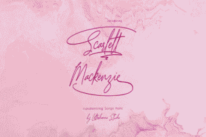
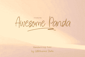
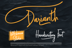
Picture this: A couple receives their wedding invitation in the mail. Before they even read the details, their fingers trace the flowing curves of the script font. They smile. They feel the romance. They know this wedding will be special.
That’s the power of choosing the right elegant script font for wedding invitations.
In a world where most communication happens through digital screens and generic templates, wedding invitations remain one of the last bastions of tangible elegance. They’re not just pieces of paper—they’re the first chapter of a love story, the promise of celebration, and a keepsake that couples will treasure for decades.
But here’s the challenge: With thousands of fonts available online, how does one choose the perfect script typography wedding style that captures both personality and timeless beauty?
This guide explores everything needed to select, pair, and implement elegant script fonts that transform wedding invitations from ordinary to extraordinary.
Why Script Fonts Reign Supreme in Wedding Invitations
Script fonts have dominated wedding invitation design for centuries, and there’s a fascinating reason why. These typefaces mimic the natural flow of handwriting, creating an immediate sense of intimacy and personal touch. When guests see an elegant calligraphy typeface on an invitation, their brains unconsciously interpret it as something crafted with care—even when it’s digitally printed.
The psychology runs deeper than aesthetics. Research in typography suggests that script fonts trigger emotional responses associated with tradition, romance, and ceremony. They slow down the reading pace, forcing recipients to savor each word rather than scan quickly. For something as significant as a wedding announcement, this deliberate pace feels appropriate.
Modern couples aren’t just looking for any script font, though. They’re seeking that sweet spot where classic elegance meets contemporary sophistication. The demand for luxury wedding fonts has evolved beyond basic cursive into a nuanced art form where ligatures, swashes, and letter spacing create visual poetry.
Understanding the Anatomy of Premium Wedding Script
Not all script fonts are created equal. The difference between a free downloaded font and a premium wedding script often lies in details invisible to untrained eyes but immediately felt by everyone who sees the invitation.
Ligatures and Connections
Superior script fonts feature carefully designed ligatures—those elegant connections where one letter flows seamlessly into the next. In cheaper fonts, letters often appear disconnected or awkwardly joined. Premium options invest in multiple ligature variations, ensuring that common letter combinations like “th,” “st,” and “ff” connect beautifully.
Contrast and Line Weight
Sophisticated invitation fonts exhibit varying line weights, where downstrokes appear thicker than upstrokes. This mimics traditional calligraphy created with flexible nibs. The contrast adds dimension and visual interest, preventing the text from appearing flat or monotonous.
Swashes and Alternates
Luxury fonts include alternate characters and decorative swashes—those flourishing extensions that add drama to capital letters or final letters in words. These elements allow designers to customize the look while maintaining the font’s integrity.
The Five Categories of Elegant Script Typography
Understanding script font categories helps narrow choices based on wedding style and personal aesthetic preferences.
Modern Calligraphy Scripts
These romantic font styles capture the organic imperfection of hand-lettered calligraphy. They feature irregular baselines, varied letter slanting, and a casual elegance that feels both contemporary and timeless. Modern calligraphy works beautifully for outdoor weddings, bohemian celebrations, and couples who want their invitations to feel personal rather than formal.
Formal Copperplate Scripts
Copperplate represents the pinnacle of traditional elegance. With its consistent slant angle, uniform spacing, and refined letterforms, this style evokes ballroom grandeur and black-tie affairs. These timeless script fonts communicate sophistication and ceremony, making them ideal for formal venue weddings and traditional celebrations.
Brush Lettering Fonts
Characterized by their bold strokes and dynamic energy, brush scripts bring a contemporary edge to wedding invitation design. They work exceptionally well for couples who want to balance elegance with personality, particularly for modern weddings with non-traditional elements.
Vintage Script Revival
These fonts draw inspiration from historical periods—Victorian flourishes, Art Deco geometry, or 1950s advertising scripts. They offer couples a way to theme their wedding around a specific era while maintaining sophisticated appeal. Vintage scripts pair beautifully with period-appropriate invitation design elements.
Minimalist Contemporary Scripts
The newest category embraces simplicity without sacrificing elegance. These fonts feature clean lines, minimal embellishment, and a refined restraint that appeals to modern sensibilities. They’re perfect for couples who appreciate elegance but want to avoid anything overly ornate.
Mastering Elegant Font Pairing: The Secret Sauce
Here’s where most invitation designs succeed or fail: font pairing. Even the most beautiful script font can look amateurish when paired incorrectly with secondary typefaces.
The golden rule? Contrast with purpose.
Script + Serif Combinations
Pairing a flowing script with a classic serif creates sophisticated tension. The script handles names and romantic elements while the serif grounds the practical information—dates, times, locations. This combination works universally across wedding styles, from garden parties to cathedral ceremonies.
Popular successful pairings include delicate scripts with refined serifs like Garamond or Baskerville. The serif’s traditional authority balances the script’s romance, creating invitations that feel both elegant and trustworthy.
Script + Sans-Serif Pairings
For modern weddings, pairing cursive wedding lettering with clean sans-serif fonts creates fresh, contemporary appeal. The sans-serif adds breathing room and clarity, preventing the overall design from feeling too busy or difficult to read.
This approach works particularly well for minimalist wedding invitation design, where white space and typography carry the entire aesthetic weight.
The Cardinal Sin: Script + Script
Unless working with a professional designer who deeply understands typographic hierarchy, avoid pairing two script fonts together. The result almost invariably appears cluttered and reduces readability. If multiple script elements are needed, use the same font family with different weights or alternate characters instead.
Readability: Where Elegance Meets Function
The most gorgeous script font in the world fails if guests can’t read essential information. Wedding invitation design must balance aesthetic beauty with practical communication.
Size Matters
Script fonts require larger point sizes than sans-serif or serif fonts to maintain readability. While body copy might use 10-12pt in a serif font, script fonts typically need 14-16pt minimum. Names and featured text often work best at 24pt or larger.
Spacing Considerations
Letter spacing (tracking) and line spacing (leading) need careful attention. Many script fonts are designed with specific spacing built in. Adjusting these values can destroy the font’s natural flow. When spacing adjustments are necessary, increase line spacing rather than letter spacing to preserve the script’s intended rhythm.
Color and Contrast
While tempting to use metallic inks or light colors with script fonts, high contrast ensures readability. Deep charcoal or black ink on white or cream paper remains the most legible combination. If colored ink is desired, navy, burgundy, or forest green provide elegance while maintaining readability.
Digital Printing vs. Traditional Techniques
The chosen printing method significantly impacts how script fonts appear on final invitations.
Digital Printing
Modern digital printing has evolved remarkably, offering high-quality results at accessible price points. It handles script fonts well, particularly when using premium cardstock. Digital printing allows for easy customization and smaller print runs—ideal for modern couples who might want multiple design variations.
Letterpress
For ultimate luxury, letterpress printing creates tactile impressions that guests can feel. The pressure of the press creates slight debossing, adding dimension to script fonts. This centuries-old technique pairs exceptionally well with formal copperplate scripts, emphasizing their traditional elegance.
Foil Stamping
Adding metallic foil to script fonts creates show-stopping results. The reflective quality highlights the font’s curves and flourishes. Rose gold, gold, and silver foil have dominated wedding trends, though copper and holographic foils are emerging for 2026.
Engraving
The most traditional and expensive option, engraving produces crisp, raised lettering with a timeless quality. It’s particularly stunning with classic script fonts and remains the choice for ultra-formal weddings.
Top Script Font Trends Shaping 2026 Weddings
Wedding typography evolves alongside broader design trends, and 2026 is bringing fascinating shifts.
Maximalist Swashes
After years of minimalism, decorative elements are making a dramatic comeback. Fonts with elaborate initial caps and dramatic tail swashes are trending, allowing couples to make bold statements with their names and key phrases.
Monoline Scripts
These scripts maintain consistent line weight throughout, creating a modern, approachable elegance. They bridge the gap between formal calligraphy and contemporary design, appealing to couples who want sophistication without stuffiness.
Mixed Script Sizes
Designers are increasingly varying script font sizes within single invitations, creating visual hierarchy through scale rather than font changes. A couple’s names might appear in large, dramatic script while other details use the same font in smaller sizes.
Unexpected Color Combinations
While classic black on white remains timeless, 2026 is seeing more adventurous color choices. Deep jewel tones, unexpected pastels, and earth-inspired palettes are being paired with script fonts to create memorable impressions.
Practical Tips for Implementation
Test Before Committing
Always request printed samples before ordering full quantities. Script fonts can look different on screen versus paper, and different paper textures affect how fonts appear. Seeing physical samples prevents expensive mistakes.
Consider the Envelope
The envelope addressing deserves as much attention as the invitation itself. Many couples choose to continue the script font theme onto envelopes, either through printed addresses or hiring calligraphers for hand-lettering. This creates a cohesive experience from the moment the invitation arrives.
Proofread Obsessively
Script fonts can occasionally make certain letter combinations ambiguous. Have multiple people review proofs, specifically checking names, dates, and addresses. A misspelled name in beautiful calligraphy is still a misspelled name.
Respect Hierarchy
Establish clear visual hierarchy: the couple’s names should be most prominent, followed by the invitation phrase (“request the pleasure of your company”), then ceremony details. Script fonts work best for the first two elements, while clean secondary fonts handle detailed information.
Beyond the Invitation Suite
Consistent typography across all wedding stationery creates professional cohesion. The chosen elegant script font should extend beyond invitations to:
- Save-the-date cards
- RSVP cards
- Ceremony programs
- Menu cards
- Place cards
- Thank you notes
- Wedding website headers
This consistency creates brand recognition for the wedding, making every piece feel connected to the larger celebration.
Making the Final Selection
Choosing the perfect script font ultimately comes down to answering three questions:
Does it reflect the couple’s personality? The typography should feel authentic to who they are, whether that’s classically romantic, modernly minimalist, or creatively bold.
Does it match the wedding’s formality level? A garden brunch wedding calls for different typography than a cathedral evening ceremony. The script should align with the event’s overall tone.
Will it remain beautiful decades from now? While trendy elements can be fun, wedding invitations become cherished keepsakes. Choosing timeless script fonts ensures the invitation remains elegant even when design trends shift.
The Lasting Impact of Thoughtful Typography
Wedding invitations serve a purpose far beyond conveying logistical information. They set expectations, create excitement, and provide guests with their first tangible connection to the celebration.
When couples invest time in selecting the perfect elegant script font for wedding invitations, they’re not just choosing letters on paper. They’re crafting an experience, establishing a mood, and creating something that recipients will keep in drawers and scrapbooks for years to come.
The right typography whispers promises of the beauty to come. It suggests that if this much care went into a simple invitation, the wedding itself will be extraordinary.
And in 2026, with more options than ever before, couples have the opportunity to find script fonts that don’t just communicate information—they tell love stories in every curve and flourish.
The perfect font is out there, waiting to make wedding invitations truly unforgettable.


