
Picture this: A wedding invitation arrives in the mail. Before reading a single word, the graceful curves of the script font have already whispered stories of elegance and romance. That’s the power of fancy script fonts—they don’t just communicate words, they evoke emotions.
In the digital age where everyone has access to the same basic typefaces, fancy script fonts have become the secret weapon of designers who refuse to blend into the background. Whether crafting a luxury brand identity, designing eye-catching social media graphics, or adding personality to a personal project, the right script typography can transform ordinary text into visual poetry.
But here’s the challenge: With thousands of options available—from free fonts to premium collections—how does one navigate this ornate landscape without getting lost in a sea of swirls and flourishes?
What Makes Fancy Script Fonts So Irresistible?
Fancy script fonts are the chameleons of typography. They can whisper sophistication in a spa brochure, shout celebration on a party poster, or murmur intimacy in a handwritten note—all while maintaining their distinctive flowing character.
Unlike rigid sans-serif or structured serif fonts, script fonts carry the DNA of human handwriting. Each curve, loop, and connection mimics the natural movement of pen on paper, creating an immediate sense of personality and warmth. This organic quality makes them particularly effective for brands wanting to establish emotional connections with their audience.
The beauty of modern fancy script fonts lies in their versatility. Today’s font collections range from formal copperplate styles that evoke 18th-century elegance to casual brush scripts that feel fresh off an artist’s easel. Some feature elaborate decorative elements perfect for headlines, while others offer restrained sophistication suitable for body text.
The Free vs. Premium Debate: What Every Designer Should Know
The internet overflows with free fonts, and many are genuinely excellent. Platforms offering free font download options have democratized design, allowing students, small business owners, and hobbyists to access quality typography without breaking the bank.
However, the world of premium fonts exists for good reason. Commercial typefaces typically offer expanded character sets, multiple weights, professional kerning, and crucially—proper licensing for commercial use. A stunning script discovered on a free site might seem like a treasure until discovering it’s missing essential punctuation or lacks the legal clearance for client work.
The smart approach? Build a curated font collection that balances both. Use free fonts for personal projects and mockups, but invest in premium fonts for professional work where licensing, technical quality, and brand reputation matter.
Mastering Script Typography: The Rules Worth Breaking (and Those Worth Following)
Script fonts are beautiful rebels, but even rebels need some structure. The cardinal rule of script typography: readability always trumps decoration. A font that looks gorgeous in a logo might become illegible at small sizes or in body text.
When working with fancy script fonts, size matters tremendously. These typefaces typically shine in display applications—think headlines, logos, and featured quotes. Forcing them into paragraphs of body text is like asking a ballroom dancer to navigate a crowded subway; technically possible, but missing the point entirely.
Contrast is another crucial consideration. Fancy script fonts work best when paired with simpler typefaces. A delicate script headline paired with clean sans-serif body text creates visual hierarchy and maintains readability. This principle of font pairing prevents designs from becoming chaotic or overwhelming.
Try out and download our best font for free 👀


Color and background choices can make or break script typography. Light, airy scripts need sufficient contrast against their backgrounds, while bold brush scripts can handle more adventurous color combinations. The elaborate details that make fancy scripts appealing can disappear against busy backgrounds or in poor color pairings.
Building Your Typography Arsenal: Essential Design Resources
The quest for the perfect fancy script font begins with knowing where to look. Established font foundries like MyFonts, Creative Market, and Adobe Fonts offer curated collections with quality assurance. These platforms provide preview tools, allowing designers to test fonts with custom text before committing.
For those seeking elegant fonts without the price tag, Google Fonts houses several quality script options with proper web licensing. Sites like Font Squirrel specialize in commercial-use free fonts, clearly marking licensing terms to avoid legal headaches.
Smart designers don’t just collect fonts—they organize them. Creating a personal typography guide helps catalog favorites, noting which scripts work for different moods and applications. This might include samples showing each font at various sizes, successful pairing combinations, and notes about where each font shines.
The Art of Font Pairing: Creating Harmony in Contrast
Font pairing with fancy scripts follows a principle of complementary opposition. The script provides personality and visual interest, while its partner provides stability and readability. Think of it as a design partnership where each typeface plays to its strengths.
Classic combinations pair ornate scripts with neutral sans-serifs like Montserrat, Open Sans, or Proxima Nova. The script handles emotional heavy lifting while the sans-serif manages information clearly and efficiently. For projects needing more traditional elegance, pairing scripts with classic serifs like Garamond or Baskerville creates sophisticated, timeless designs.
The key is maintaining hierarchy. The fancy script should be the star in its designated role—headline, logo, or accent text—while supporting typefaces gracefully step back. Using multiple decorative fonts in one design rarely ends well; it’s like having multiple lead singers in a band.
Decorative Fonts: When More Is Actually More
Some fancy script fonts embrace maximalism with open arms. These decorative fonts feature swashes, alternates, flourishes, and ornamental characters that transform simple words into elaborate artworks. They’re not for every project, but when the occasion calls for drama, nothing else will do.
Wedding stationery, luxury branding, and special occasion designs often benefit from these ultra-ornate options. The trick is using their decorative elements judiciously. A font with beautiful swash alternates doesn’t require using every special character in every word. Strategic placement of one or two flourishes often creates more impact than overwhelming decoration.
Many premium fonts include OpenType features allowing designers to toggle decorative elements on and off. This flexibility lets one typeface serve multiple purposes—restrained and refined in one context, elaborately decorated in another.
Trends Worth Watching (and Some Worth Ignoring)
Typography trends ebb and flow like fashion. Currently, the design world shows appetite for script fonts that balance personality with restraint—the “casual elegant” aesthetic. Hand-lettered styles that feel authentic without being sloppy, and vintage-inspired scripts with modern refinements are particularly popular.
Side Note : Promote & earn with Letterhanna’s affiliate program.

However, chasing trends blindly leads to dated designs. The fancy script fonts that endure are those based on solid typographic principles rather than momentary popularity. A well-crafted script inspired by traditional calligraphy will outlast dozens of trendy brush fonts that all look identical.
Practical Applications: Where Fancy Scripts Shine
Certain applications practically demand fancy script fonts. Logo design for boutiques, bakeries, and creative services often benefits from script typography’s approachable elegance. Social media graphics gain stopping power when headlines pop with carefully chosen script fonts.
Packaging design, particularly for beauty products, food items, and artisanal goods, frequently employs fancy scripts to convey quality and care. Even in digital products, strategic use of script fonts in navigation, headers, or accent elements adds warmth to otherwise clinical interfaces.
The question isn’t whether to use fancy script fonts, but rather how to use them effectively. Every project has a emotional tone to strike, and script typography offers nuanced options for hitting precisely the right note.
Technical Considerations: Making Scripts Work Across Platforms
Beautiful typography means nothing if it doesn’t display properly. Web designers using fancy script fonts must consider file sizes, loading times, and cross-browser compatibility. Google Fonts solves many of these issues, but custom font files require optimization.
Print designers face different challenges. Ensuring script fonts reproduce cleanly requires attention to resolution, proper embedding, and sometimes converting text to outlines before final output. Those delicate serifs and connecting strokes can disappear or blur if technical specs aren’t properly managed.
Building a Professional Font Collection: Quality Over Quantity
The most effective font collections aren’t the largest—they’re the most carefully curated. Rather than hoarding hundreds of free fonts that look similar, investing in a smaller collection of versatile, high-quality typefaces serves designers better in the long run.
A solid foundation might include three to five carefully chosen fancy script fonts covering different styles: perhaps one formal copperplate, one casual brush script, one vintage-inspired option, one modern minimal script, and one decorative showstopper. This range handles most projects while maintaining manageable organization.
Supplementing these core scripts with complementary sans-serif and serif families creates a professional toolkit capable of tackling diverse design challenges. The goal is having options without drowning in choice.
The Future of Fancy Script Fonts
Variable fonts represent the cutting edge of typography technology, allowing single font files to contain multiple weights and styles. As this technology matures, expect fancy script fonts with unprecedented flexibility—adjusting weight, slant, and decorative elements on the fly.
Artificial intelligence and machine learning are also entering the typography space, though they’re unlikely to replace human font designers anytime soon. The subtle details that make great script fonts work—the rhythm of letter connections, the balance of thick and thin strokes—still require human artistry and judgment.
Final Flourishes
Fancy script fonts are more than decorative elements—they’re communication tools that convey mood, establish brand personality, and create emotional resonance. Whether downloading free fonts for personal projects or investing in premium fonts for client work, the key is choosing typography that serves the message while delighting the eye.
The difference between amateur and professional design often comes down to typography choices. Fancy scripts used thoughtfully elevate work from merely acceptable to genuinely memorable. They transform cold digital text into warm human expression.
In a world increasingly dominated by standard system fonts and safe typography choices, fancy script fonts offer designers the opportunity to break free from uniformity. They remind audiences that design is both art and communication, that beauty and function can coexist, and that sometimes the right curves in the right places make all the difference.
The ultimate typography guide isn’t about memorizing rules—it’s about understanding principles well enough to know when breaking them serves the design. Fancy script fonts embody this philosophy perfectly: structurally complex yet visually effortless, traditionally rooted yet endlessly adaptable.
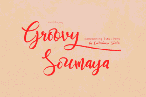
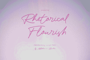
Here Are Some Fonts You Might Love! 👀


