Fonts are not all created equal. Some are refined aristocrats; others are gritty modernists. Understanding the classifications of typefaces helps you pick the right font for the right vibe—because you wouldn’t use Papyrus for a luxury watch ad… right? (Right?!)
📚 A Brief History of Font Families
As printing evolved, so did the design of letters. Early type mirrored handwritten forms. Later, more geometric and experimental styles emerged with changing technology, design philosophies, and cultural movements. Classifying these styles helps us understand where a typeface comes from—and what kind of energy it brings.
Think of it like fashion. Is it baroque? Is it modern? Vintage? Minimalist? Fonts have style periods too.
🎩 The Main Typeface Classifications
Let’s look at the heavy hitters, from oldest to newest:
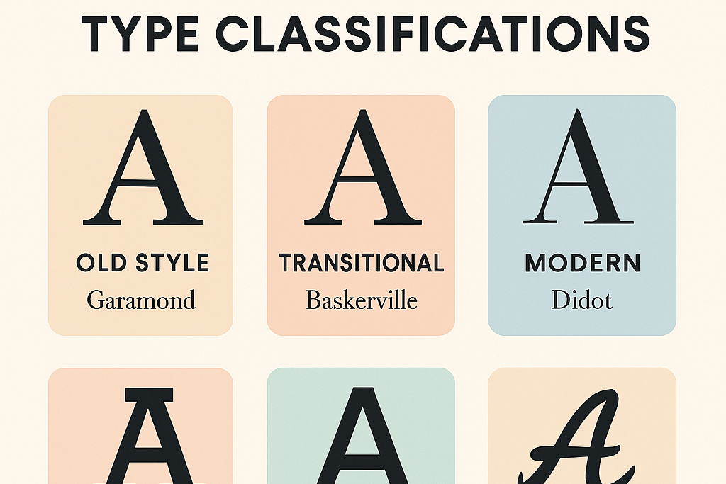
1. Old Style (Humanist)
Examples: Garamond, Bembo, Goudy Old Style
Era: 1400s–1600s
Vibe: Classic, elegant, timeless
Traits:
-
Diagonal stress (like handwriting)
-
Modest contrast between thick and thin strokes
-
Bracketed serifs (soft, curved transitions)
-
Warm and readable
Use Case: Long texts, books, elegant branding. Basically, it whispers “literary sophistication.”
2. Transitional
Examples: Baskerville, Times New Roman
Era: Late 1600s–1700s
Vibe: A bit more polished than Old Style, but not flashy
Traits:
-
More contrast between strokes
-
Vertical stress
-
Sharper, more refined serifs
Use Case: Academic works, formal documents, traditional websites. Transitional fonts are like the business casual of serif fonts.
3. Modern (Didone)
Examples: Didot, Bodoni
Era: Late 1700s–1800s
Vibe: Fashion-forward, dramatic, sharp
Traits:
-
High contrast between thick and thin strokes
-
Vertical stress
-
Hairline, unbracketed serifs
-
Geometric and sleek
Use Case: Fashion magazines, luxury brands, headlines. These fonts scream “look at me” while sipping espresso in Paris.
4. Slab Serif (Egyptian)
Examples: Rockwell, Courier
Era: 1800s
Vibe: Bold, industrial, no-nonsense
Traits:
-
Thick, blocky serifs (like slabs of meat)
-
Minimal contrast in strokes
-
Feels stable and strong
Use Case: Posters, typewriter aesthetics, retro design, signage. Great when you need your type to thump.
Side Note : Promote & earn with Letterhanna’s affiliate program.

5. Sans-Serif
Examples: Helvetica, Futura, Gill Sans
Era: Early 1900s onward
Vibe: Clean, modern, minimalist
Traits:
-
No serifs (duh)
-
Uniform stroke width
-
Geometric or humanist forms
Subcategories:
-
Grotesque: Early sans-serifs, like Akzidenz-Grotesk
-
Neo-Grotesque: Like Helvetica, more refined
-
Geometric: Built from basic shapes (like Futura)
-
Humanist: More organic and readable (like Gill Sans)
Use Case: Web design, apps, logos, anything modern. Sans-serifs are your typographic Swiss Army knives.
6. Script / Handwritten
Examples: Brush Script, Pacifico, Bickham Script
Vibe: Fancy, personal, sometimes playful, sometimes dramatic
Traits:
-
Mimics handwriting or calligraphy
-
Can range from casual to formal
-
Often includes connected letters (like cursive)
Use Case: Invitations, logos, greeting cards, anything where a “human touch” is needed.
7. Display / Decorative
Examples: Lobster, Impact, Jokerman
Vibe: Fun, unique, often loud
Traits:
-
Highly stylized
-
Meant to be used in large sizes
-
Not ideal for body copy (your eyeballs will revolt)
Use Case: Posters, headlines, branding. These fonts are like the main act on a concert poster—not background vocals.
🧠 Unique Fact of the Day
Helvetica was originally called “Neue Haas Grotesk.”
Yep—before it became the face of modern design, Helvetica had a very German-sounding name. It was renamed in 1960 to reflect its Swiss origin (Helvetia = Latin for Switzerland). Imagine the iPhone using “Neue Haas Grotesk” on-screen. Not quite as iconic, huh?
Here Are Some Fonts You Might Love! 👀