Typography. It’s everywhere, yet somehow… invisible. That elegant wedding invite? Typography. The subway signage that saved you from getting on the wrong train? Typography. The dramatic movie poster that made you feel something before even watching the film? Yep. Typography again.
In this guide, we’re going on a journey. Whether you’re a curious beginner, an aspiring font designer, or just a type nerd looking to level up—this one’s for you. We’re gonna cover the basics, unpack the deeper science, and sprinkle in some juicy design wisdom.
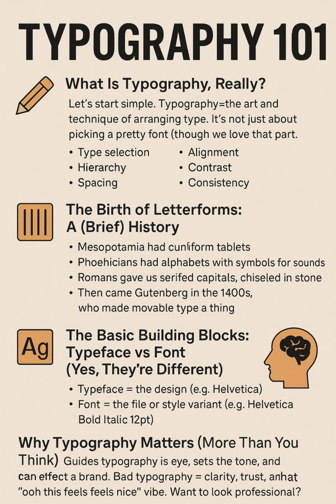
🧐 What Is Typography, Really?
Let’s start simple. Typography is the art and technique of arranging type. It’s not just about picking a pretty font (though we love that part too). It involves:
-
Type selection
-
Hierarchy
-
Spacing
-
Alignment
-
Contrast
-
Consistency
Basically, it’s design’s quiet whisper that yells “Hey, read me first!” without being obnoxious.
Quick distinction:
👉 Typography = how you use type
👉 Type design = making the typefaces themselves
They’re close cousins. Like the artsy illustrator and the font-obsessed developer at the same family BBQ.
✍️ The Birth of Letterforms: A (Brief) History
Let’s rewind. Wayyy back.
-
Mesopotamia had cuneiform tablets.
-
Phoenicians had alphabets with symbols representing sounds.
-
Romans gave us serifed capitals, chiseled in stone.
-
Then came Gutenberg in the 1400s, who made movable type a thing. Typography went mass-market.
Fast-forward to now, and we’ve got more fonts than we know what to do with—thanks, Google Fonts.
🔤 The Basic Building Blocks: Typeface vs Font (Yes, They’re Different)
Let’s clear up a common mix-up:
-
Typeface = the design (e.g., Helvetica)
-
Font = the file or style variant (e.g., Helvetica Bold Italic 12pt)
So, when someone says “I downloaded a new font called Garamond,” technically… they mean typeface. But we’re not font snobs here. (Well… maybe a little.)
🧠 Why Typography Matters (More Than You Think)
Typography doesn’t just decorate your message—it delivers it. It guides the reader’s eye, sets the tone, and can even make or break a brand.
Try out and download our best font for free 👀


-
Bad typography = confusion, eye strain, and lost attention.
-
Great typography = clarity, trust, and that “ooh this feels nice” vibe.
Want to look professional? Nail your type.
🛠️ Typography Basics: A Crash Course
1. Hierarchy
Use size, weight, and spacing to tell your reader what to read first. Headlines are bigger for a reason.
2. Alignment
Left-aligned is easiest to read. Centered text? Use it sparingly. Justified? Risky—watch those rivers.
3. Spacing
-
Kerning = space between pairs of letters.
-
Tracking = spacing across a whole word or paragraph.
-
Leading = line spacing between lines of text.
Adjust these, and you go from “meh” to masterful.
4. Contrast
Pair a bold headline with a light body font. Serif with sans. Big with small. Let opposites attract.
5. Consistency
Don’t use eight fonts. (Please.) Pick 2–3 that play well together. Set rules and stick with them.
🔎 Level Up: Advanced Typography Concepts
So you’ve got the basics. Let’s get spicy.
➤ The Grid
Designers use invisible grids to align text and images. It’s like feng shui for your layout.
➤ Optical Adjustment
Letters aren’t always sized mathematically. They’re tweaked to look right. Like overshooting curves above the x-height.
Side Note : Promote & earn with Letterhanna’s affiliate program.

➤ Typeface Psychology
Fonts have vibes:
-
Serif = traditional, trustworthy
-
Sans-serif = clean, modern
-
Script = elegant, expressive
-
Display = funky, loud, sometimes unhinged (in a fun way)
Choose wisely. Comic Sans isn’t evil. But… maybe don’t use it on a law firm’s website.
➤ OpenType Features
Pro fonts come with bonus goodies like:
-
Ligatures
-
Old-style numerals
-
Swashes
-
Alternate glyphs
It’s like font Easter eggs.
🎨 Font Design: The Next Level
Ever wanted to create your own font? It’s part technical skill, part artistic journey.
Tools of the Trade:
-
Glyphs (Mac) – super intuitive, popular with pros
-
FontForge (Free) – a bit clunky, but gets the job done
-
RoboFont – for the scripting nerds
-
Procreate & Vector tools – great for sketching ideas
Process in a Nutshell:
-
Sketch basic letters (n, o, h, m… the usual suspects)
-
Digitize with Bézier curves
-
Define spacing and kerning pairs
-
Export and test in the wild
It’s oddly satisfying to type in your own handwriting.
😬 Common Typography Mistakes (We’ve All Been There)
-
Too many fonts
-
Bad kerning (like AV looking like AU)
-
Using display fonts for body text
-
Ignoring readability
-
Not testing on mobile (ouch)
Typography isn’t just art—it’s UX. Don’t just design for the eye. Design for the reader’s brain.
🤹 Practical Use Cases: Where Typography Really Shines
-
Web Design – clarity, hierarchy, accessibility
-
Branding – identity, voice, emotion
-
Editorial – readability over long-form
-
Posters & Ads – impact, attention-grabbing
-
Packaging – shelf appeal, instant recognition
Each medium has its own rules. Master those, and you’ve got range.
✏️ So… Where Should You Start?
Right here:
-
Choose a favorite typeface and study it. (Seriously. Like… zoom in. Obsess a little.)
-
Start pairing fonts and notice the balance
-
Recreate a layout you love from scratch
-
Follow type designers on socials (they’re wildly underrated artists)
-
Get nerdy about kerning
Typography is a skill—but also a feeling. The more you play, the better you see.
📚 Resources to Bookmark
-
Typewolf – for font pairing inspiration
-
Fonts In Use – real-world examples
-
Google Fonts – free and usable everywhere
-
The Elements of Typographic Style by Robert Bringhurst – the classic
-
Type & Typography (Book) – theory meets practice
✨ Final Thoughts: It’s More Than Just Letters
Typography is where design meets language. It’s silent, but never passive. Done right, it becomes the invisible art that makes your message speak louder.
So whether you’re choosing fonts for a blog, designing an app UI, or dreaming up your own font family—remember: the letters matter.
And if all else fails? Just kern it ’til it feels right. 😄
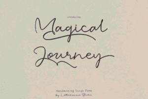
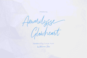
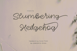
Here Are Some Fonts You Might Love! 👀