🅰️ Why Typography Matters
Typography isn’t just about picking a font that looks nice. It’s about choosing a tone of voice for your logo—one that shouts, whispers, charms, or commands. A font can make your brand feel professional, quirky, edgy, playful, elegant, or even revolutionary.
Imagine if Disney used Times New Roman in its logo. Suddenly, your childhood loses a little magic, right?
Typography isn’t decoration—it’s communication.
📚 The Two Main Font Families (and Their Vibes)
Typography is a vast universe, but let’s start with the two major species of type:
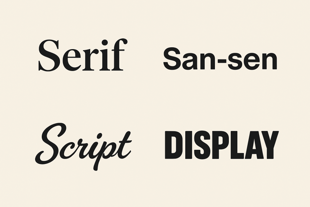
1. Serif Fonts
Serifs are the tiny “feet” or lines attached to the ends of letters.
🧠 Personality: Traditional, elegant, trustworthy, academic
🧩 Examples: Times New Roman, Georgia, Garamond
🧪 Used by: Vogue, Tiffany & Co., The New York Times
⚡ Great for: Law firms, luxury brands, publishers
Try out and download our best font for free 👀


2. Sans-Serif Fonts
Sans-serif means “without serif.” These fonts are cleaner and more modern.
🧠 Personality: Minimal, straightforward, friendly, modern
🧩 Examples: Helvetica, Futura, Proxima Nova
🧪 Used by: Google, Spotify, Airbnb
⚡ Great for: Tech companies, startups, lifestyle brands
🔤 Other Font Categories to Know
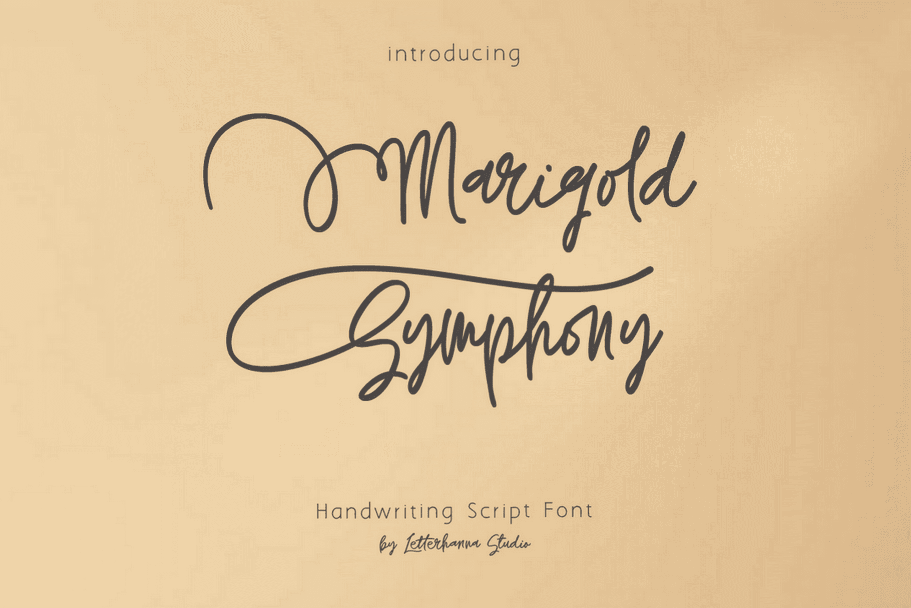
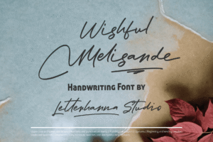
🖋️ Script Fonts
These mimic handwriting or calligraphy. Often used for elegance or whimsy.
🧠 Personality: Feminine, artistic, personal
🧪 Used by: Coca-Cola, Instagram
⚠️ Use sparingly. Hard-to-read scripts can feel messy.
Side Note : Promote & earn with Letterhanna’s affiliate program.

💡 Display Fonts
Unique, decorative fonts designed to stand out. Think weird, bold, fun.
🧠 Personality: Creative, bold, rebellious
🧪 Used by: Toys”R”Us, Fanta
⚠️ Not ideal for body text—best kept to logos and big headers.
✨ Anatomy of a Letterform (Nerd Alert!)
Let’s geek out briefly. Here are some parts of a letter you probably didn’t know had names:
-
X-height – The height of lowercase letters like “x”
-
Ascender – The part that goes above the x-height (like the top of “h”)
-
Descender – The part that drops below the baseline (like “g” or “y”)
-
Kerning – The space between individual letters
-
Tracking – Overall spacing between characters
Why does this matter? Because small tweaks in spacing and alignment can make your logo feel just right or awkward as a bad first date.
💼 Case Studies: When Fonts Make the Brand
FedEx
Simple sans-serif? Sure. But the magic? A hidden arrow in the negative space between the “E” and the “x.” Clean, clever, confident.
Vogue
Classic serif type. Instantly says “high fashion, darling.” The thick and thin strokes add sophistication.
Lego
A bold, chunky sans-serif with rounded edges that screams: “Play with me!” (But not in a creepy way.)
🎯 How to Pick the Right Font for Your Logo
-
Define your brand personality. Are you refined or rebellious? Playful or prestigious?
-
Pick one primary font. Keep it simple. Most logos use one, maybe two fonts.
-
Test in context. How does it look on a website header? On a business card? On a billboard?
-
Avoid the cliché pile. Fonts like Comic Sans and Papyrus have been… overloved. Choose something original—or customize!
🧩 Unique Fact of the Day:
Helvetica is the most used font in the world—so much so that it has a documentary made about it. The city of New York uses Helvetica for all its subway signs. So, if you’ve ever gotten lost on the F train, blame Swiss design.