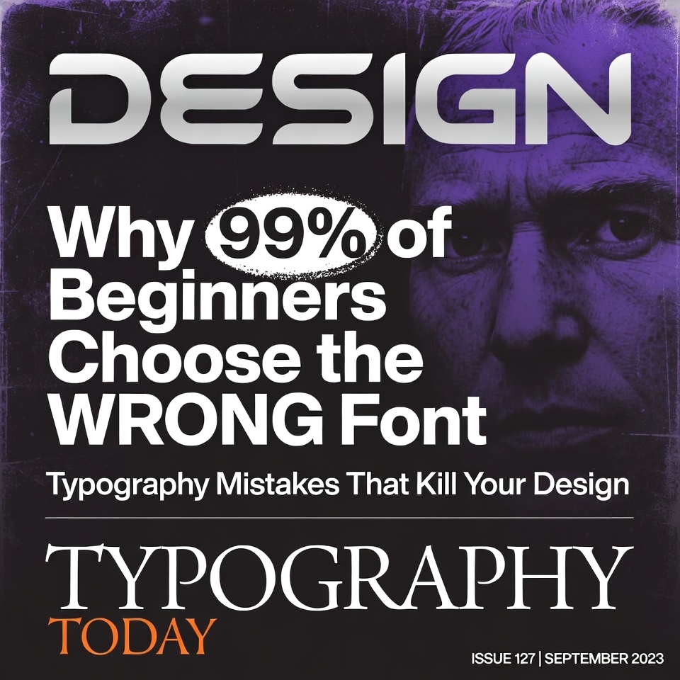
Introduction: The Silent Design Killer
You’ve spent hours perfecting your layout. Your color palette is on point. The imagery is stunning. But something feels… off.
Here’s the brutal truth: Your typography is sabotaging everything.
Most beginners don’t realize that font choice isn’t just about what “looks pretty.” It’s the difference between a design that converts and one that gets ignored. In this comprehensive guide, we’ll expose the most common typography mistakes that are killing your designs—and show you exactly how to fix them.
The #1 Typography Sin: Using Too Many Fonts
Why This Destroys Your Design
The fastest way to make your design look amateurish? Mix five different fonts and call it “creative.”
The Reality Check:
- Professional designs rarely use more than 2-3 font families
- Each additional font creates visual chaos
- Your brain struggles to establish hierarchy when fonts compete
The Professional Solution
The Golden Rule: Stick to 2-3 fonts maximum
- Primary font: For headings and emphasis
- Secondary font: For body text
- Optional accent font: For special callouts (use sparingly)
Pro Tip: Choose fonts from the same superfamily (like Roboto Regular and Roboto Slab) for guaranteed harmony.
Mistake #2: Ignoring Font Pairing Psychology
The Beginner’s Trap
Randomly pairing fonts because they “look cool together” is like wearing a tuxedo jacket with cargo shorts. Technically, they’re both clothes…
Understanding Font Personalities
Every font communicates a feeling:
Serif Fonts (Times New Roman, Garamond, Merriweather)
- Evokes: Tradition, reliability, sophistication
- Best for: Financial services, law firms, editorial content
- Avoid for: Tech startups, children’s products
Sans-Serif Fonts (Helvetica, Roboto, Open Sans)
- Evokes: Modernity, cleanliness, approachability
- Best for: Tech companies, minimalist brands, UI design
- Avoid for: Luxury brands seeking elegance
Script Fonts (Pacifico, Dancing Script, Great Vibes)
- Evokes: Elegance, creativity, personality
- Best for: Wedding invitations, feminine brands, logos
- Avoid for: Body text, professional documents
Display Fonts (Impact, Bebas Neue, Righteous)
- Evokes: Drama, attention, uniqueness
- Best for: Headlines, posters, short phrases
- Avoid for: Body text, anything requiring extended reading
The Pairing Formula That Always Works
Contrast + Complement = Perfect Pair
Try these proven combinations:
- Serif heading + Sans-serif body (Classic and readable)
- Display heading + Simple sans-serif body (Bold and balanced)
- Geometric sans + Humanist sans (Modern and sophisticated)
Mistake #3: Horrific Line Spacing (Leading)
The Suffocation Problem
Cramped lines make reading feel like squeezing through a packed subway car. Your eyes have nowhere to rest.
The Science of Breathing Room
The 120-145% Rule:
- Body text should have line spacing between 120-145% of font size
- 16px font = 19-23px line height (roughly 1.4-1.5em)
- Headlines can go tighter (100-120%)
Why This Matters:
- Improves readability by 20-30%
- Reduces eye strain
- Increases time spent on page
Quick Fix Checklist
- ✓ Body text: 1.5 line spacing
- ✓ Headings: 1.2 line spacing
- ✓ Small print: 1.4 line spacing
- ✗ Never use 1.0 (single spacing) for body text
Mistake #4: Unreadable Font Sizes
The Squinting Epidemic
If your users need a magnifying glass, you’ve failed.
Size Hierarchy Done Right
The Desktop Standard:
- Body text: 16-18px minimum
- Subheadings: 20-24px
- Main headings: 32-48px
- Hero titles: 48-72px+
The Mobile Adjustment:
- Body text: Never below 16px (prevents auto-zoom on iOS)
- Increase heading sizes by 10-20% for impact
- Test on actual devices, not just desktop preview
The Readability Formula
Line length + Font size = Comfortable reading
- Optimal line: 50-75 characters (about 10-12 words)
- Shorter lines = Slightly smaller fonts work
- Longer lines = Increase font size for comfort
Mistake #5: Poor Color Contrast
The Visibility Crisis
Light gray text on white backgrounds might look “minimal,” but it’s actually just invisible.
The Contrast Standards
WCAG Guidelines (Web Content Accessibility Guidelines):
Try out and download our best font for free 👀


- Normal text: Minimum 4.5:1 contrast ratio
- Large text (18pt+): Minimum 3:1 contrast ratio
- AAA standard: 7:1 for optimal accessibility
Translation:
- Dark text on light backgrounds (or vice versa)
- Avoid: Light gray on white, yellow on white, light blue on white
- Test with free tools like WebAIM Contrast Checker
Beyond Black and White
Pro Technique: Use very dark gray (#333333) instead of pure black (#000000) on white
- Softer on eyes
- Feels more sophisticated
- Maintains excellent readability
Mistake #6: Misusing Decorative Fonts
The Overdesign Trap
Script fonts and decorative typefaces are like hot sauce—a little goes a long way.
When Decorative Fonts Work
Acceptable Uses:
- Logos (single word or short phrase)
- Hero headlines (3-5 words max)
- Special callout quotes
- Event invitations
When They Kill Your Design
Avoid decorative fonts for:
- Body text (instant readability death)
- Long headlines (cognitive overload)
- Navigation menus (usability nightmare)
- Anything users need to scan quickly
The 5-Second Rule
If you can’t read your decorative font in 5 seconds, it’s too decorative. Simplify.
Mistake #7: Inconsistent Typography Styles
The Chaos Effect
Using 16px for one paragraph, 17px for another, and 15px for a third creates subliminal discord.
Creating a Type Scale
The Professional Approach:
Establish a modular scale (ratio between sizes):
- 1.2 ratio (Minor Third – Conservative)
- 1.25 ratio (Major Third – Balanced)
- 1.414 ratio (Augmented Fourth – Dynamic)
Example Scale (16px base, 1.25 ratio):
- Small text: 13px
- Body: 16px
- H4: 20px
- H3: 25px
- H2: 31px
- H1: 39px
Building Your Typography System
Define Once, Use Everywhere:
- Choose your base font size (16-18px)
- Select your scale ratio
- Document your heading sizes
- Set your line heights
- Create reusable styles in your design tool
Tools That Help:
- Type-scale.com
- Modularscale.com
- Font pairing tools in Figma/Adobe XD
Mistake #8: Ignoring Font Weight Hierarchy
The Flatness Problem
Using only one font weight makes everything compete for attention. Nothing stands out because everything stands out.
The Weight System
Strategic Weight Usage:
- Light (300): Elegant headlines, less important info
- Regular (400): Body text, descriptions
- Medium (500): Subheadings, emphasized content
- Bold (700): Main headings, critical CTAs
- Black (900): Hero sections, maximum impact
The Emphasis Strategy
Instead of changing fonts, change weights:
- Don’t: Switch to a different font for emphasis
- Do: Use a bolder weight of the same font family
Pro Technique: Use font weight instead of color for hierarchy
- Keeps design cleaner
- More professional appearance
- Better accessibility
Mistake #9: Poor Alignment Choices
The Random Placement Problem
Center-aligning everything because it “looks balanced” actually creates more work for the reader’s eyes.
Alignment Rules for Readability
Left-Aligned (Default for most content):
- Best for body text in Western languages
- Easy for eyes to find start of next line
- Professional and clean
Center-Aligned (Use sparingly):
- Good for: Headlines, short quotes, hero sections
- Bad for: Paragraphs, navigation, long content
- Creates a ragged, difficult-to-read flow
Right-Aligned (Rarely):
- Captions beside images
- Certain artistic layouts
- Generally avoid for main content
Justified (Controversial):
- Can create awkward spacing “rivers”
- Requires hyphenation to work properly
- Best left to print design experts
The Flush-Left Principle
90% of the time, left-alignment is the answer for English-language content.
Mistake #10: Not Testing Across Devices
The Desktop-Only Delusion
Your font looks perfect on your 27-inch monitor. On a phone? Disaster.
The Cross-Device Reality Check
Common Mobile Font Failures:
Side Note : Promote & earn with Letterhanna’s affiliate program.
- Font too small on mobile (below 16px)
- Line length too long (text spans full width)
- Headings that break awkwardly
- Font weights that look different on iOS vs Android
Testing Protocol
Before you publish:
- Test on iPhone (Safari)
- Test on Android (Chrome)
- Test on tablet
- Test at 320px width (smallest smartphones)
- Check both portrait and landscape
Font Rendering Differences:
- Macs render fonts thinner than Windows
- Android renders heavier than iOS
- Consider adding font smoothing CSS
The Ultimate Typography Checklist
Before You Finalize Any Design
Font Selection:
- ☐ Using 2-3 fonts maximum
- ☐ Fonts complement each other
- ☐ Fonts match brand personality
Readability:
- ☐ Body text 16px minimum
- ☐ Line spacing 1.4-1.5 for body
- ☐ Line length 50-75 characters
- ☐ Contrast ratio meets 4.5:1 minimum
Hierarchy:
- ☐ Clear size differentiation between heading levels
- ☐ Consistent font weights
- ☐ Proper alignment choices
- ☐ Type scale system in place
Testing:
- ☐ Tested on mobile devices
- ☐ Tested in different browsers
- ☐ Readable at arm’s length
- ☐ Looks good in grayscale (contrast check)
Bonus: The 5 Best Free Font Resources
Where to find professional, free fonts:
- Google Fonts – Massive library, web-optimized, totally free
- Font Squirrel – Curated collection, 100% free for commercial use
- Adobe Fonts – Included with Creative Cloud subscription
- FontShare – High-quality, free for personal and commercial use
- DaFont – Large variety, check licenses carefully
Pro Warning: Free doesn’t always mean professional. Invest in premium fonts for client work when budget allows.
Real-World Typography Transformations
Case Study: Blog Redesign
Before:
- 5 different fonts
- 14px body text
- Center-aligned paragraphs
- 1.0 line spacing
- Result: 28-second average time on page
After:
- 2 fonts (Merriweather + Open Sans)
- 18px body text
- Left-aligned content
- 1.5 line spacing
- Result: 2:47 average time on page (493% increase!)
Case Study: Landing Page Conversion
Before Typography Fix:
- Decorative font for body text
- Poor contrast (light gray on white)
- Inconsistent sizing
- Conversion rate: 1.2%
After Typography Fix:
- Clear sans-serif for body
- Proper contrast (#333 on #FFF)
- Consistent type scale
- Conversion rate: 3.8% (217% increase!)
Common Typography Questions Answered
“Should I use system fonts or custom web fonts?”
System Fonts (Pros):
- Instant loading
- Consistent rendering
- Zero cost
Custom Web Fonts (Pros):
- Brand uniqueness
- More options
- Better aesthetics
The Best Answer: Use custom fonts for headings and branding, system fonts for body text if performance is critical.
“How do I know if my font pairing works?”
The Squint Test: Squint at your design. Can you still tell what’s a heading vs body text? If yes, your hierarchy works.
The 5-Foot Test: Stand 5 feet from your screen. Is it still readable? If no, adjust sizes and contrast.
“Can I use more than 3 fonts?”
Technically yes, but you shouldn’t. Unless you’re an experienced designer with specific artistic intent, more fonts = more problems.
Take Action: Your 30-Day Typography Challenge
Week 1: Audit Your Current Designs
Identify which mistakes from this article you’re making. Be honest—we’ve all done them.
Week 2: Build Your Typography System
Create a type scale, choose your fonts, document everything.
Week 3: Redesign One Project
Apply everything you’ve learned to a single project. Compare before/after.
Week 4: Test and Refine
Get feedback, test on devices, make adjustments.
Conclusion: Typography is Your Secret Weapon
Here’s what most beginners don’t realize: Typography isn’t just decoration—it’s communication.
Every font choice, every pixel of spacing, every weight adjustment sends a message to your audience. The difference between amateur and professional design often comes down to typography mastery.
The good news? Now that you know these mistakes, you’re already ahead of 99% of beginners.
Your next step: Choose ONE mistake from this article to fix in your current project today. Not tomorrow. Today.
Because great design isn’t about knowing everything—it’s about fixing one thing at a time until everything clicks.
Additional Resources
Books Worth Reading:
- “The Elements of Typographic Style” by Robert Bringhurst
- “Thinking with Type” by Ellen Lupton
- “Just My Type” by Simon Garfield
Online Learning:
- Typewolf.com (font pairing inspiration)
- Practical Typography by Matthew Butterick (free online book)
- Google Fonts Knowledge (free typography course)
Typography Tools:
- WhatFont (browser extension to identify fonts)
- Type Scale (generate type systems)
- Font Joy (AI-powered font pairing generator)
Ready to transform your designs? Start by auditing your current typography choices against this checklist. Your future self (and your clients) will thank you.
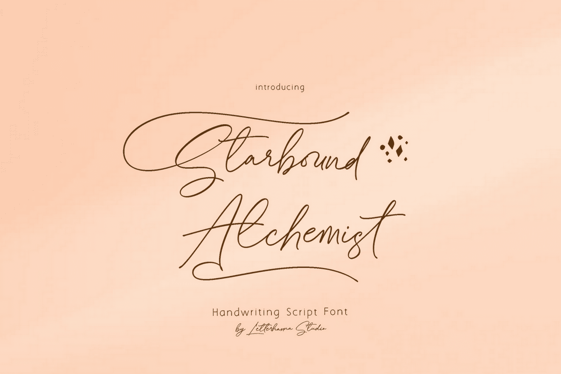
Here Are Some Fonts You Might Love! 👀